Combined wallpaper in the bedroom
Wall decoration with wallpaper is a common method that has been popular for more than one hundred years. Wallpaper was used in Ancient Greece and Rome, even representatives of the Russian nobility and merchants of the 18th century decorated their houses with wallpaper. Modern technology offers the consumer a variety of new products, and therefore a variety of design methods.
Combination methods
To make the room look stylish and correspond to the overall design concept, it is necessary to choose the right wallpaper. And for this you need to know what design is relevant for a modern bedroom. There are many options for combinatorial wallpaper patterns, with which you can solve various problems facing the owner. And this applies not only to the interior, but also to specific points.
The main advice of designers at the initial stage is to choose the right material. When choosing, you must have with you a sample of the solo canvas, the main one in the tandem wallpaper of the companions. The permissible number of types of canvases should not exceed 3.
Otherwise, the room will look at least lurid, and as a maximum - a jumble of prints, especially since we are talking about a bedroom, a place to rest and sleep.
Professionals offer the following formula:
- the first texture is the main one;
- the second one contains a print that matches the main one;
- the third texture should be neutral, in the basic palette.
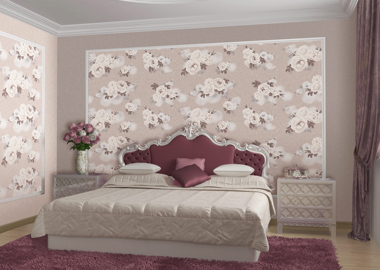
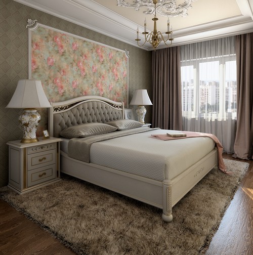
To accentuate the style and zoning of certain areas on the wall, decorative elements are often used - baguettes, moldings, borders, stucco. Such zoning involves filling the accent part with a bright canvas, surrounding it with a more neutral companion. This method visually enlarges the room. In addition, this technique distracts attention from existing defects.
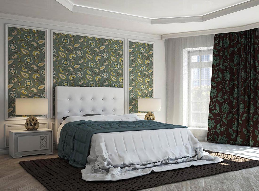
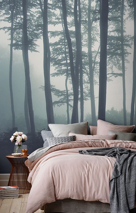
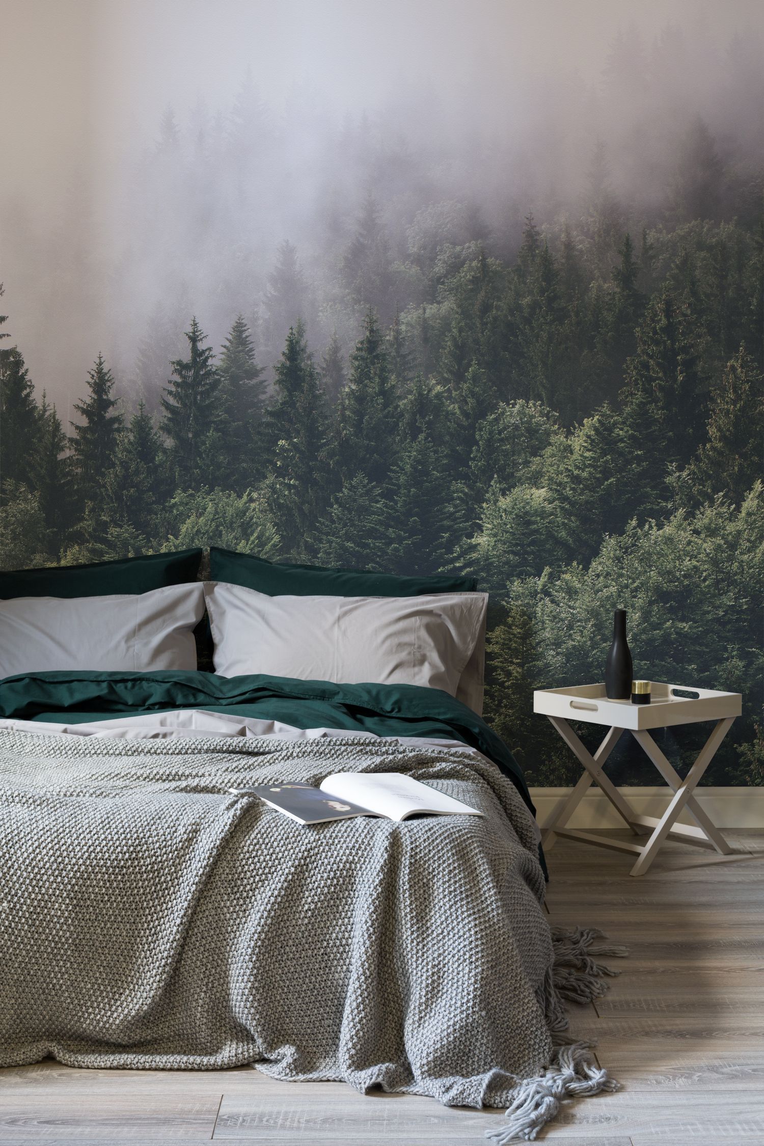
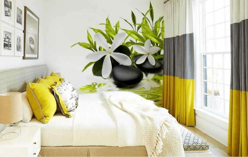
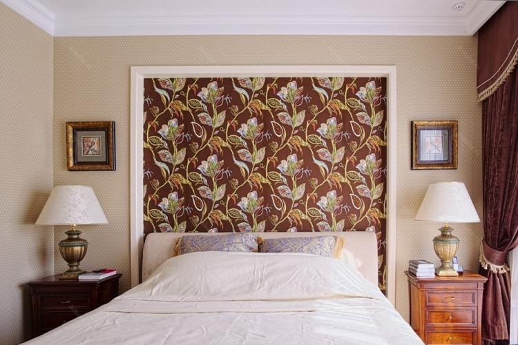
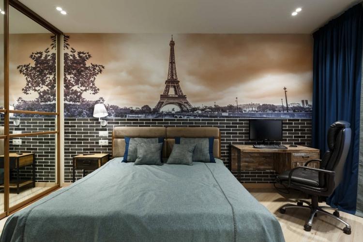
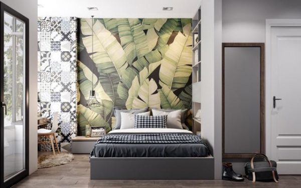
Wall murals in a small room visually increase spatial volumes. A well-chosen design creates a sense of deep perspective, such as a view from a window, seascapes or natural landscapes. It is enough to paste over one wall with them, and create a calm background on the others. Wall murals with flowers, images in the form of paintings are surrounded by a decorative frame using the elements mentioned above, or a monochromatic combined print is placed next to it. Bedrooms have different indicators of footage, height, illumination, they can be small or large, light or dark. All these parameters must be taken into account when creating a design and a desire to adjust a room.
Here are examples of options for combining wallpaper.
-
Defect masking. The wallpaper combination is the perfect solution for rooms with uneven walls. Two-, three-color composition solves this problem. The palette in pastel colors will visually smooth the surface, as well as the small drawing, the embossed texture, while they all harmoniously fit into the interior of the bedroom. But even long stripes or large squares, on the contrary, will highlight the flaws. Dark and deep colors are not used to hide defects, as they tend to emphasize them rather than minimize them. Uneven joints are easily masked with borders or baguettes, moreover, they contribute to the organic transition of materials of different textures from one part to another.
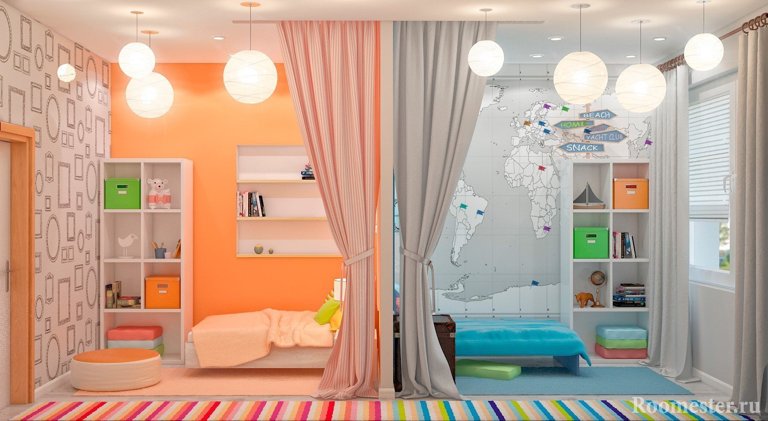
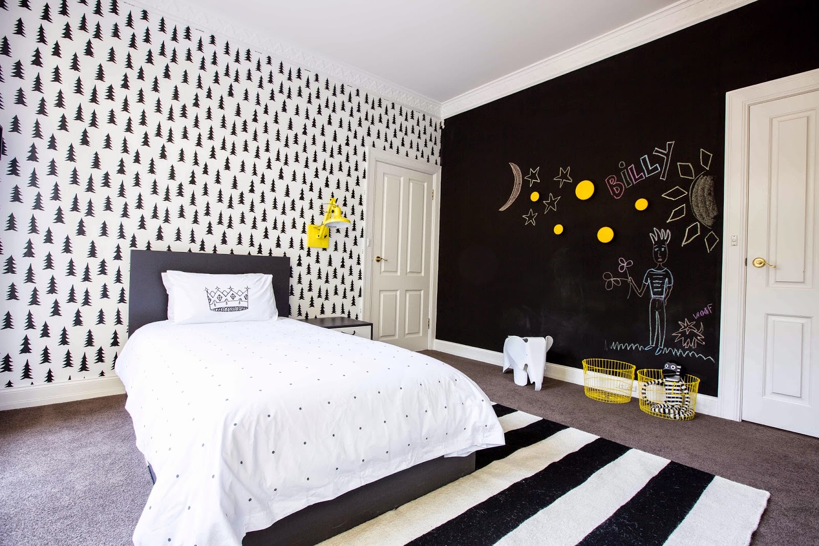
- Space zoning. Combinatorics of wallpaper will help to competently and beautifully decorate the living room, study, children's rooms, bedrooms. In addition to the aesthetic impact, they perfectly zone the space.In the office, with their help, you can emphasize the recreation area and the workplace, in the kitchen-living room, separate the dining area from the upholstered furniture and home theater. In the bedroom there is a place to sleep from the dressing room and toilet area. In the nursery - the place of the sister from the space of the brother. For example, place the boy's bed against the background of a light gray canvas, decorate the wall near the girl's bed in pink tones.
In addition to gender designation, these colors are perfectly combined with each other.
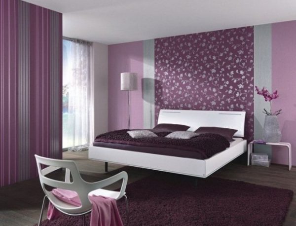
- Correction of space. The visual perception of the room can be adjusted using combined wallpaper. A small room will look much larger if you accentuate only one wall with a bright color or catchy ornament. A rectangular room will appear wider if you use a nude palette in pearl, caramel, coffee colors on the side walls and darker shades on the end walls. To visually make a spacious bedroom more comfortable, you should pay attention to small patterns or plain fabrics in dark blue, warm tones of hot chocolate, coatings with black splashes. This gamut significantly hides the space.
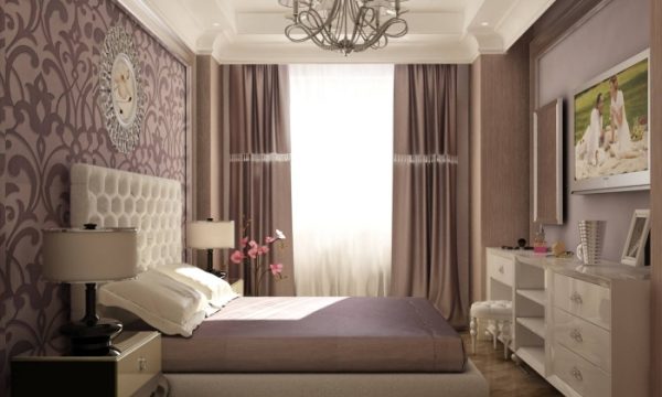
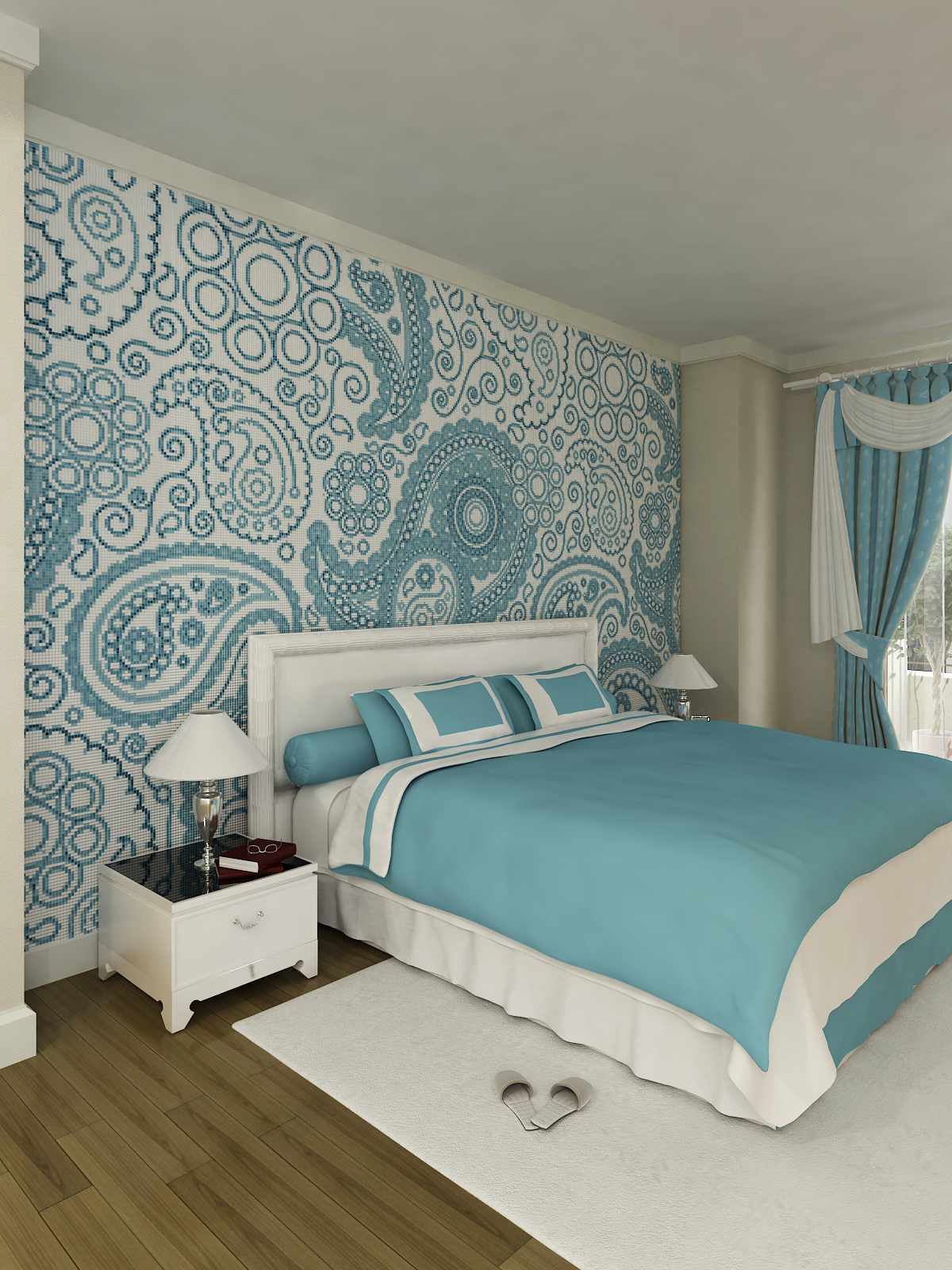
- Accentuation. The ideas of pasting walls with bright wallpaper against a background of monochromatic surfaces, preferably dark shades, will help make them a highlight, an accent of the bedroom interior. Such a technique attracts attention, highlights objects adjacent to the accented area, while dark wallpapers contribute to defocusing the gaze, thereby creating a feeling of coziness and solitude.
The choice of combined wallpaper for a bedroom, living room, office is a more difficult task than decorating the walls with wallpaper in a mono version. We have to carefully observe the combination of all models with interior design, furniture, and a general concept. This applies not only to the color scheme, but also to the texture and style. Advice from renowned designers: a sign of good taste is the decor of a room with common patterns or tones on the walls and furniture. It is effective both in the arrangement of the bedroom and in the design of the living room.
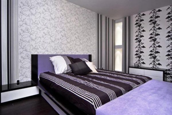
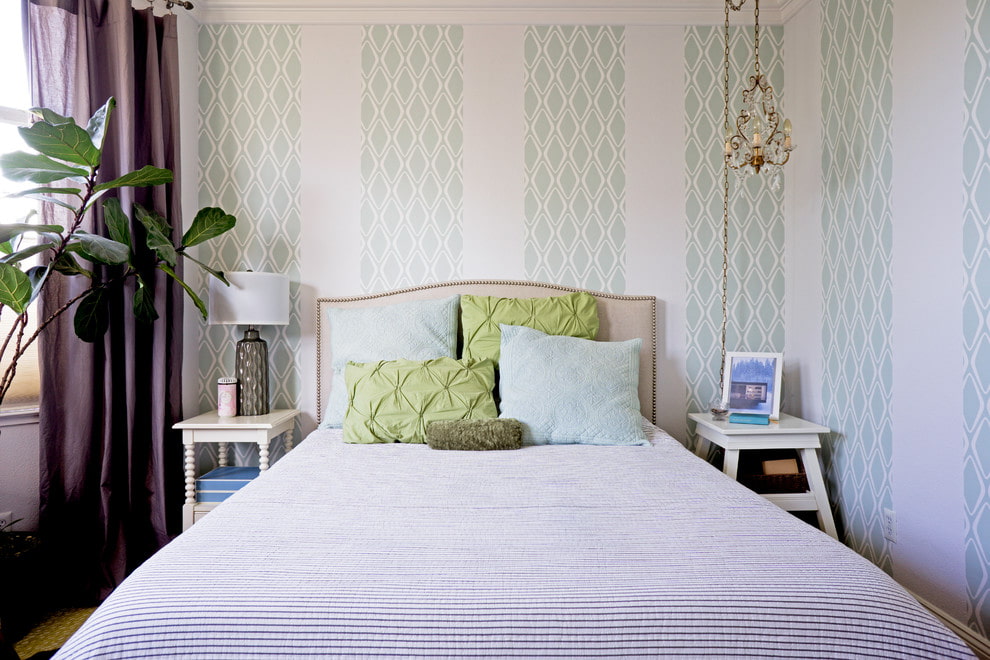
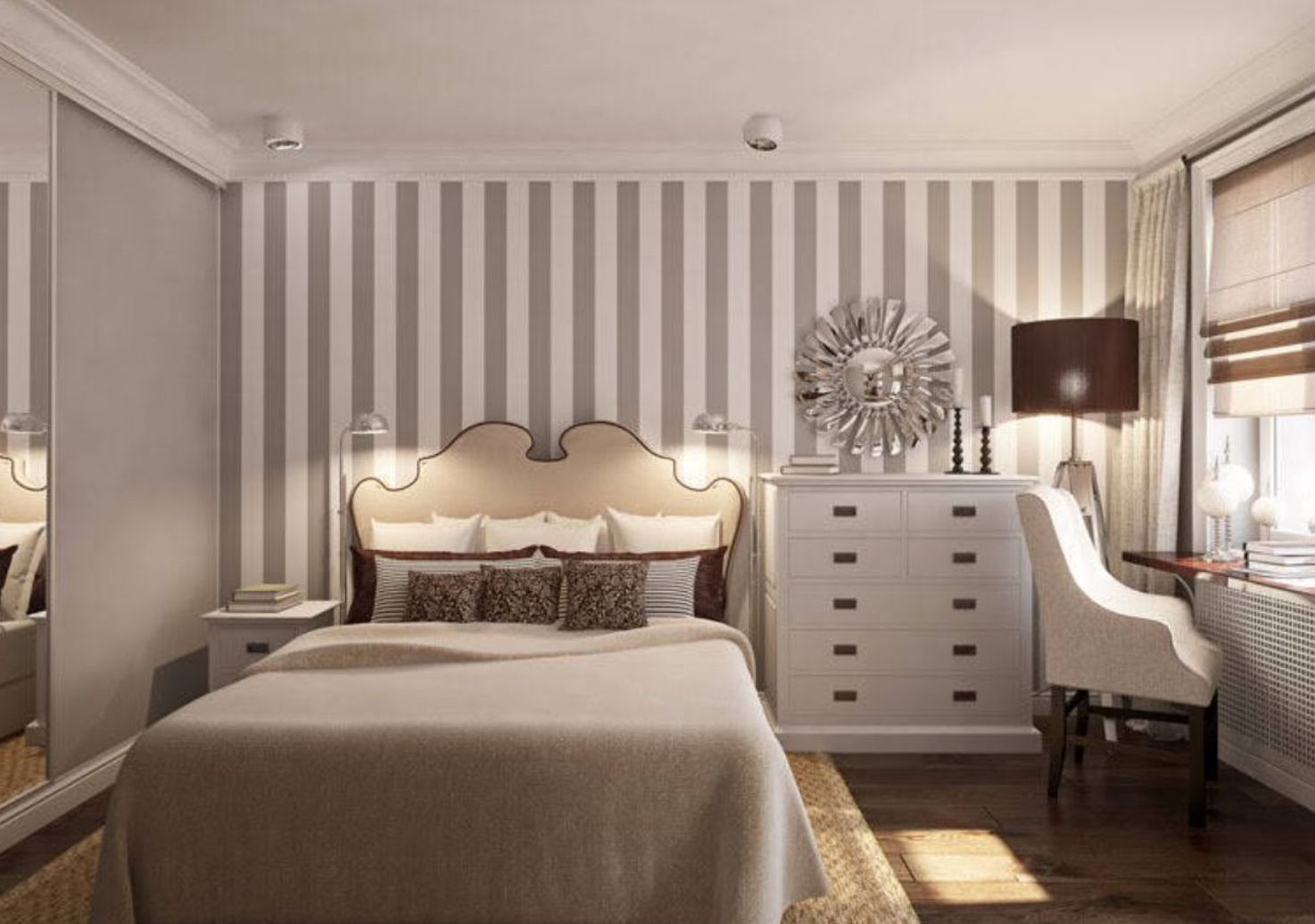
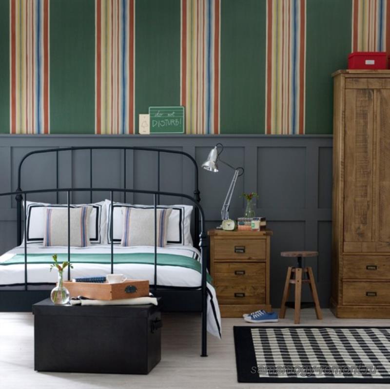
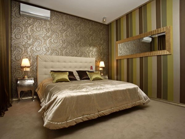
Vertical
Such a technique will help to achieve an excellent optical effect. Excellent results are achieved by alternating colored stripes. This solution is possible only when using wallpaper with the same texture. The alternation of stripes can be either schematic - through 1, 2, 3 rows, or chaotic, disorderly. The application of this method is possible with the use of different colors, a combination of several shades of the same color, a contrasting combination of different colors.
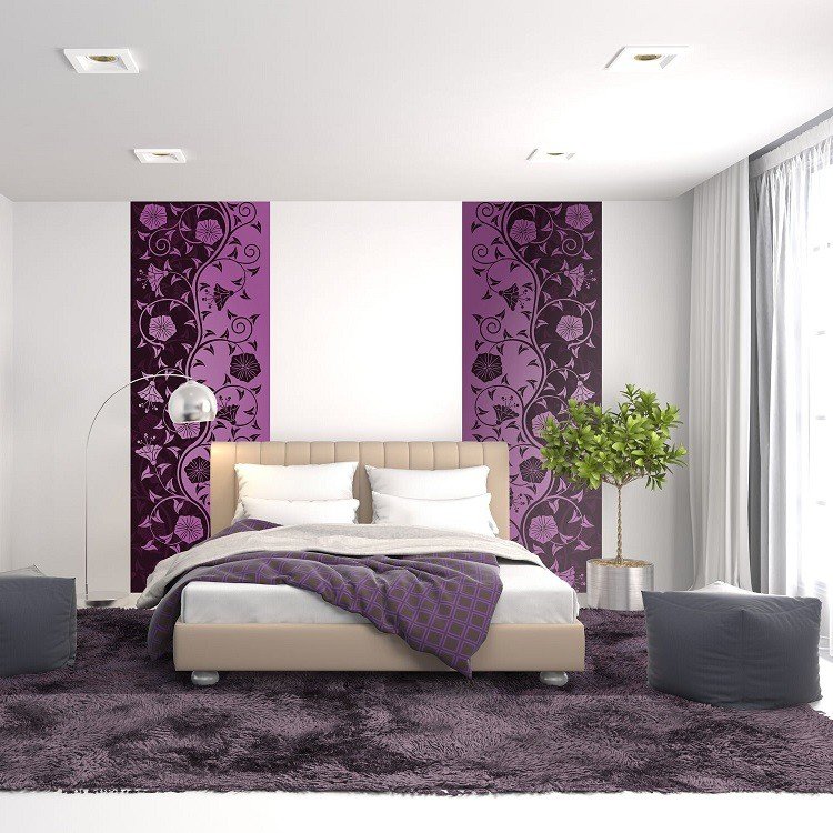
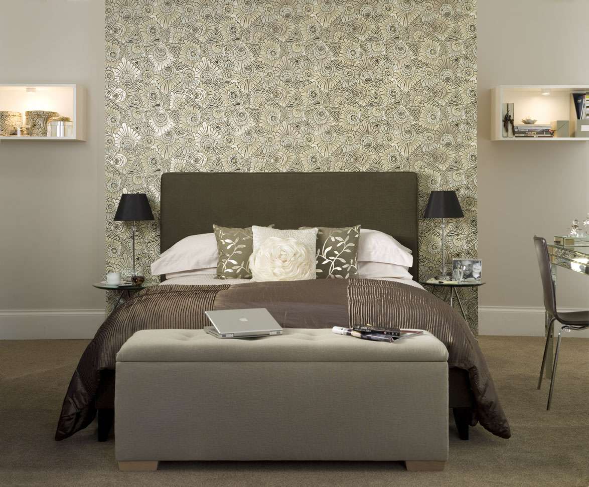
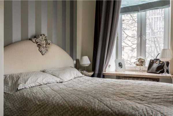
By combining vertical stripes, the bedside area is distinguished, this is especially true for small bedrooms. Thus, it becomes possible to visualize the place of sleep using a vertical strip of a different tone. This technique is usually used in the headboard area, and the width of the accent should correspond to the width of the bed, or occupy the entire wall.
A stunning effect is achieved through the transition of the decorative strip to the ceiling, thereby creating the illusion of a mirror image.
The vertical print goes well with various designs. With this technique, you can make the room much warmer and more comfortable, more stylish and original. In this case, there is scope for imagination and creativity - a combination of stripes and a floral print in the same color scheme, stripes and geometric shapes in contrasting shades, stripes and natural motifs, and so on. The whole palette is necessarily kept in the general concept. The main thing is that the main, prevailing color of the interior remains clearly visible. As a rule, wallpaper, bedspreads, curtains, and a set of furniture are responsible for this. Another design technique - a vertical strip serves as a panel.
You can stick additional stripes in other parts of the room, if they are combined with an accent combinationally and functionally, the main thing is not to overload the space. The work of gluing striped wallpaper with a vertical arrangement of stripes is not difficult, since it does not require adjustment, and the pattern visually increases the height of the ceiling.
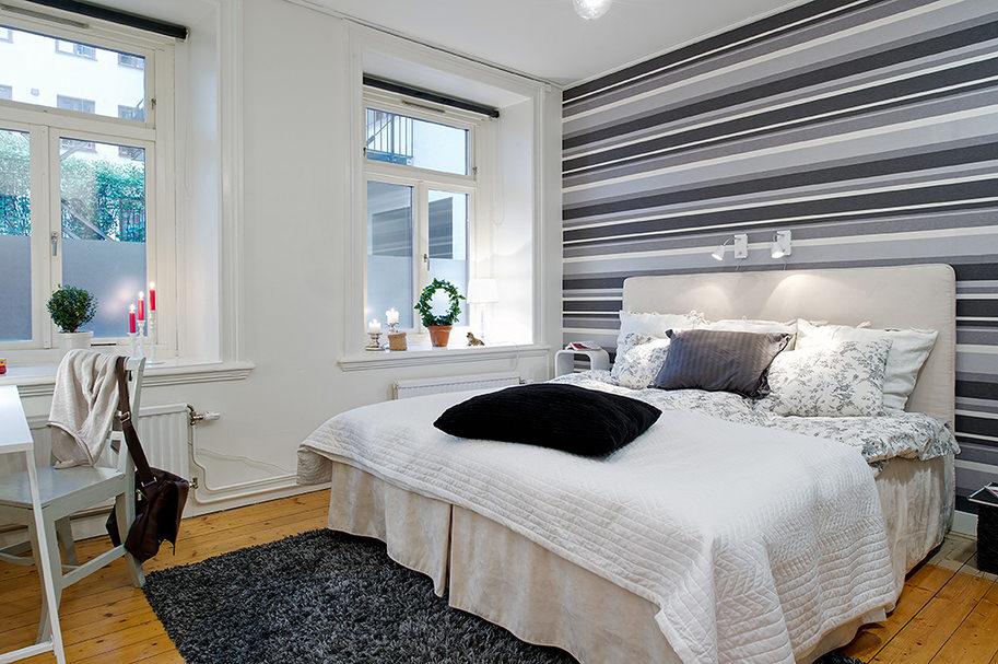
Horizontal
With a canvas with a horizontal print, you can always expand the space. Many designers use the horizontal combination technique. For example, they divide the room into a lower dark part and a lighter upper part. The light part is responsible for the lighting level, so its location is the upper limit. Usually, horizontal trims are characterized by alternating stripes. In this case, it is also appropriate to use a molding, a baguette, a border and a variety of fabrics.
Striped wallpaper on the lower part and monochromatic wallpaper on the upper part are well combined, possibly passing into the ceiling space. The result will be great in another case: an ornamented ceiling and upper part of the wall - and a plain lower one. However, combinatorialism is dangerous in excess, in this one must be guided by a sense of proportion. It is not necessary to decorate the entire bedroom in a combinatorial effect; it would be more correct to give preference to accents, leaving the main space calm so as not to excite the psyche.
How to match colors?
The choice of a palette of combined wallpaper canvases is one of the main conditions for creating a harmonious interior in the bedroom. There are several parameters to keep in mind when designing a design.
-
The intensity of the color gamut. The complexity of the task is the need to maintain harmony in the layout of various colors and tones. Pay attention not only to dark and light colors, you will need the ability to arrange a color transition in both a contrasting and a smooth format, although there are two-color wallpapers on sale. For example, coral flows into caramel or peach shades.
The main tone should be lighter, although you can buy double or twin models.
- The approach to shades is twofold - as a rule, a combination of tones in one color is not allowed, however, this technique is increasingly common in design. For example, two walls are pasted over in dark green tones, while others are pasted over in light green or mint. A great help in this will be the color wheel, which shows the main color spectrum and its tones in ascending order. The same principle is used in combinatorial material - from a deep dark to a lighter palette. This is the best technique for decorating a bedroom with white furniture.
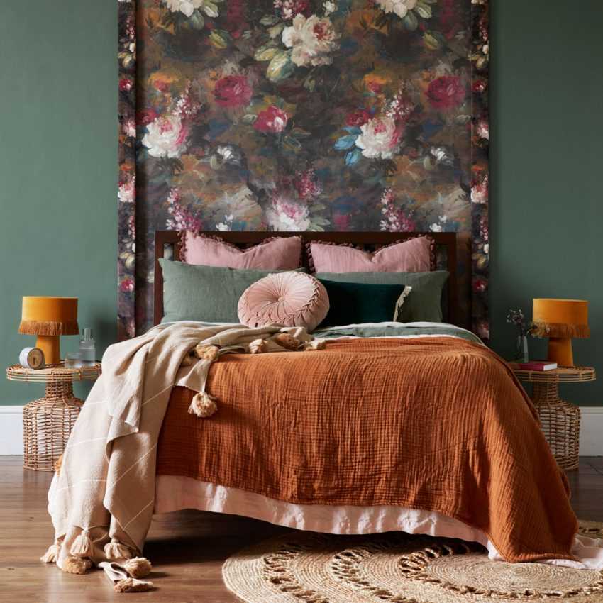
- Balance. Here they pay attention to the harmonious combination of pretentious and simplistic prints. For example, a floral material in the top half of a wall in the center is interrupted by a solid color material. In this case, it is not necessary to observe smooth transitions. In this case, moderation and a sense of sufficiency are important - since there are contrasting shades in the design, the solo color is placed in the center of the room. For example, turquoise or chocolate color against the background of milky wallpaper. It should be remembered that the bedroom is a passive zone intended for relaxation. Bright colors should act only as an accent, a large number of colorful details have a stimulating effect on the psyche.
It has long been known that the colors of the red spectrum cause a psychological surge. Purple and lilac cold shades are depressing. Pastel colors in modern design are considered irrelevant, out of fashion, so you should pay more attention to the blue-green-brown range. This palette has a calming effect on the mind, surrounding it with a feeling of comfort and warmth.
When choosing a material for combination, you need to adhere to some rules to avoid classic mistakes:
- shades of different wallpapers should be close;
- bright colors are chosen only to create an accent;
- a combination of monochromatic canvases with a print is considered fashionable, and therefore relevant;
- if the owners prefer patterned patterns, then such a canvas should be the main one and emphasized by calmer tones and patterns.
A few tips on color matching.
- Beige - calmness and tranquility. Combines with white and chocolate: the first will make the space lighter, the second will emphasize the sophistication of the interior
- Pink - the lot of romantics. Perfectly combined with gray, white, lilac shades. These tones muffle the pink color, while the other tones make it overly saturated.
- Peach - the standard of warmth and comfort. Combines with blue, gold, beige shades.
- Brown - an atmosphere of peace. Companions - beige palette.
- Purple - riddle and mystery. Looks good on white or gold backgrounds.
- Blue - ideal for white and chocolate colors, as well as for pastel shades.
Reds, yellows and purples are not at all suitable for the bedroom.
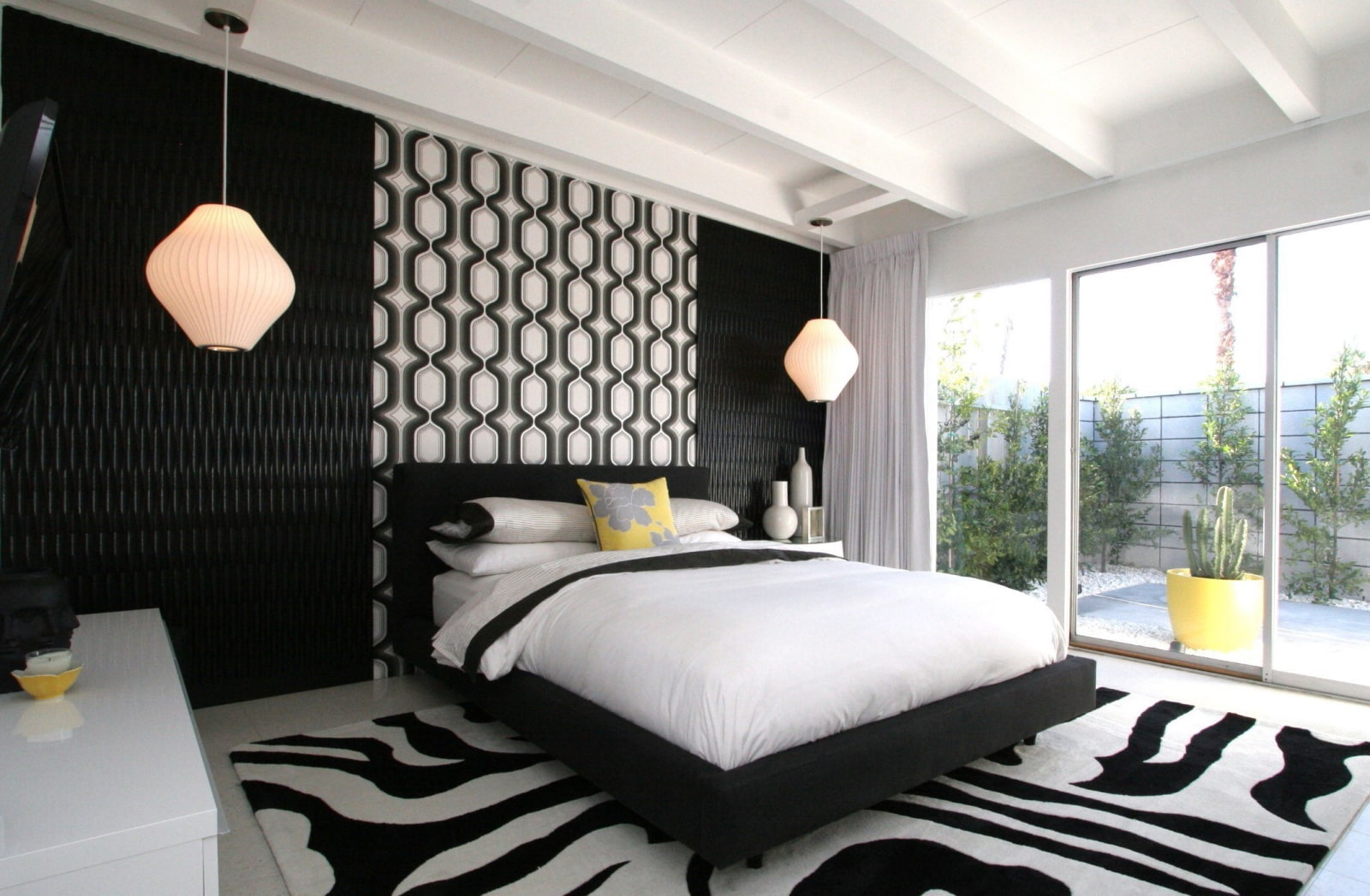
They excite the nervous system. But the black and white tandem is at the peak of popularity and is in demand when decorating a room in modern, high-tech and even classical styles.
Combination of textures
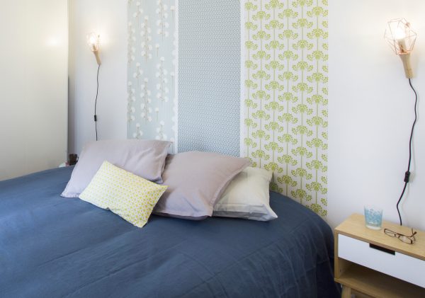
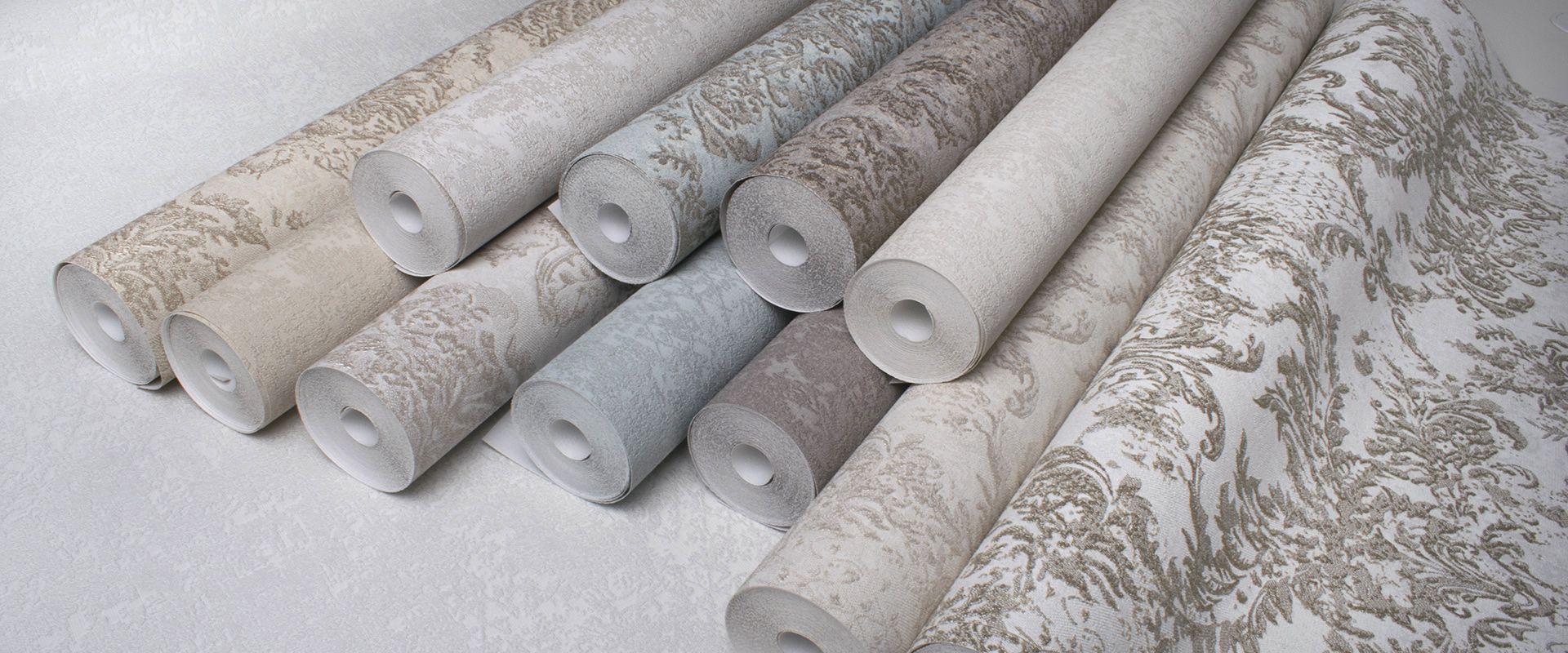
Modern trends are considering various possibilities to combine canvases. To make the wallpaper look beautiful, stylish, harmonious, you need to remember about important techniques. Manufacturers produce paper, vinyl, non-woven, textile materials, as well as glass wallpaper for painting.
- Non-woven and vinyl canvases are well combined. However, if you wish, you can stick wallpaper of completely different textures - the main thing is to make sure that the joints are carefully glued.
- The canvases should be of the same texture (although in exceptional cases a different approach is allowed), and of the same thickness, otherwise there are difficulties in alignment when pasting.
- A composition of more than 3 shades will look too pretentious.
- Bright colors are not suitable for spectral combinatorics. This technique prefers monochrome combinations, such as white-gray-black, blue-blue, and the like.
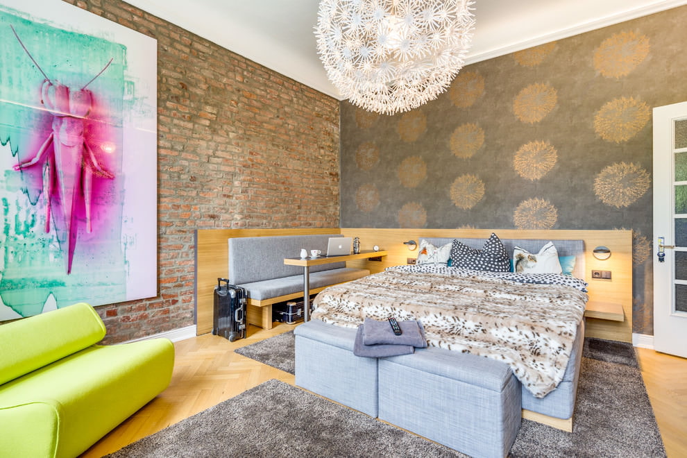
Today, wallpapers that imitate natural materials are in maximum demand for styles such as loft, Scandinavian, minimalism. If earlier there were always wallpapers on sale that imitated brickwork, now there are canvases with imitation of concrete. But in the bedroom, such wallpapers can be used only for the loft style.
Fashion trends
With the assortment that construction supermarkets offer, it is sometimes difficult to opt for something specific. To make things easier, a few popular options are listed below.
-
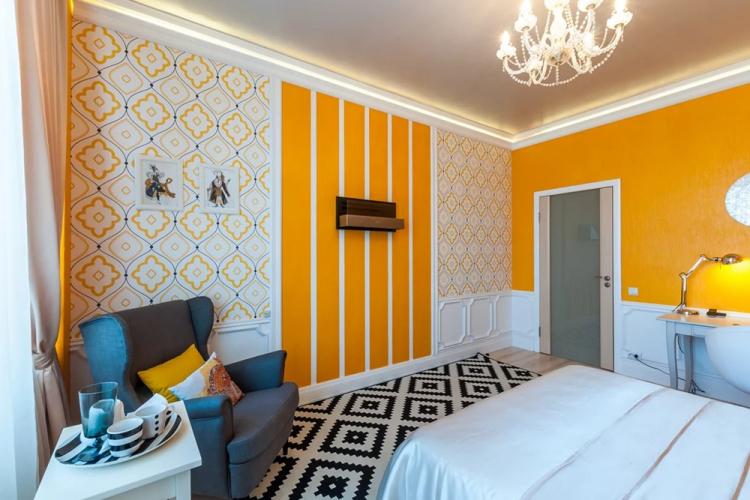
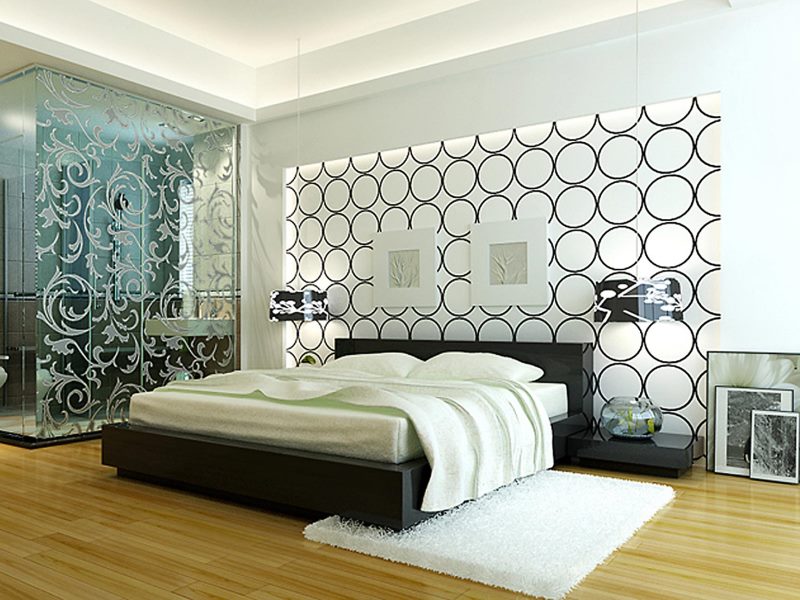
Geometry. It can be safely considered a classic - horizontal and vertical stripes, squares, rhombuses, Egyptian ornament of various size and color parameters are still popular.
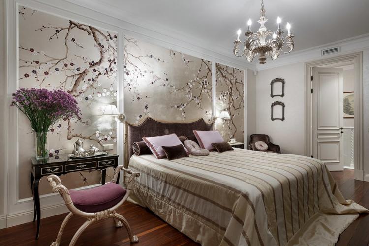
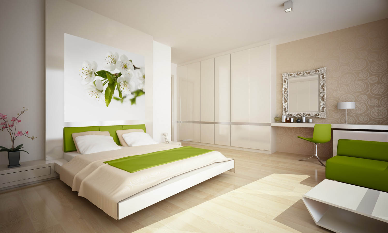
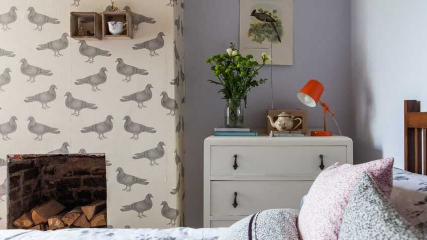
- Natural print. Flowers, grass, images of animals and birds fit perfectly into the interior of the bedroom, as well as photomurals.
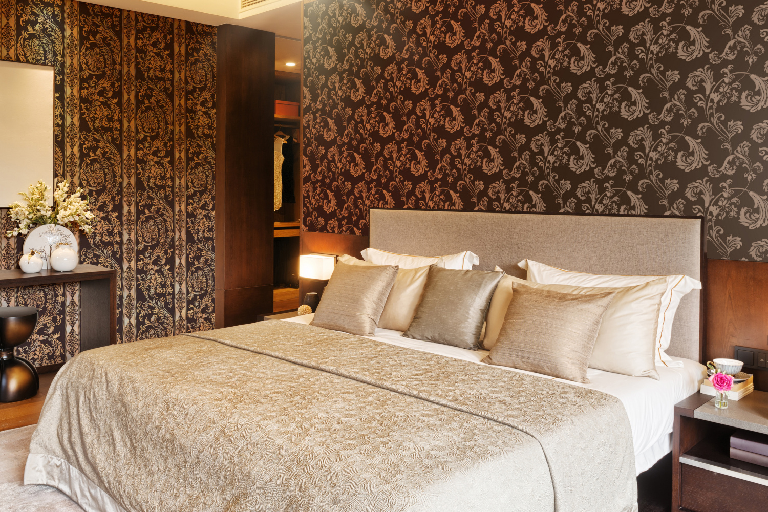
- Vintage. Suitable for classic style and solid furniture. Reminiscent of tapestry.
There is also a method of working in contrast - a combination of 2 or more options.
Bold solutions for people with out-of-the-box thinking.
Styles
You need to combine taking into account the general style of the home. To do this, it is enough to know the latest design trends, the main law in which is the observance of the color scheme.
-
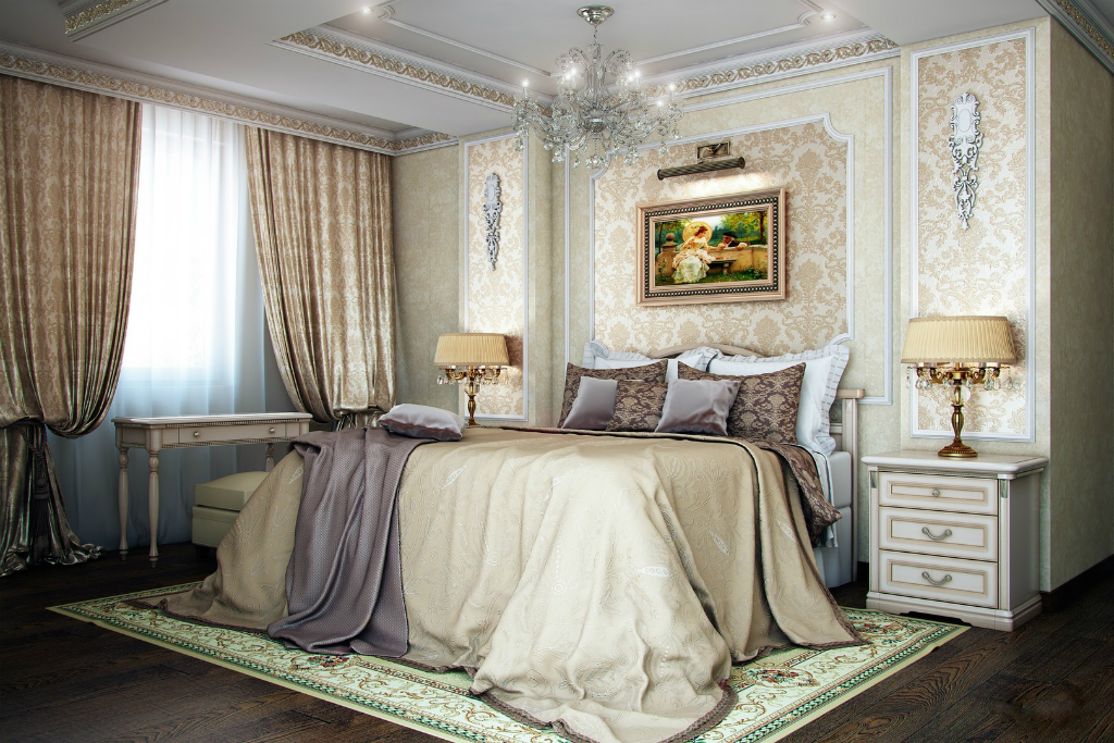
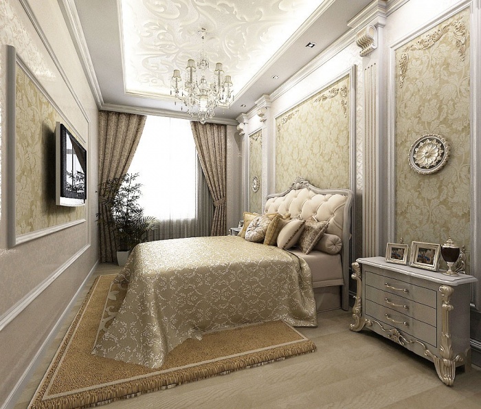
Classic. Prefers a combination of simple and complex designs. The accent should be several tones deeper than the main color. The horizontal principle of combination with the use of moldings around the perimeter. Bright geometry alternates with light print.
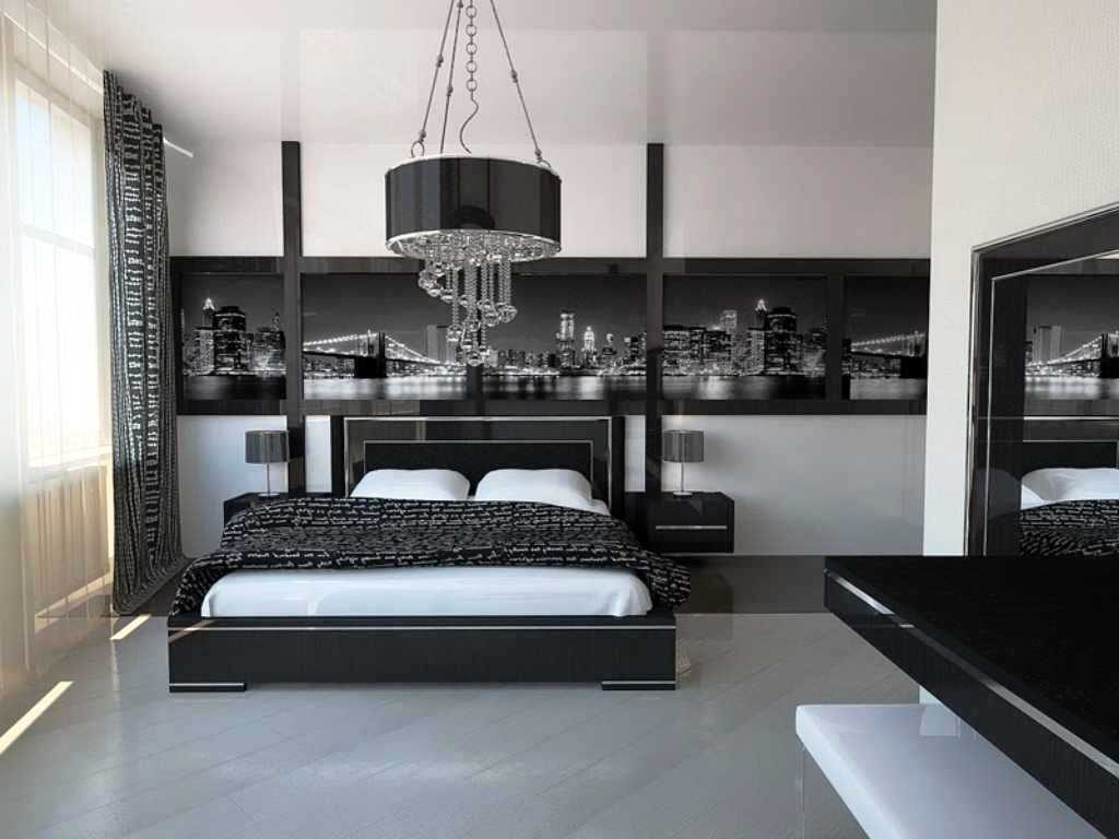
- Hi-tech is similar to minimalism - without a bright palette, complex patterns, warm colors. For the bedroom, designers offer splashes of pastel colors combined with cold shades. The main hi-tech colors are white, gray, dark blue and black.For the bedroom, white acts as a background, black will be the accent. The most successful choice would be a graphic print.
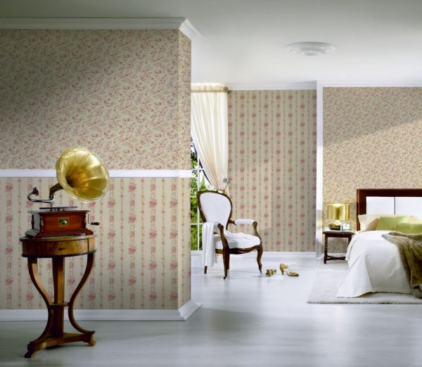
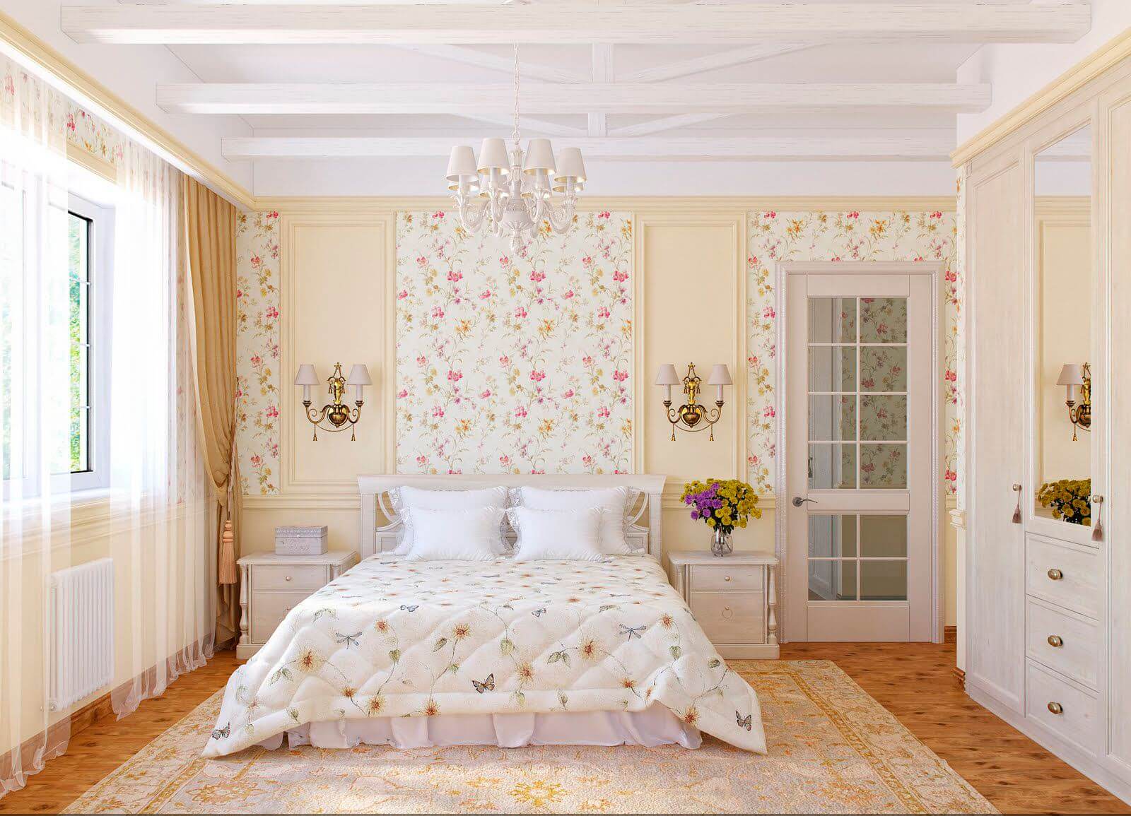
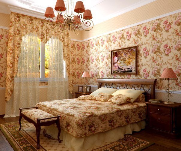
- Provence. Its colors are a nautical palette and interspersed with a sandy, pink-brown palette in a small floral print, as well as a strip, patchwork combination, imitation of natural stone or wood. For Provence, a material with a print called "chints", inspired by the motives of Indian fabrics, is suitable.
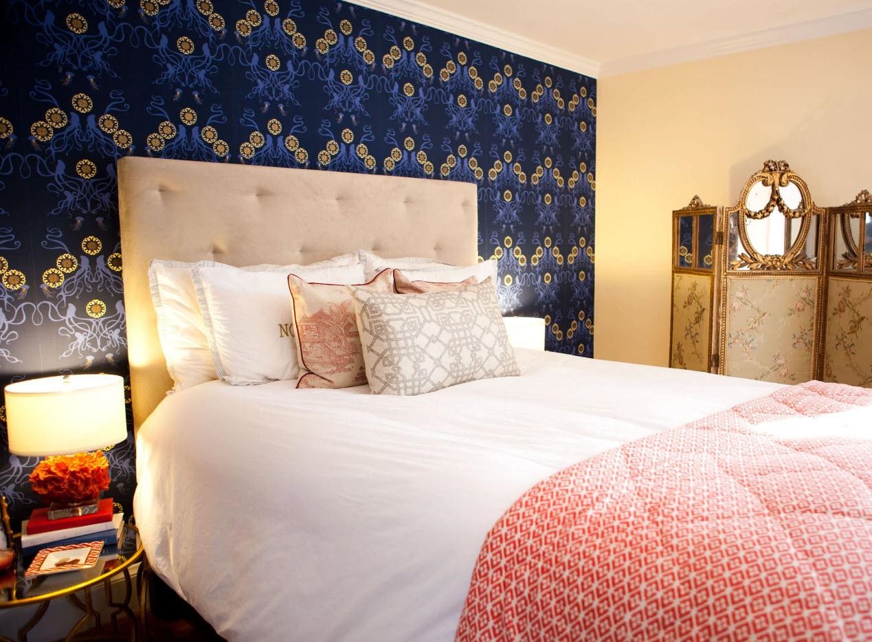
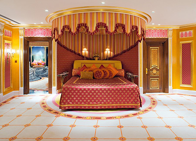
- Oriental. This style will require the most expensive materials: silk-screen printing, natural fibers with a bright print - carmine, orange, burgundy, blue, gold. If pastel shades are found, then only in small blotches. They choose canvases in dark colors with fanciful patterns. It is not customary to use photowall-paper in the oriental style; the textile texture is the most preferable.
How to choose a room for the interior?
When choosing a canvas for a bedroom, it is necessary to require a roll to be rolled in order to see the perspective of the drawing. Better yet, put selected options next to each other to assess compatibility. You should buy wallpaper from the same collection with a mandatory quality certificate.
The next thing to do is to make sure that the print, color, texture are in harmony with curtains and furniture elements, carpets and the general concept of the apartment.
If you decide to choose calm colors for decorating a bedroom with white furniture, then you should opt for material with a bright print to accentuate one of the walls. When combining a monochromatic material with wallpaper of a different color, you need to select the same monochromatic canvases in other shades.
Alternatively, you can take the same color, but with a patterned print, whose place will be above the bed.
Beautiful examples
Ideas and beautiful examples can help with the selection and purchase of combinable materials.
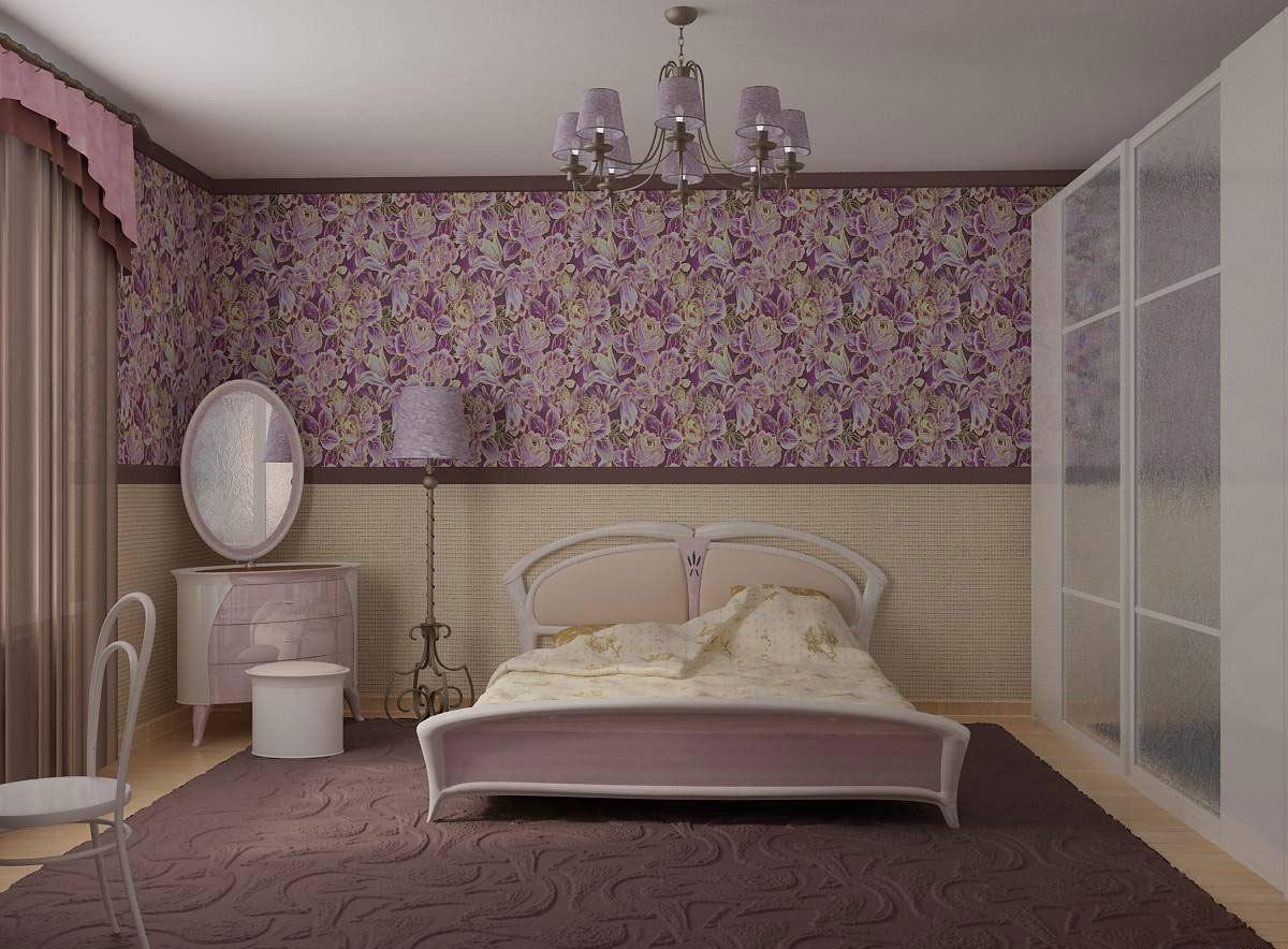
Design based on the principle of horizontal. Designers use a 3: 2 division of the wall area, where 3 parts are given to the main canvases, and 2 parts are accentuated. You can use a combination of 2 or 3 prints, or opt for different patterns.
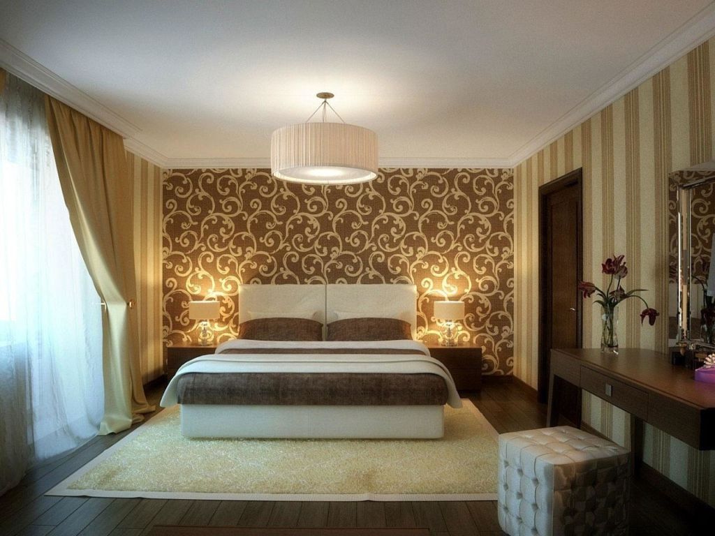
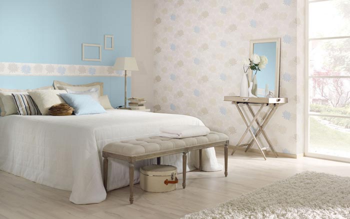
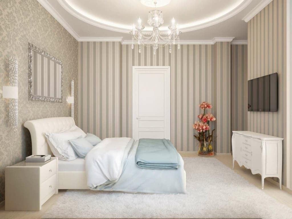
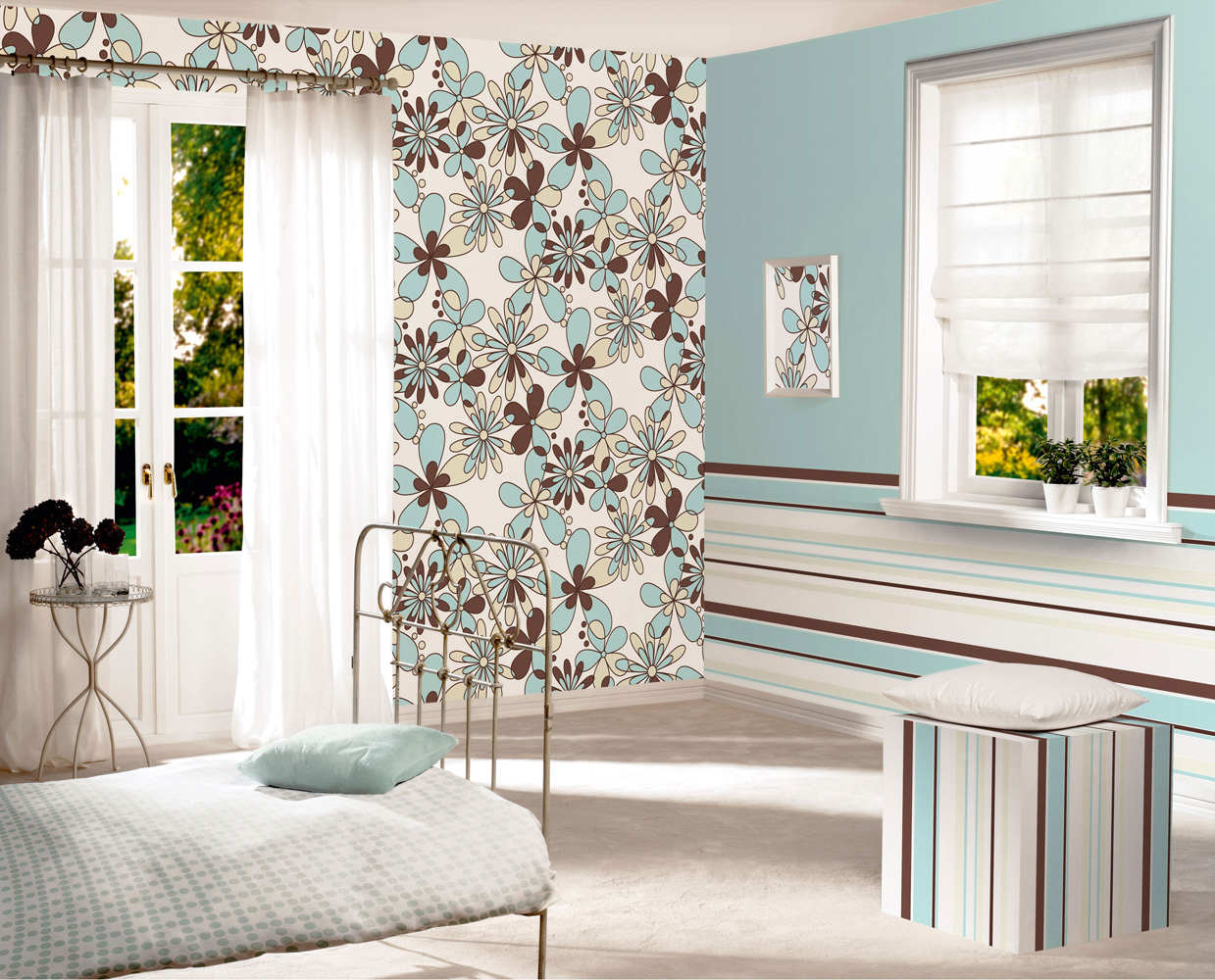
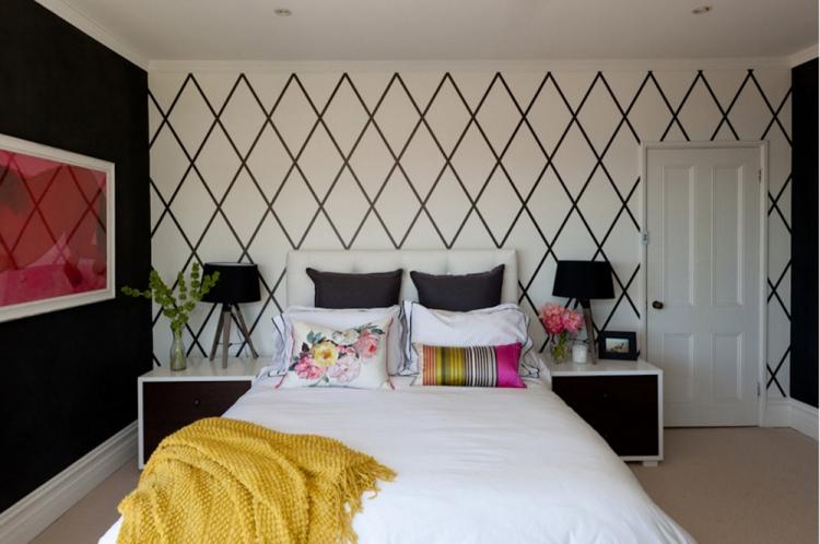
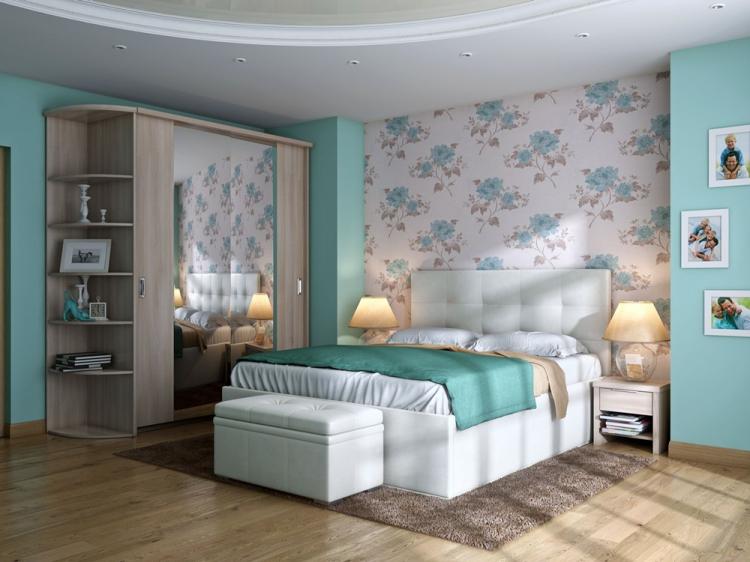
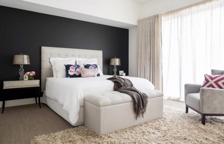
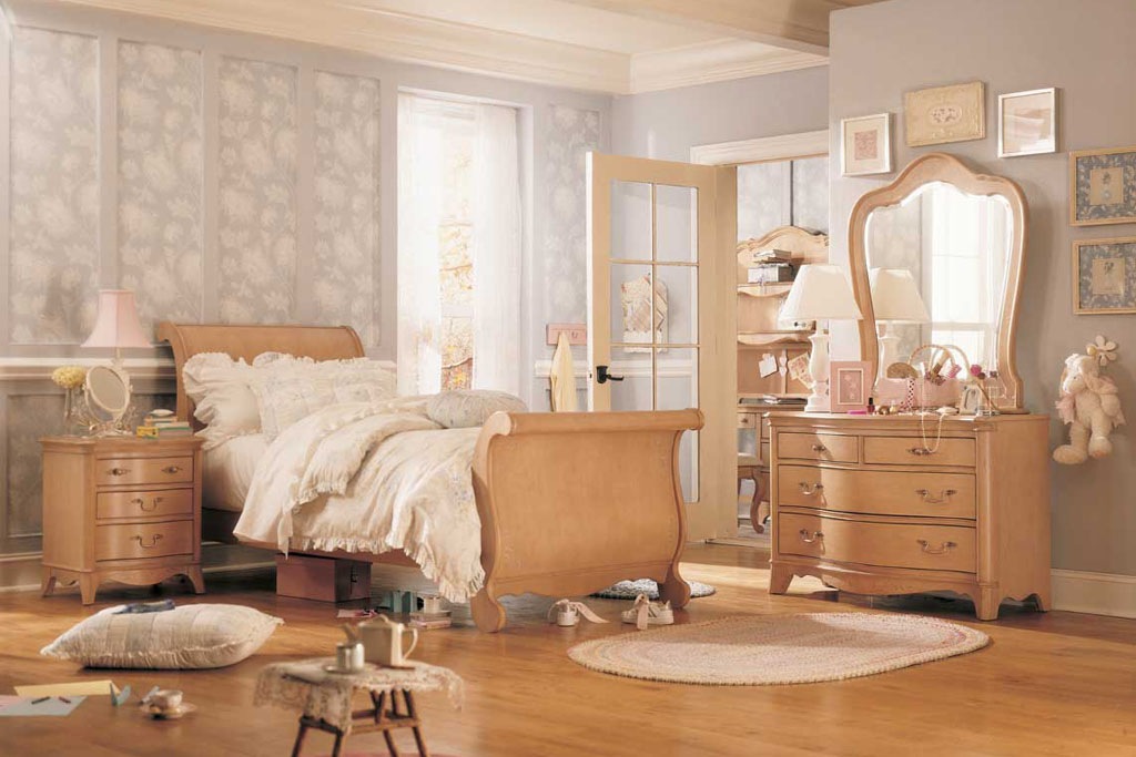
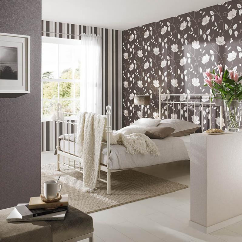
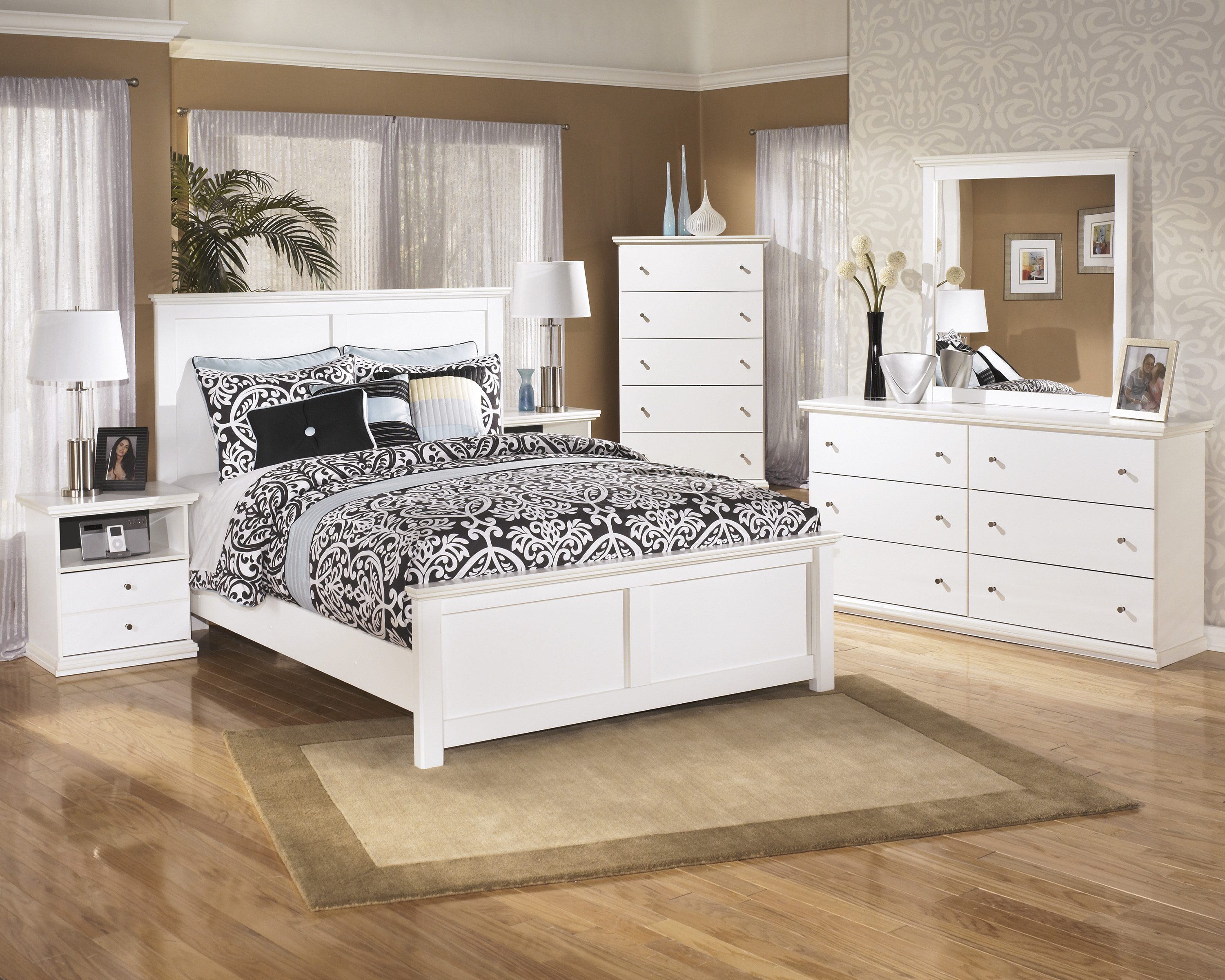
Small bright bedroom with white furniture, a geometric pattern as an accent on the bedside wall and white wallpaper with a subtle print on the rest. The perfect harmony of cold tones is slightly softened by beige splashes.
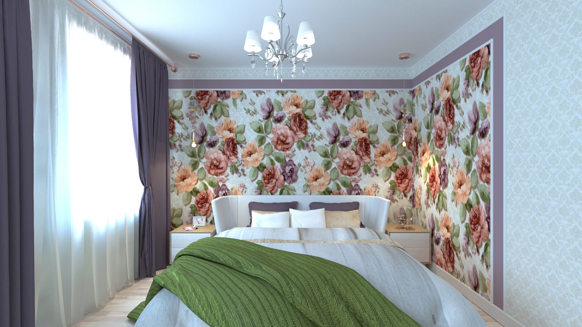
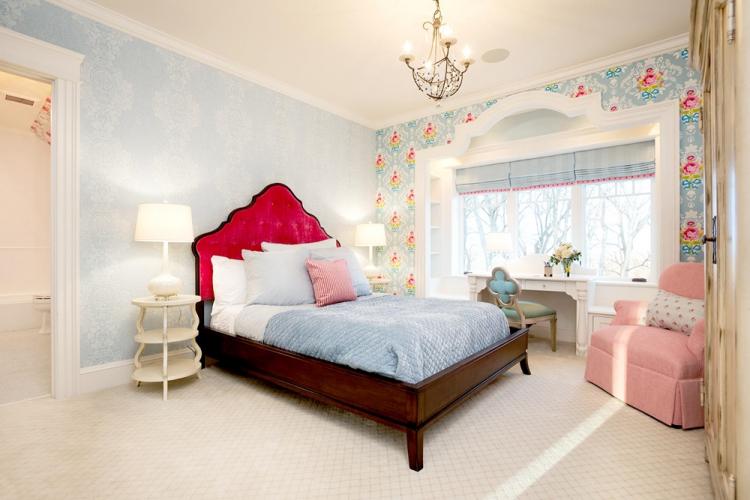
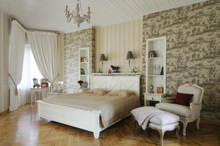
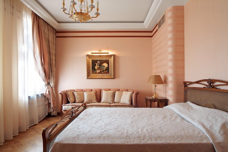
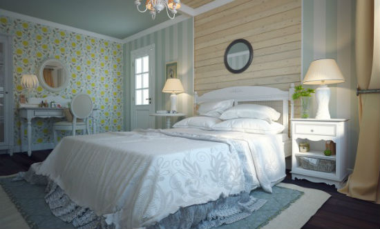
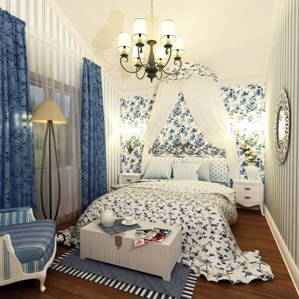
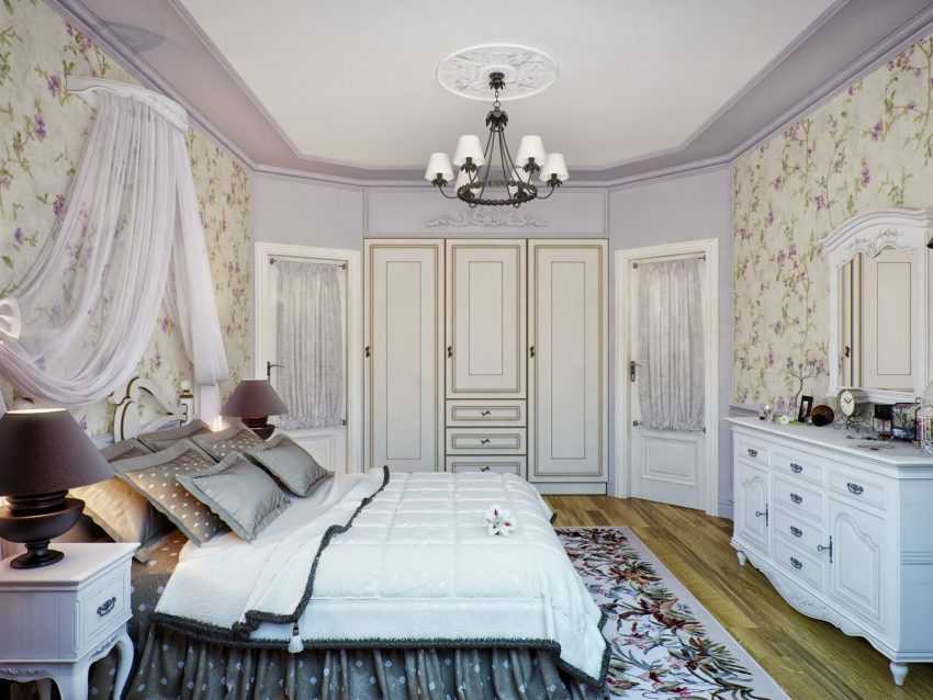
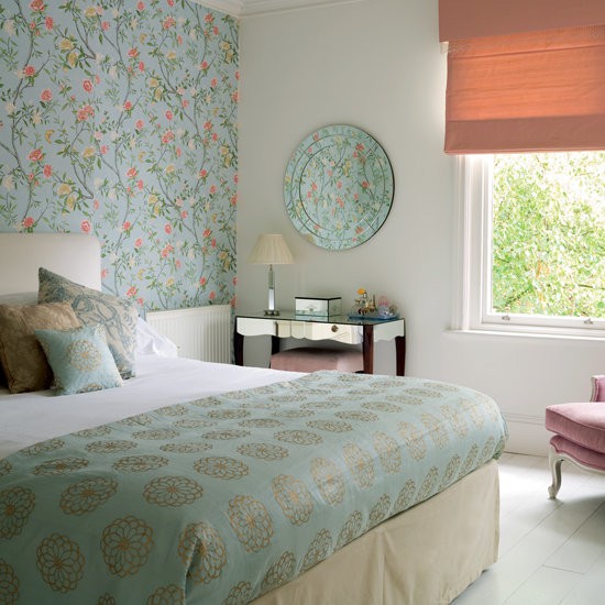
Provence style bedroom, dominated by floral prints on the bedside wall in muted tones of a marine palette with the addition of coral, turquoise, nude shades. The style is highlighted by a bedspread that echoes in color with an accent wall and a terracotta Roman blind on the window.
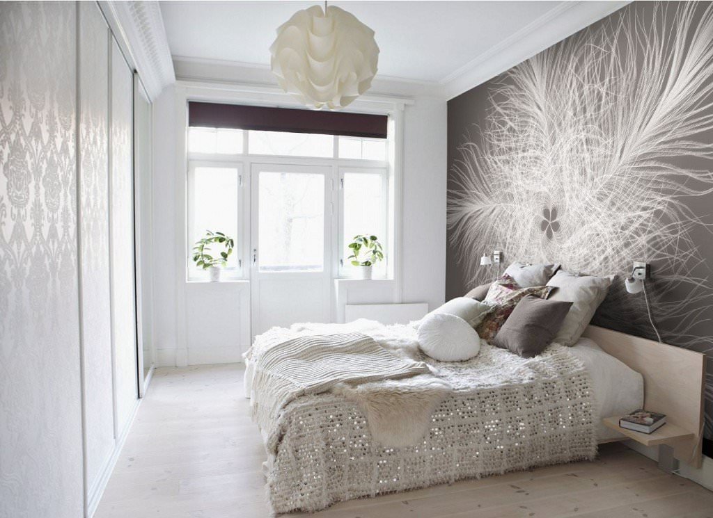
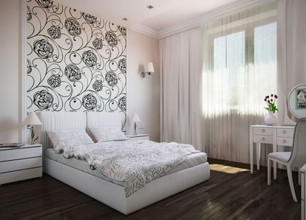
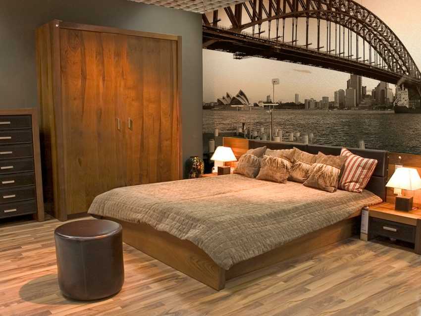
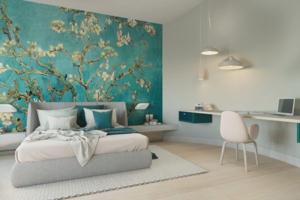
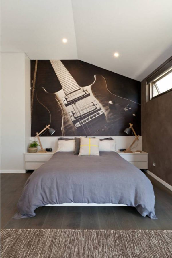
Bedroom in vintage style with photo wallpaperthat visually enlarge a small space. The gaze is lost in the distance of a skillfully chosen perspective. The light-colored flooring is in perfect harmony with the chosen design.