Design studio with an area of 20 sq. m
A studio of 20 meters is like a small "odnushka", only without a separating wall. Sometimes this option is bought by parents for student children, or lonely (at a certain moment people) decide to purchase such an affordable and sufficient housing for themselves. At the same time, this is not such a bad option for a young family that leads an active lifestyle and does not want (or cannot) immediately acquire more spacious housing.
Layout
The room is as open as possible, in most cases it is light and airy. But a small footage is a reality that is stupid not to admit.
This means that the owner or the owners will have to contrive to arrange the space in such a way that everything you need can fit on it, and so that all the interior elements “make friends”.
Here are the layout features of a studio apartment of 20 sq. m.
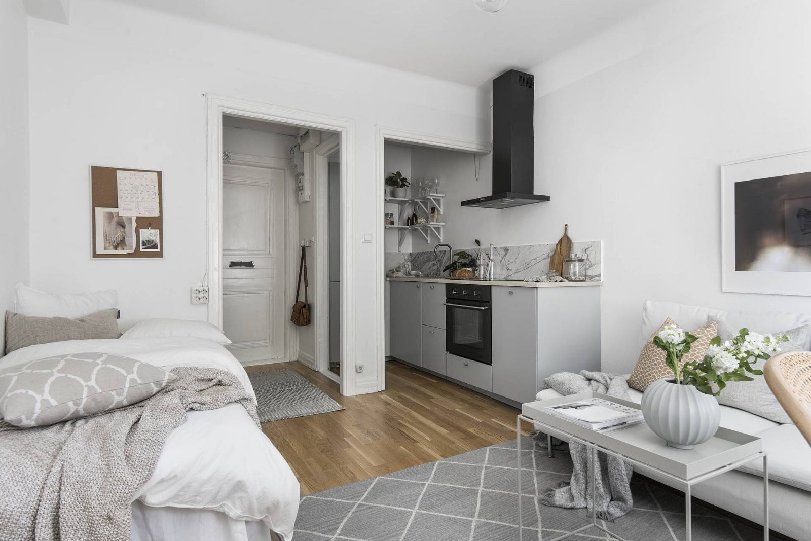
- If the studio has rectangular shape and one window, it is relatively easy to divide into several parts. As a rule, this is the area of the corridor, bathroom, kitchen and living room.
- If the premises square, the partition helps to isolate the toilet, and the kitchen and living room are combined.
- If this is a studio wrong forms, then standard solutions will be difficult, because beveled corners, niches and curved walls will make them adjust to them. But in the same recesses, you can make a dressing room or a small cabinet, and so the architectural feature will turn into a functional area.

A big plus of such studios is simple and quick repair. The main thing is that it is not chaotic, that there is a clear plan, and everything is thought out (or better, visualized at least in a sketch).
It is also important whether the project provides for a balcony or loggia, which can also be used in the arrangement, in some cases combined with the main space.

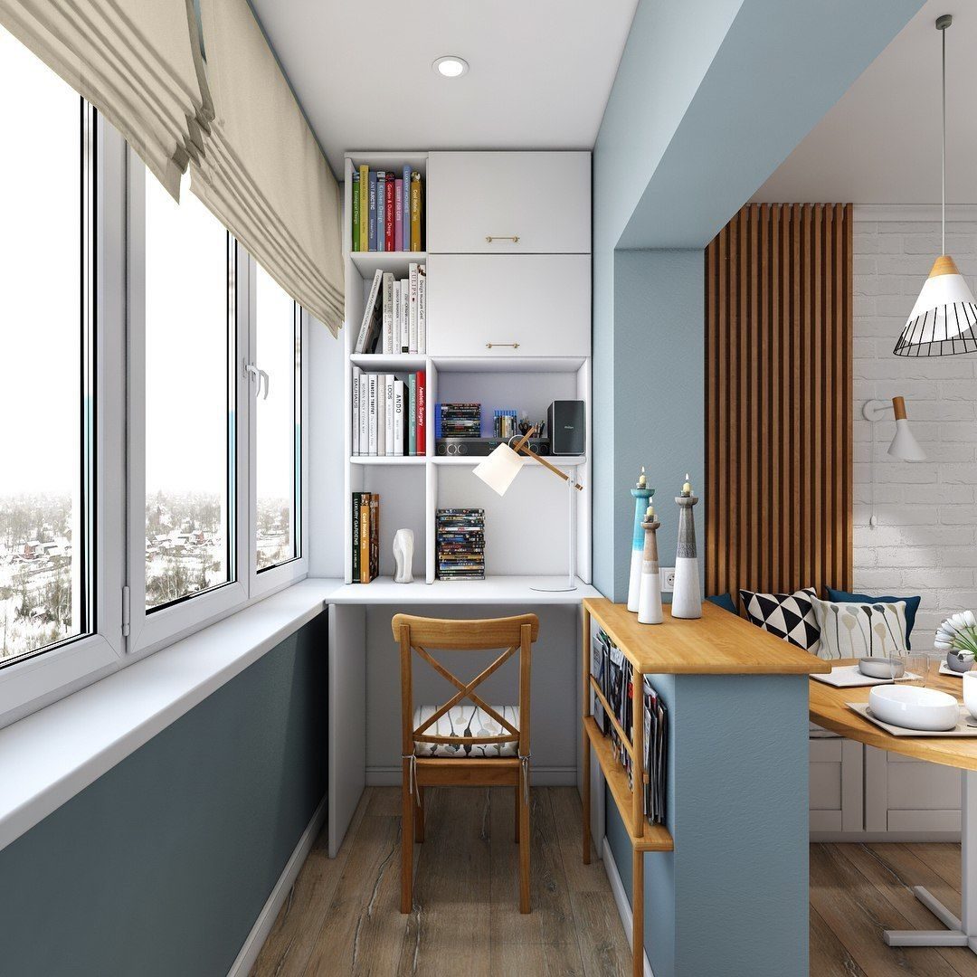

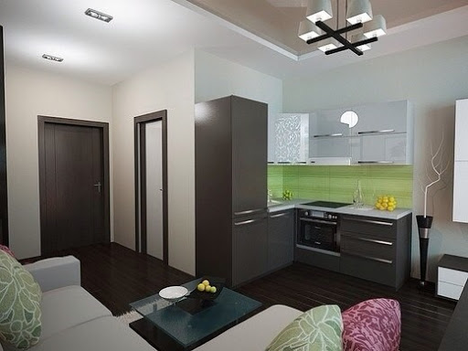
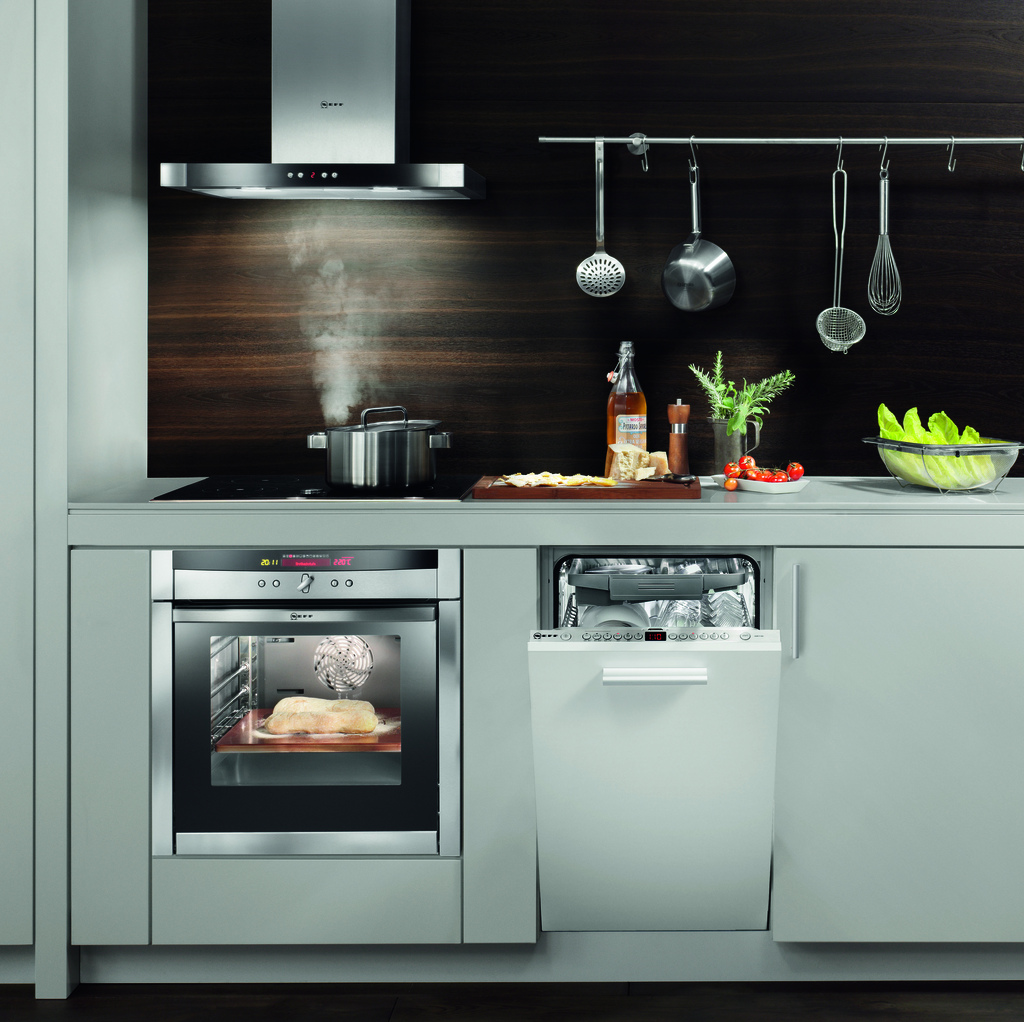
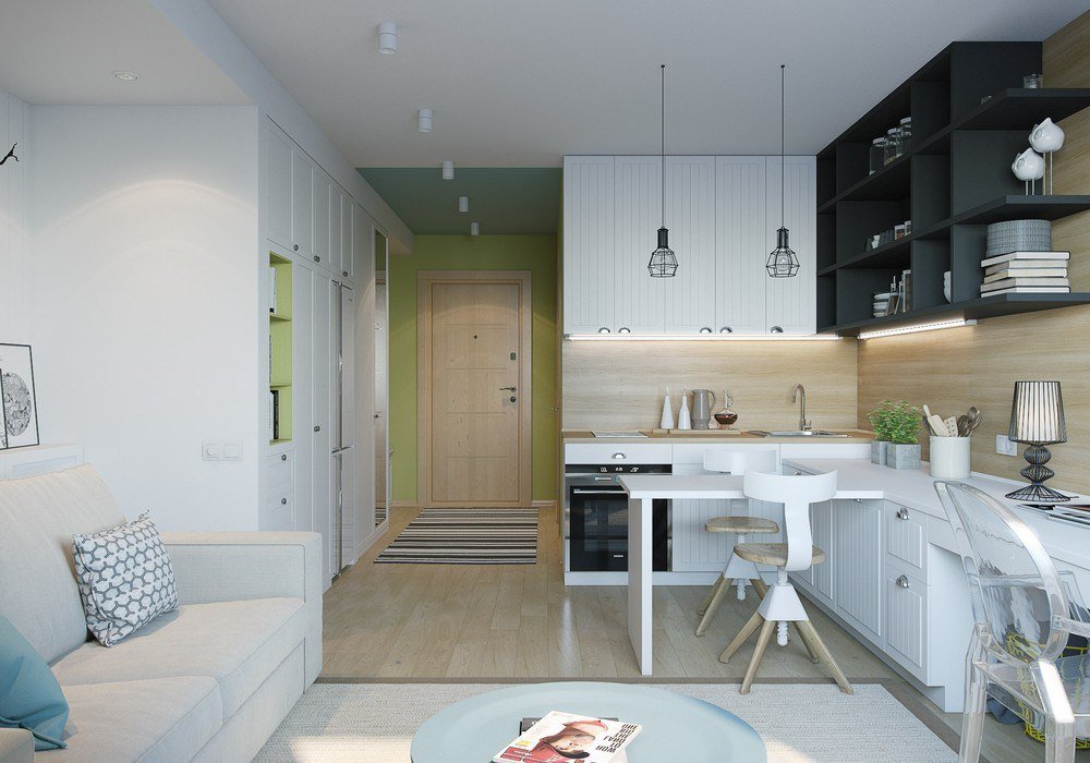
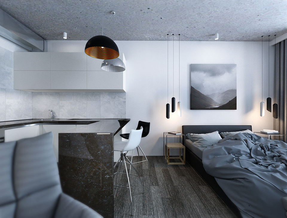
The emphasis should be on the functionality of these 20 m2. For example, a dining table can be hidden under work drawers in the kitchen; if you make a table on wheels, it will slide out easily. An oven and even a small dishwasher can be hidden behind the kitchen fronts. But the sleeping areas in such apartments are often unusual: they can be located on the podiums, from which the bed is "taken out", or, conversely, they are placed higher.


How do you divide the space?
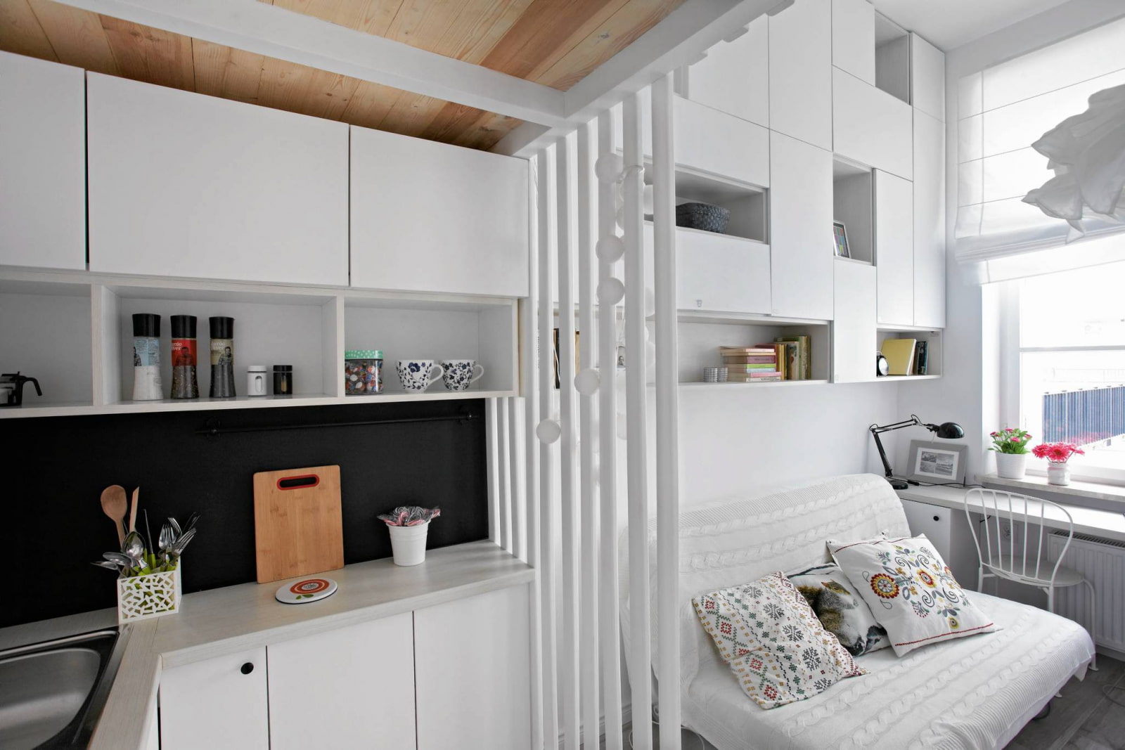
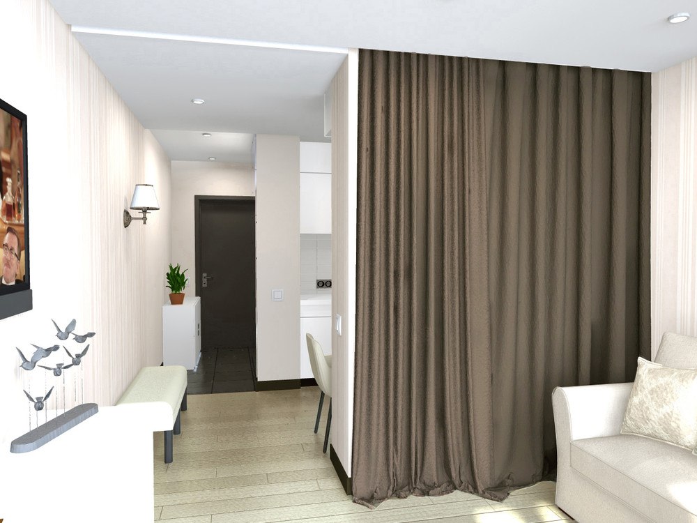
The easiest zoning option in a room is mobile partition. Its function can also be performed by a fabric curtain or a folding screen. And if you want to make not an inconspicuous divider, but, on the contrary, noticeable, it can be a wardrobe, a sofa, a rack. And you can also delimit the room with color, lighting, or all the same podium.

Successful zoning in a small studio can be different.
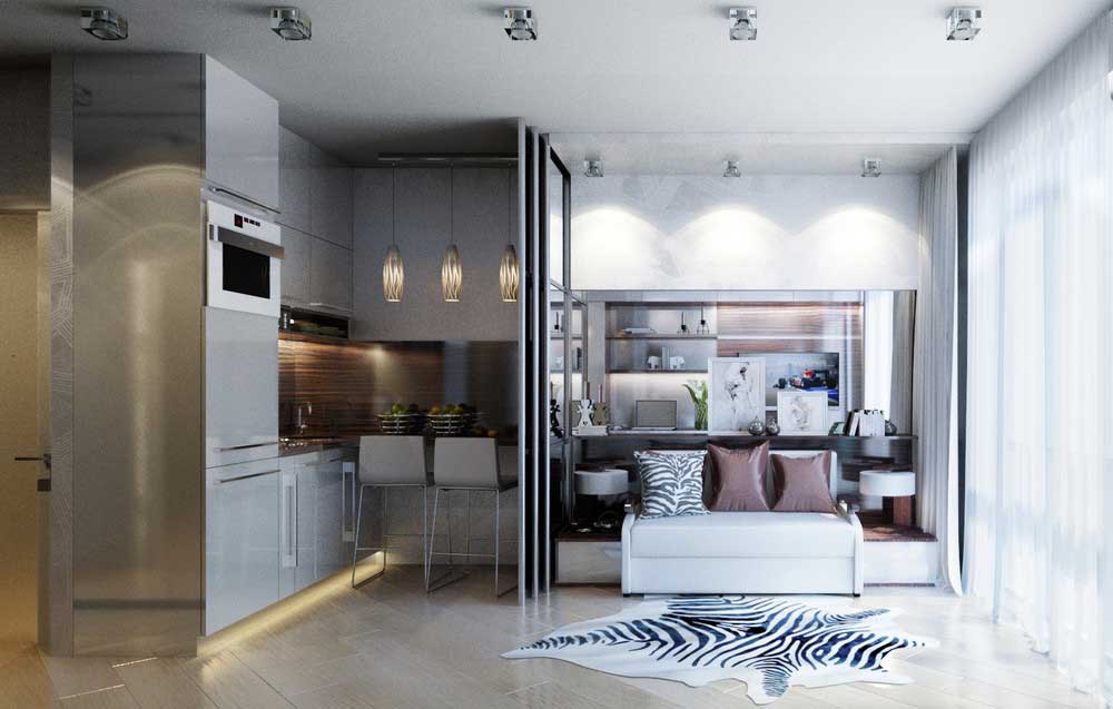
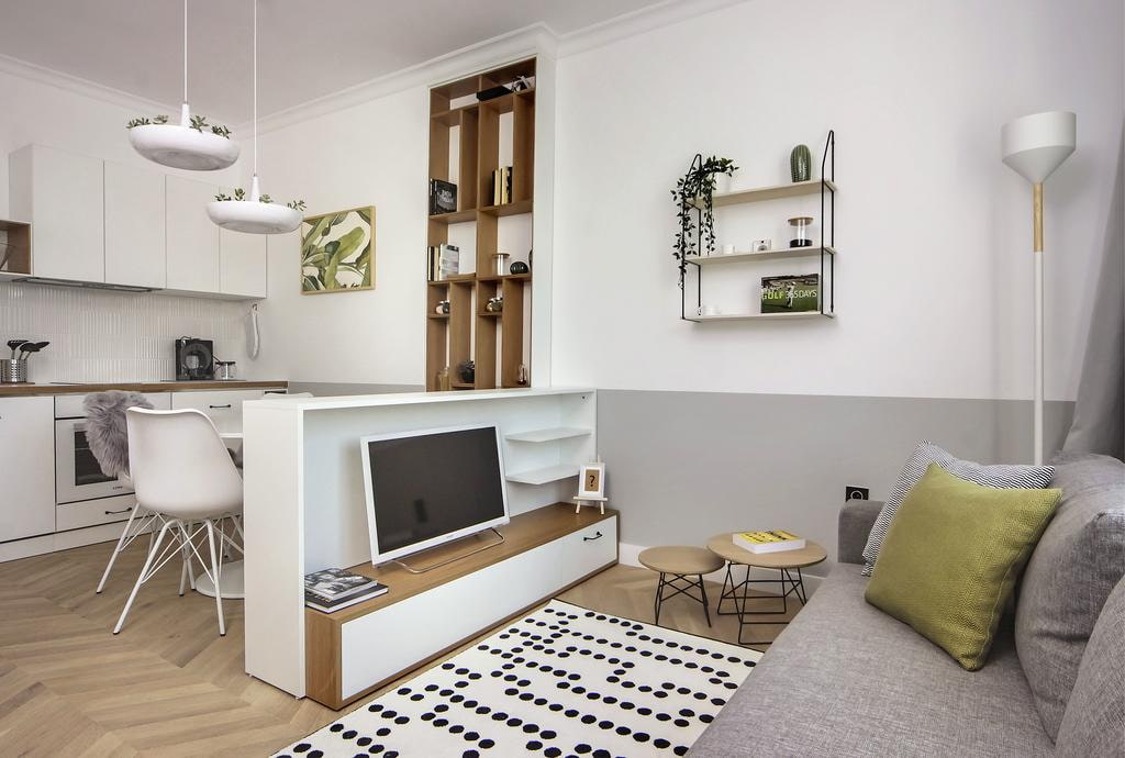
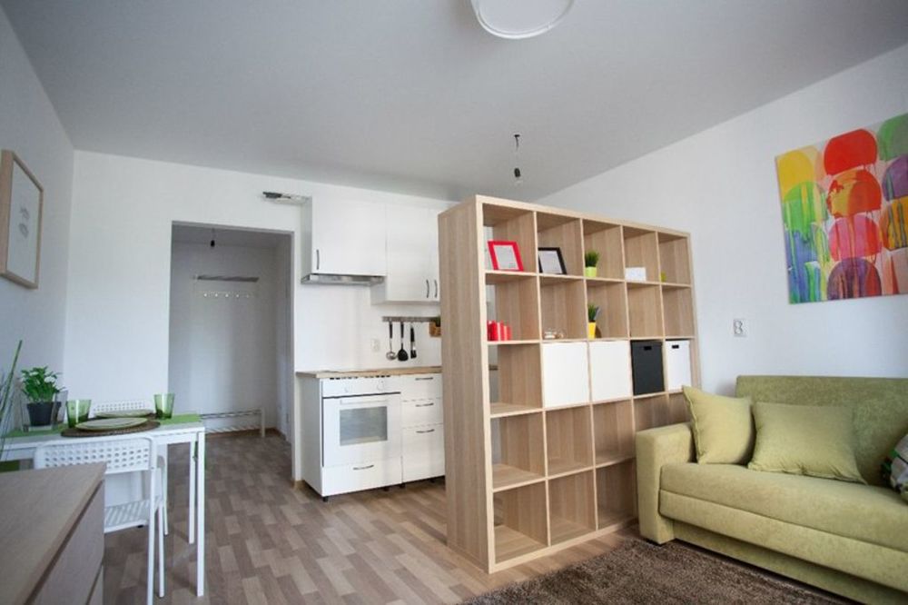
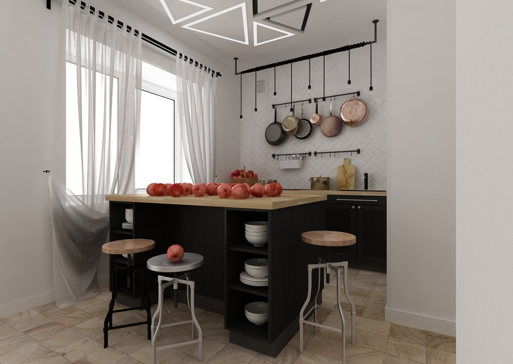
- Using visual dividers, which are functional. This is an example of a bar, dresser, or shelving unit. That is, a special partition is not built, but what was originally planned in the apartment is taken and put in the right place.
This is how the classic tall shelving unit becomes a divider, decorating the kitchen and living room, acting as a strong visual delimiter.
- Color separation. But this must be done very subtly, so that the room does not acquire an unnecessary, space-compressing dynamics. That is, it is not necessary to use contrasting colors to divide the room. But you can take related ones, and you get a soft color transition.

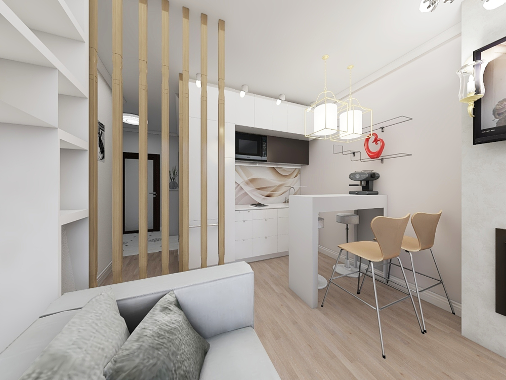
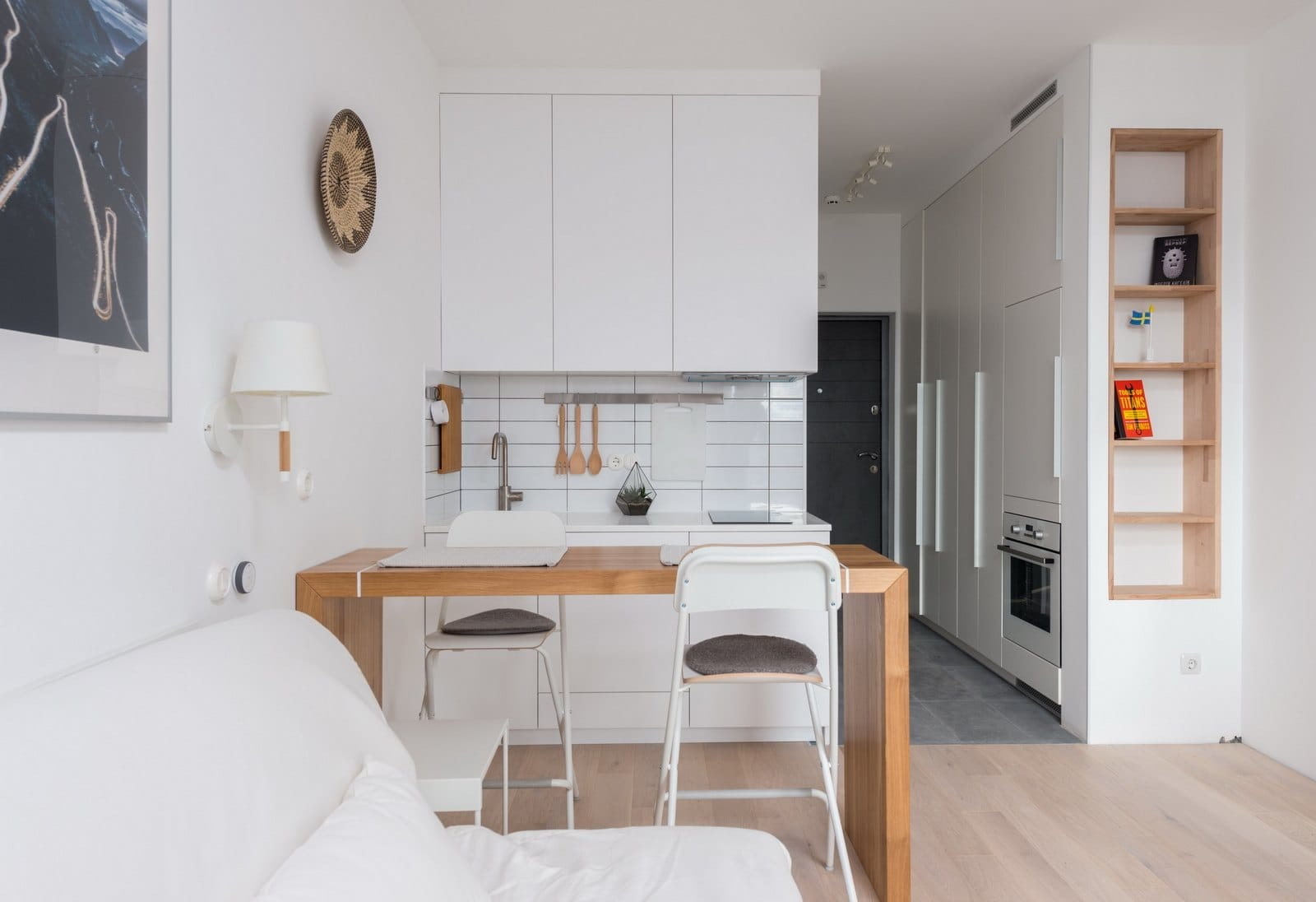
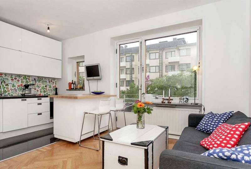
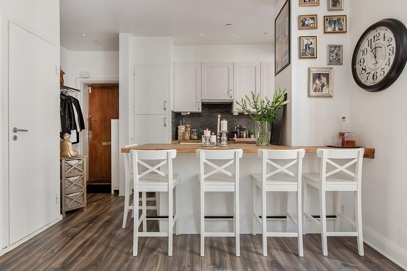
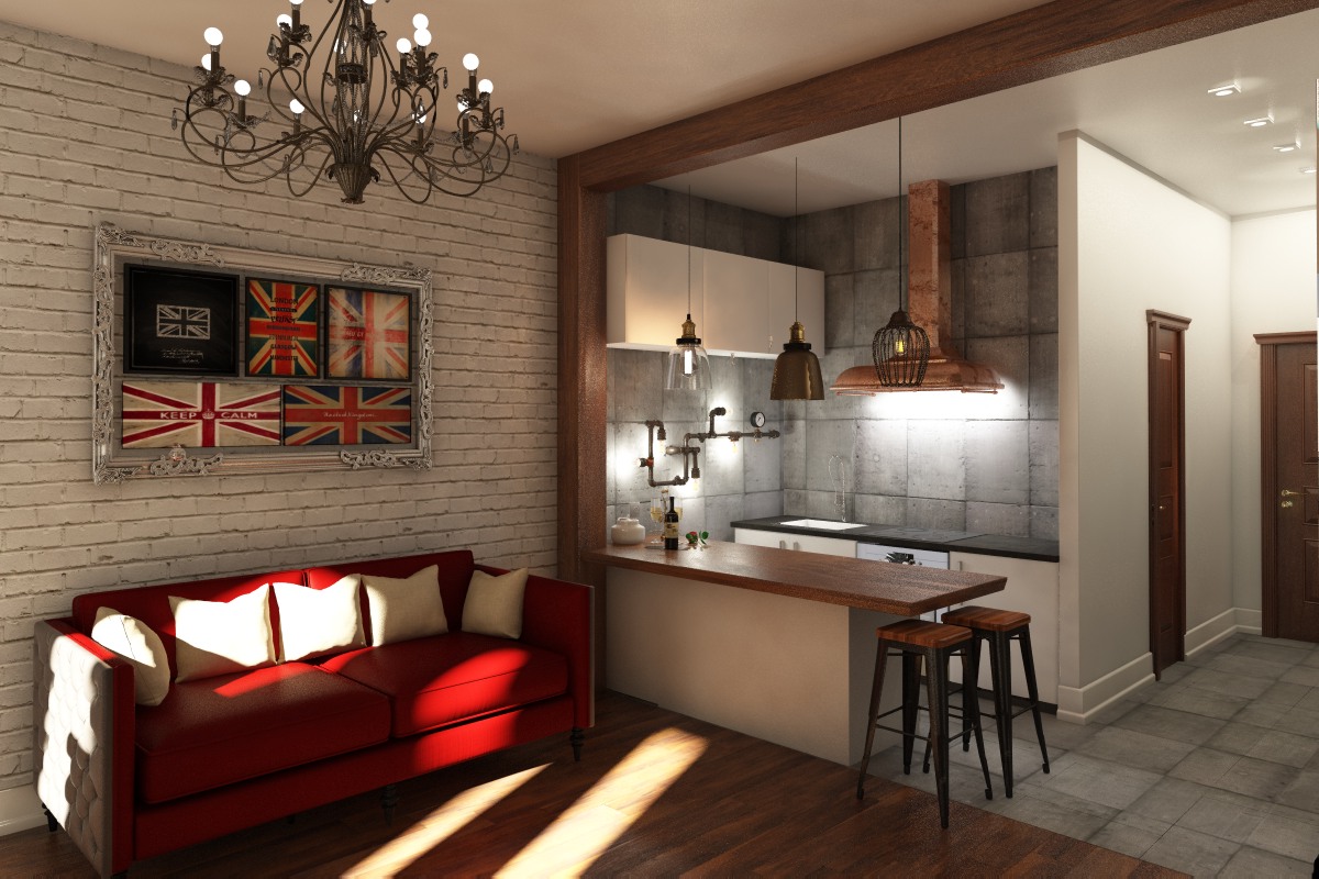
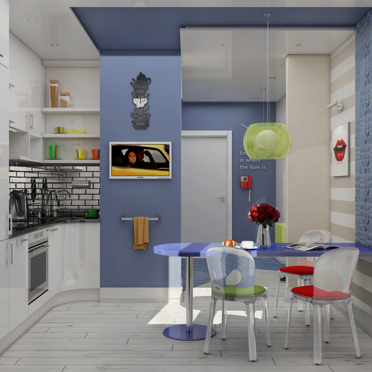
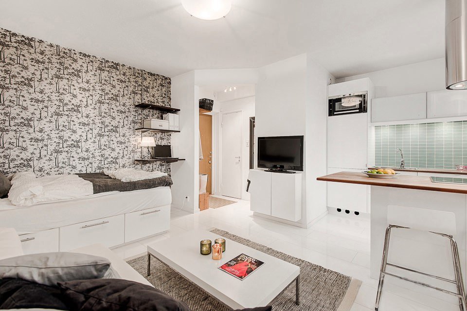
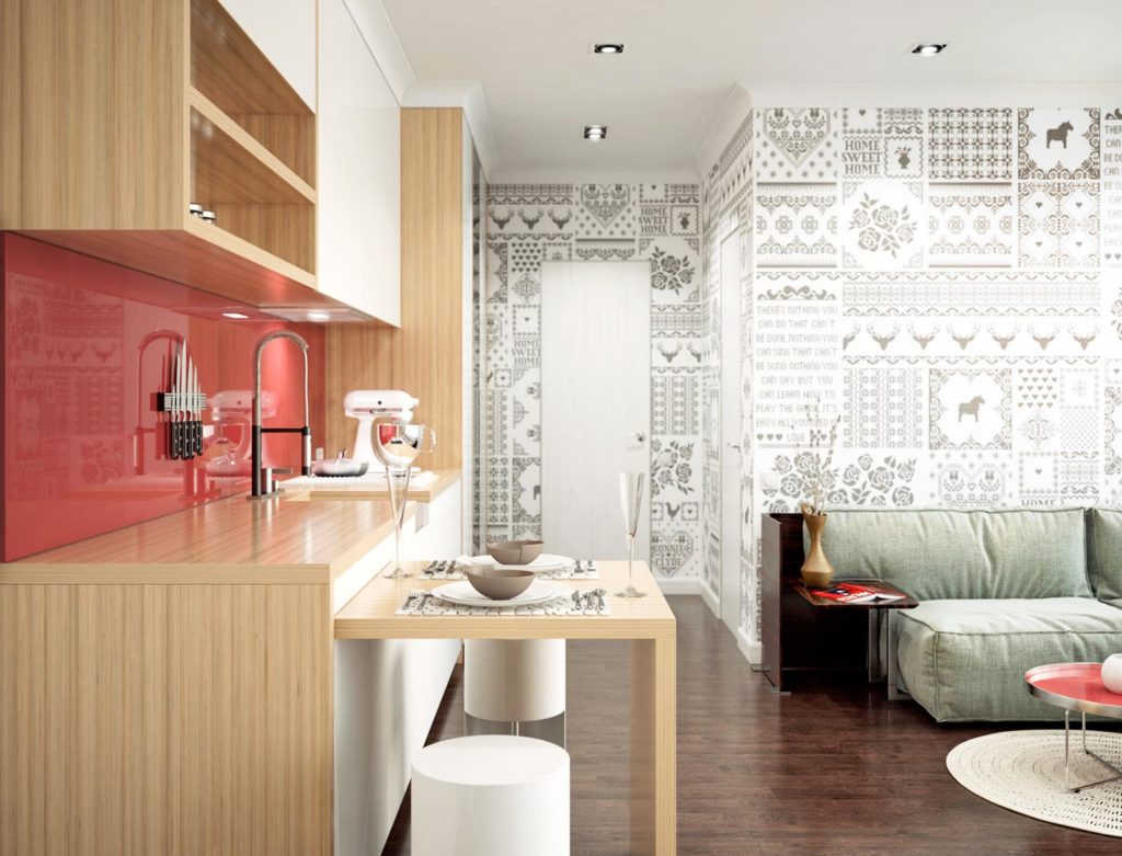
- Delimiter table... The kitchen area itself can be very small, but at the intersection of it and the living room there is a table (or maybe a bar counter).Moreover, it can be a rather large element from the point of view of the countertop, but under it you can equip storage boxes in order to increase the functionality of the item.
Sometimes the zoning is so subtle that it is difficult to detect it. It seems that the furniture is simply arranged around the perimeter, and meanwhile the zoning accents are clearly placed.
Styles
It seems that 20 meters is not enough to realize also stylistic wishes, but this is a misconception. Style consists of accents and recognizable features, and this does not require space as much as taste and the ability to stop in time.
Scandinavian
Scandi design is so fond of far beyond the borders of Sweden, Denmark and Finland that it seems that it has already become a classic. But even those who keep their nose to the wind and do not want to repeat what has been repeated many times, pay tribute to the most democratic style.
Scandi-style studio design is:
- air and light that dominate even such a small space;
- natural materials as an important criterion for style formation;
- cozy, personally significant decor for the owners;
- priority of light colors in the design.
However, you can play at the intersection of styles or their variations. For example, the sincere and absolutely inexpensive Scandinavian kinfolk is popular today. This word is translated as “relatives, family” or something close, which means that here you can combine the best elements of Nordic Scandi with the use of old furniture and accessories. With everything that doesn't have to look new.
This is a grandmother's sideboard or chairs from her kitchen, this is a floor lamp from the times of the USSR and curtains, which now seem old-fashioned, but very cute.
Minimalism
It seems that this is the first thing you can think about when planning the arrangement of a twenty-meter studio. But minimalism is also options with different types of finishes and the best modern ideas.
How minimalism will be noted in a studio apartment:
- very discreet presence of decor;
- a minimum set of colors;
- lack of non-functional things;
- discreet finish;
- the ability to abandon the bed in favor of a convertible sofa.
The interior will not become impoverished, it will be rather laconic. And if your eyes want decor and variegation, you can always make a seasonal decoration - with thematic textiles, decorations and other small attributes that help to change the picture in front of your eyes.

High tech
By the way, this style is very well embodied in such small combined spaces. The main requirement is one - it should be, indeed, modern, advanced technology, which is very ergonomically placed on an area of 20 squares. The style is also distinguished by the abundance of gloss, achromatic colors, smooth surfaces. There are almost no textiles and decor in it, and unusual lighting can become the main decoration.
The family rarely picks up such ideas, but single men are often impressed by hi-tech. This is not the most demanding style, he is capricious only when eclecticism impudently bursts into the space. That is, you cannot lay carpets from Soviet times on the floor in such a studio. But hi-tech solves other problems. But whoever will quickly dislike him is those who want to relax at home from office interiors.

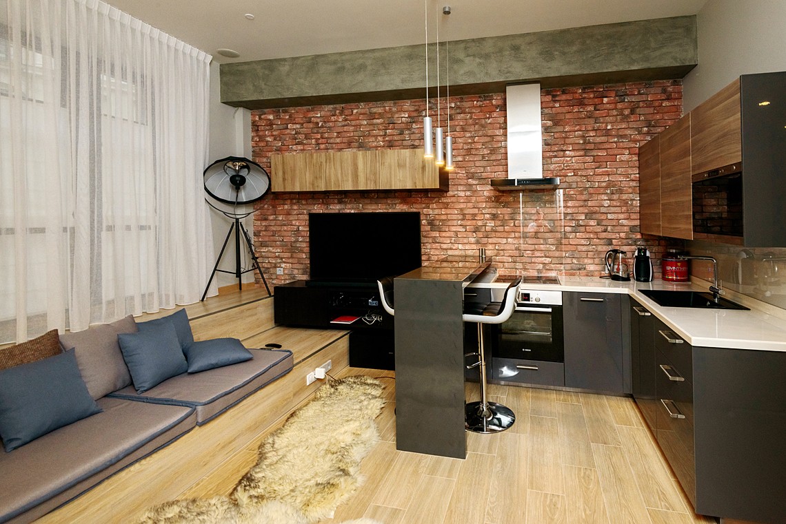
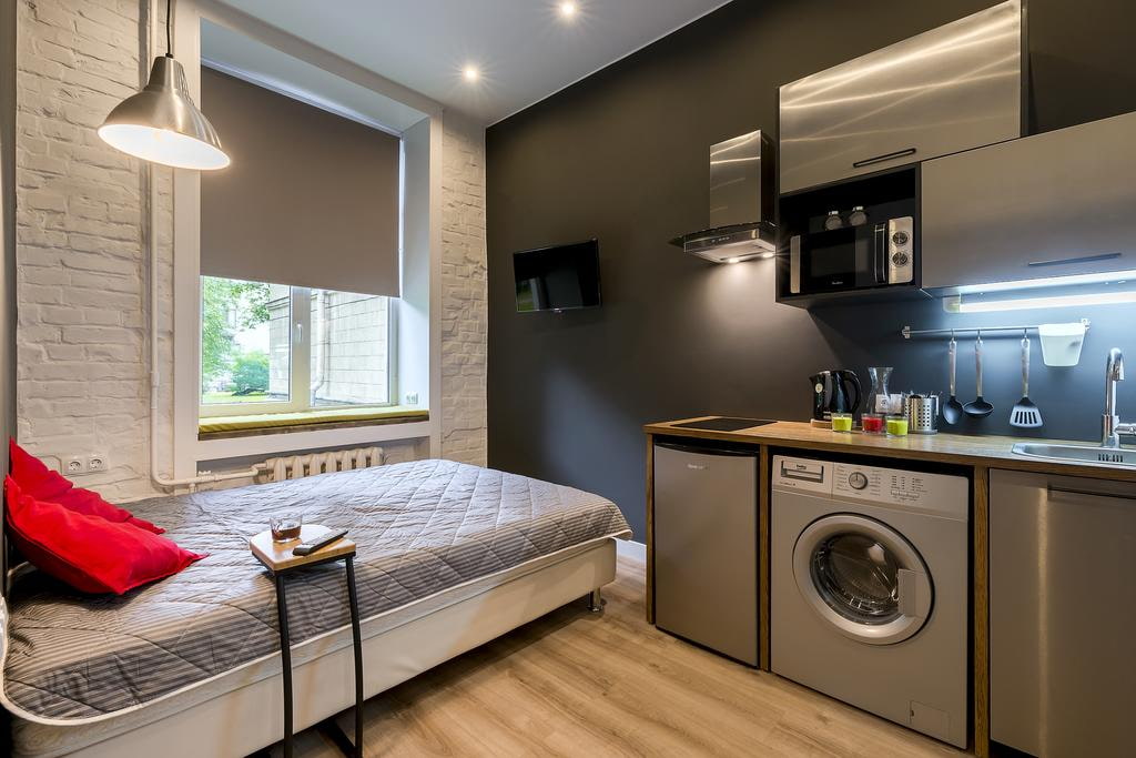
Loft
The loft is basically designed for studios. And even for those as small as twenty meters. To decorate a home in this style, you do not need a global, grandiose renovation. A brick or concrete wall, a ceiling devoid of any visible finishing - often a stop occurs already at the stage of dismantling, when it becomes clear that this production moment needs to be left unchanged. A lot of furniture is not about a loft in a small studio, bright colors are also rare here.
The main thing is that there is a place for cooking, a table and a sofa.... Everything else is optional. If the owner, instead of a closet, wants to put a simulator or hang a bicycle on the wall - please. And the wardrobe will replace the corner for the dressing room.
By the way, young families often stop at an atmospheric, freedom-loving loft, because with the advent of children, you will probably have to go towards completely different styles.

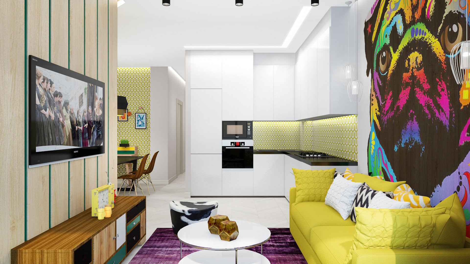
Pop Art
Pop art is a style of surprise. Here you can play with size and shape, actively use repetitive motives. Natural is not at all necessary here, plastic, synthetics, metal and paper are used. Pop art furniture often features abstract patterns, flashy colors and expressive glossy surfaces.
Of course, pop art prefers spacious rooms, but it will take root in a small studio. And this will already be the "light" version, when the author concentrates on the details, stylizes the interior to the image of a dream. If it is a color, then it is saturated, bold and flashy. That is, when choosing a sofa for a studio, it will be a raspberry or emerald, yellow or orange object that does not have to be combined with anything. Colors, really, should not complement and smooth each other, they have different tasks. It makes sense to choose furniture in the spirit of retro-futurism.
Often, such spaces are occupied by artists, photographers, in a word, people of creative professions who live where they work.
How to arrange furniture?
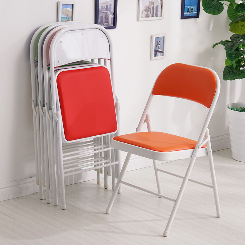
Bulky furniture must be excluded from the arrangement immediately, as well as furniture made in dark shades. Convertible furniture will be the most successful purchase, for example, sofa beds, wardrobes, folding tables and even folding chairs.
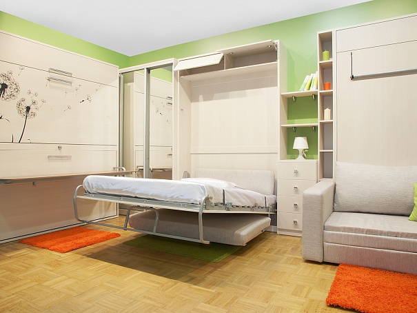
A good solution would be built-in appliances and storage systems, equipped in a free niche or pallet boxes. A small folding sofa is suitable for a berth. An apartment is often furnished around the perimeter, but even to furnish it in such a traditional way, you need to find a suitable place for everything. Sometimes the sofa becomes not behind the kitchen area, but opposite it.
The arrangement of furniture can be unexpected, there is no need to be afraid of such decisions: the algorithm for arranging a studio is always different from the usual things.
How to visually enlarge?
There are some cool tricks that always work. Yes, the increase will only be visual, but this is already a lot.
Visual expansion of the studio apartment:
- light pastel colors always work for "growing" footage;
- if the room needs to be lengthened, the opposite wall is made out in a colder and lighter color;
- a large drawing visually brings it closer, a small one lengthens, this applies to the design of the walls;
- low ceilings require a light and glossy design if you want to visually raise them;
- if curbs are used in a small space, it can be reduced even more;
- mirrors are an excellent interior expander, but it is also important not to overdo it with them;
- furniture is priority simple, with straight lines, as functional as possible, does not differ strikingly from the general color background of the space;

- if in the farthest corner of the room you mark out a bright decor item (for example, a table lamp with a yellow shade), the effect of a great perspective will work, and the room will seem more spacious;
- you can not take something significant, weighty place in the center of the room;
- furniture with glass surfaces also helps out, adding air to the space;

- a niche with circular illumination in the wall visually pushes this wall even further, and this increases the overall volume of the studio.

Well, how these and other techniques work in practice, you can see the examples of such small but nice studios.
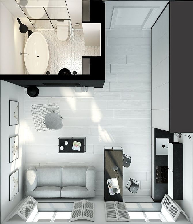
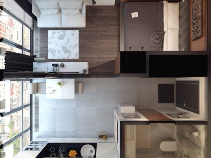
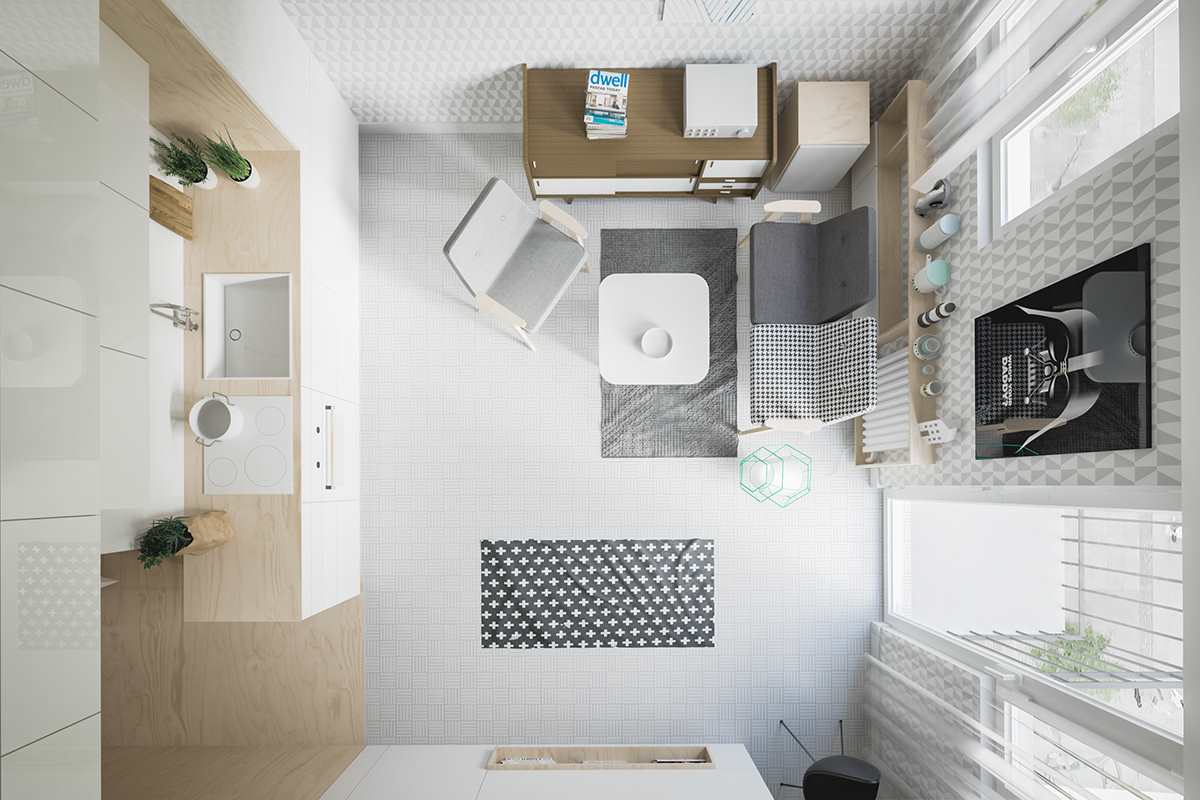
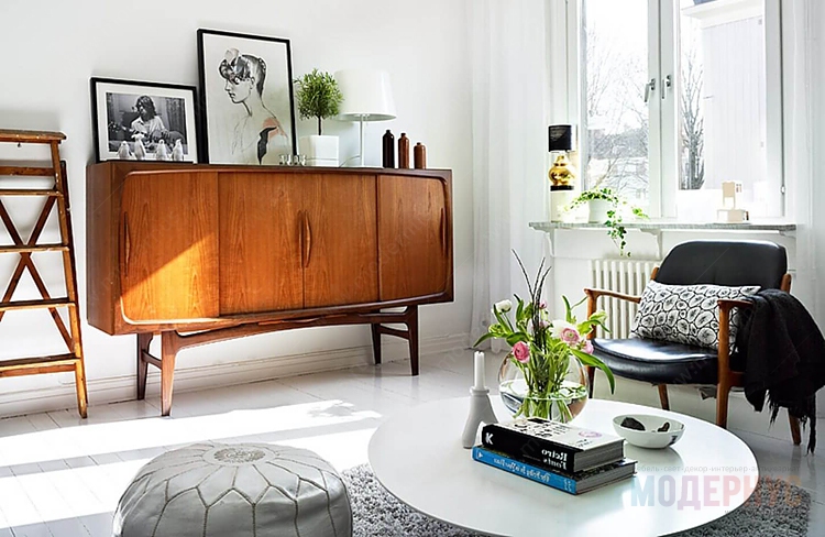
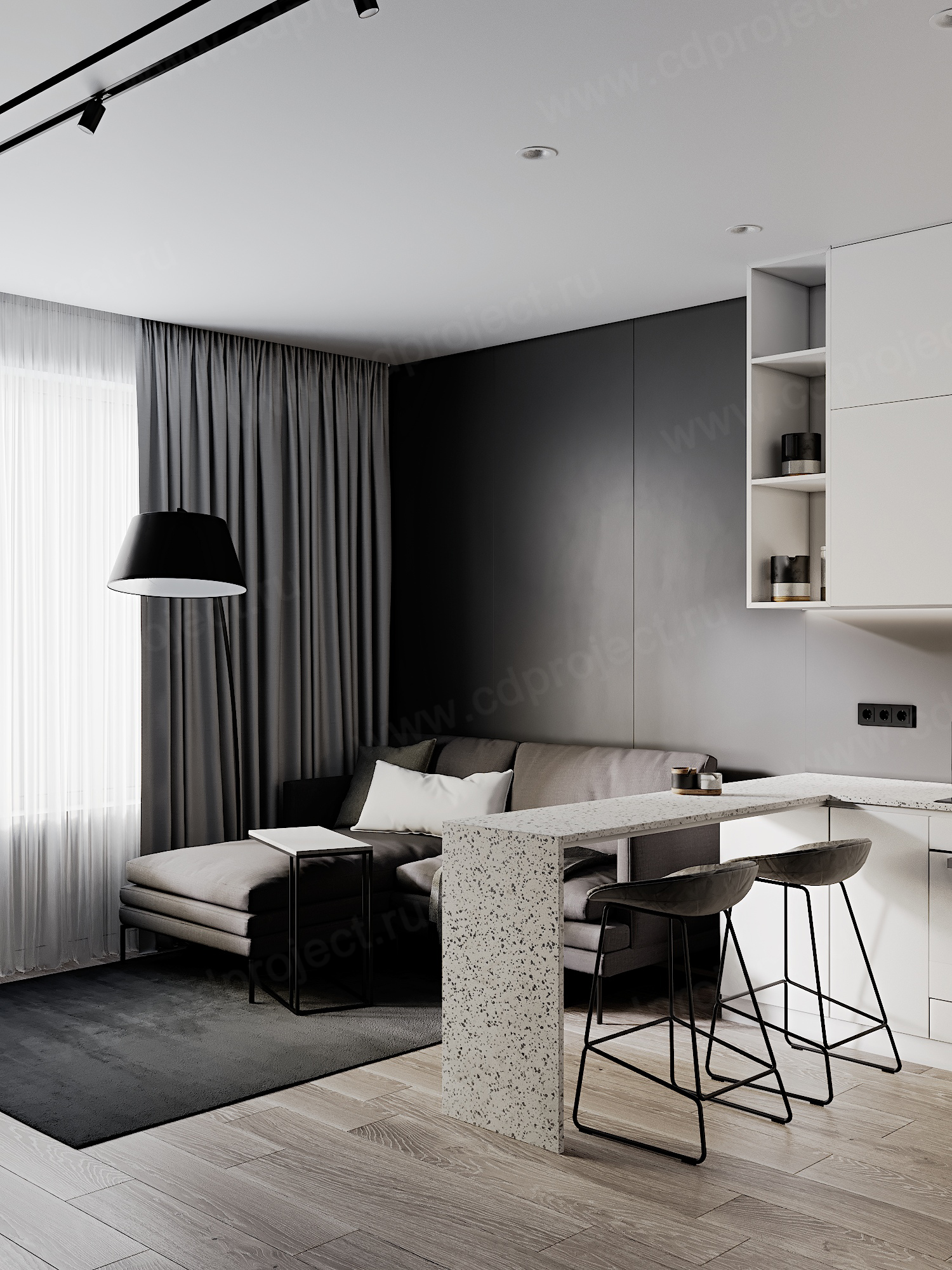
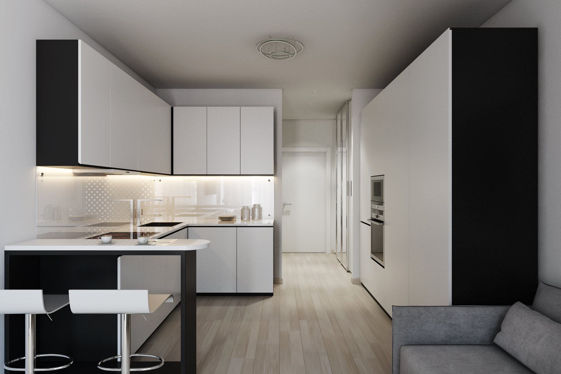
Beautiful examples
Inspirational examples show that even small footage is suitable for large and classy solutions. Here are 10 studio apartments, where 20 meters have been mastered in a very interesting way.
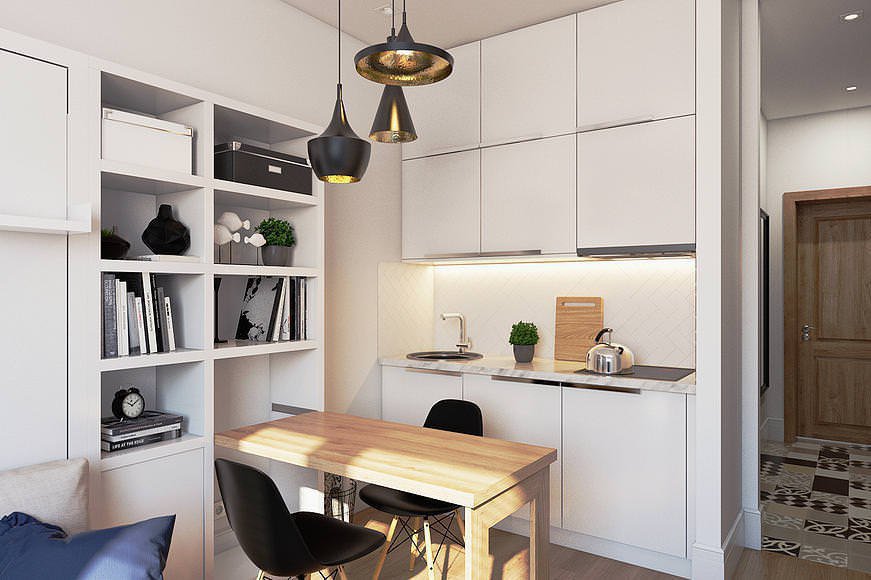
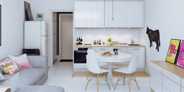
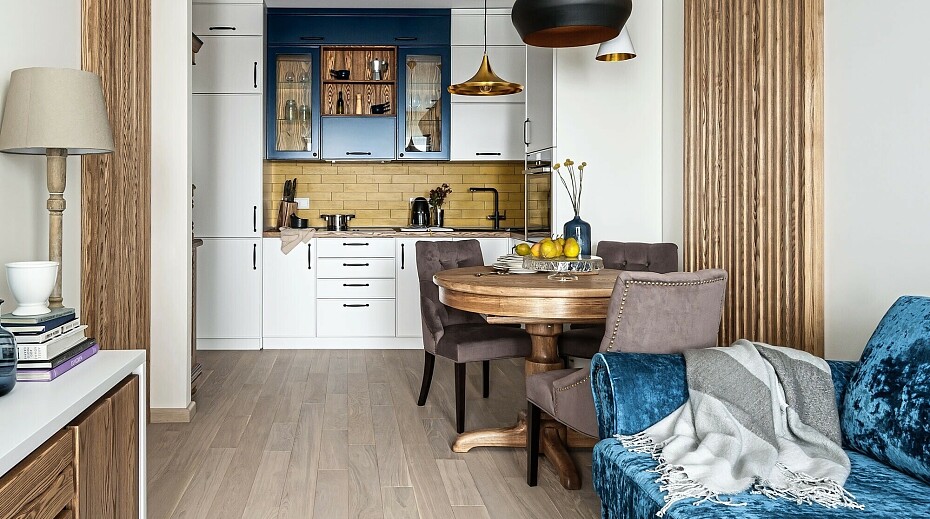
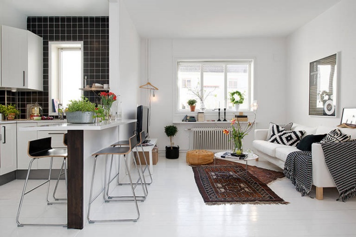
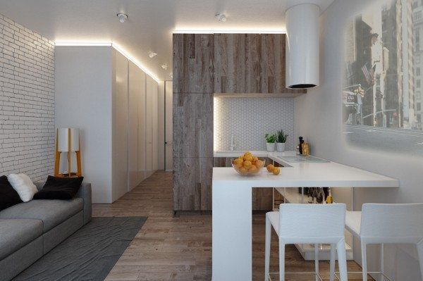
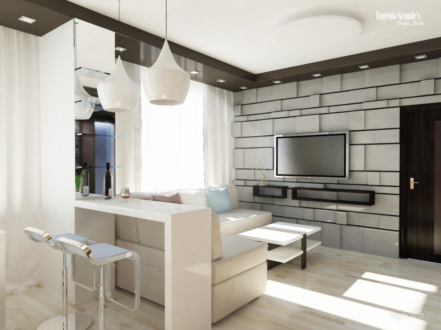
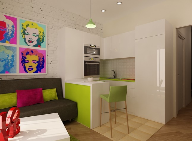
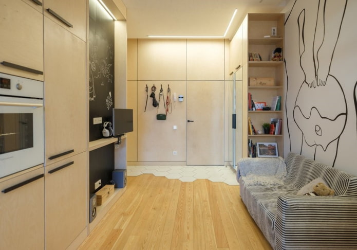
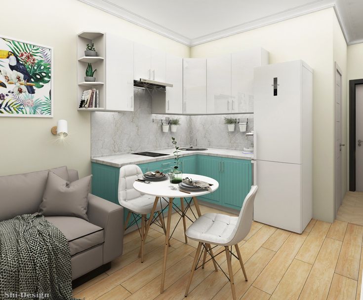
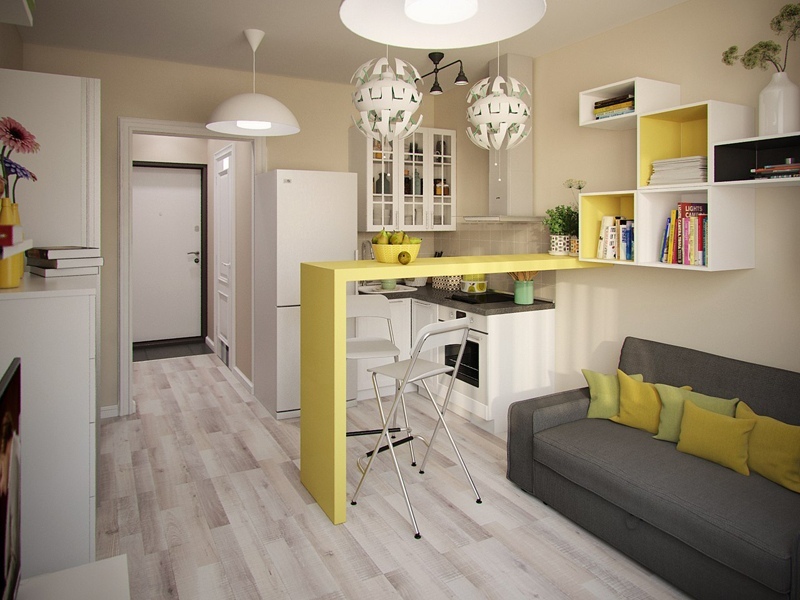
- The yellow delimiter looks very cool, and it is also the kitchen table.... Yellow color in this calm interior plays the role of the creator of comfort and warmth, and it is used in just such a quantity so as not to draw attention to itself.
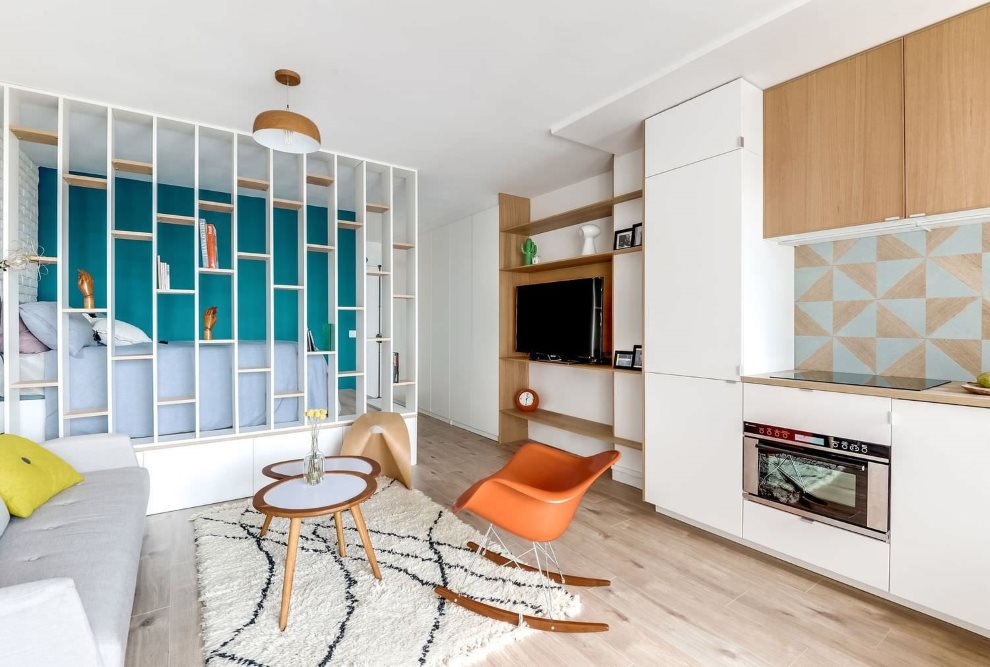
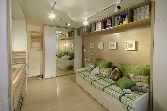
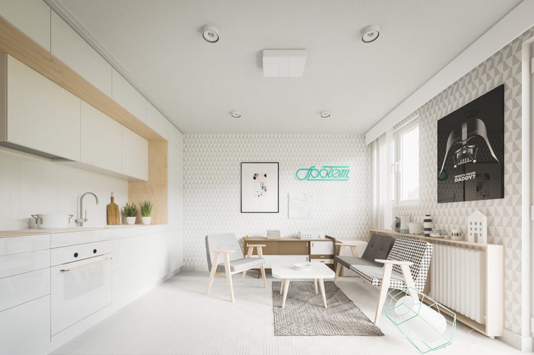
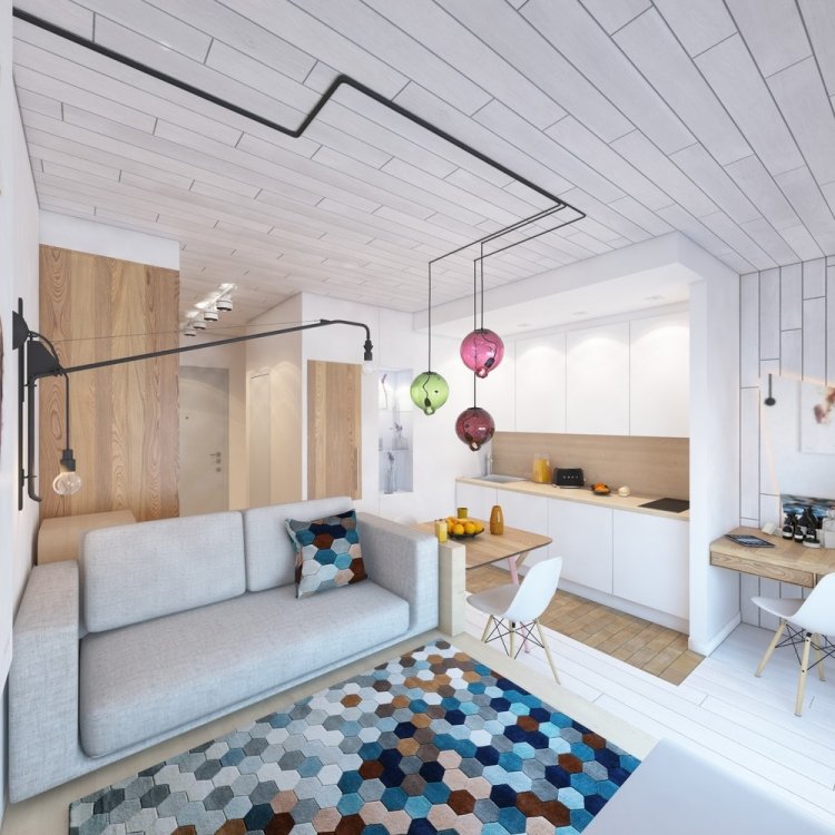
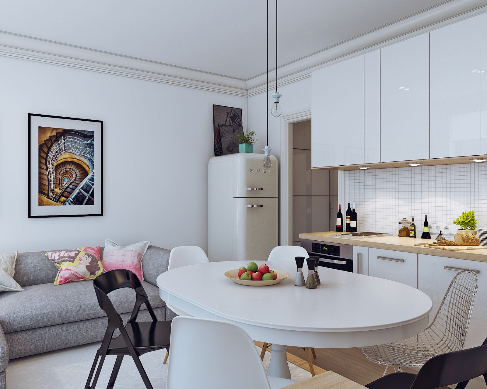
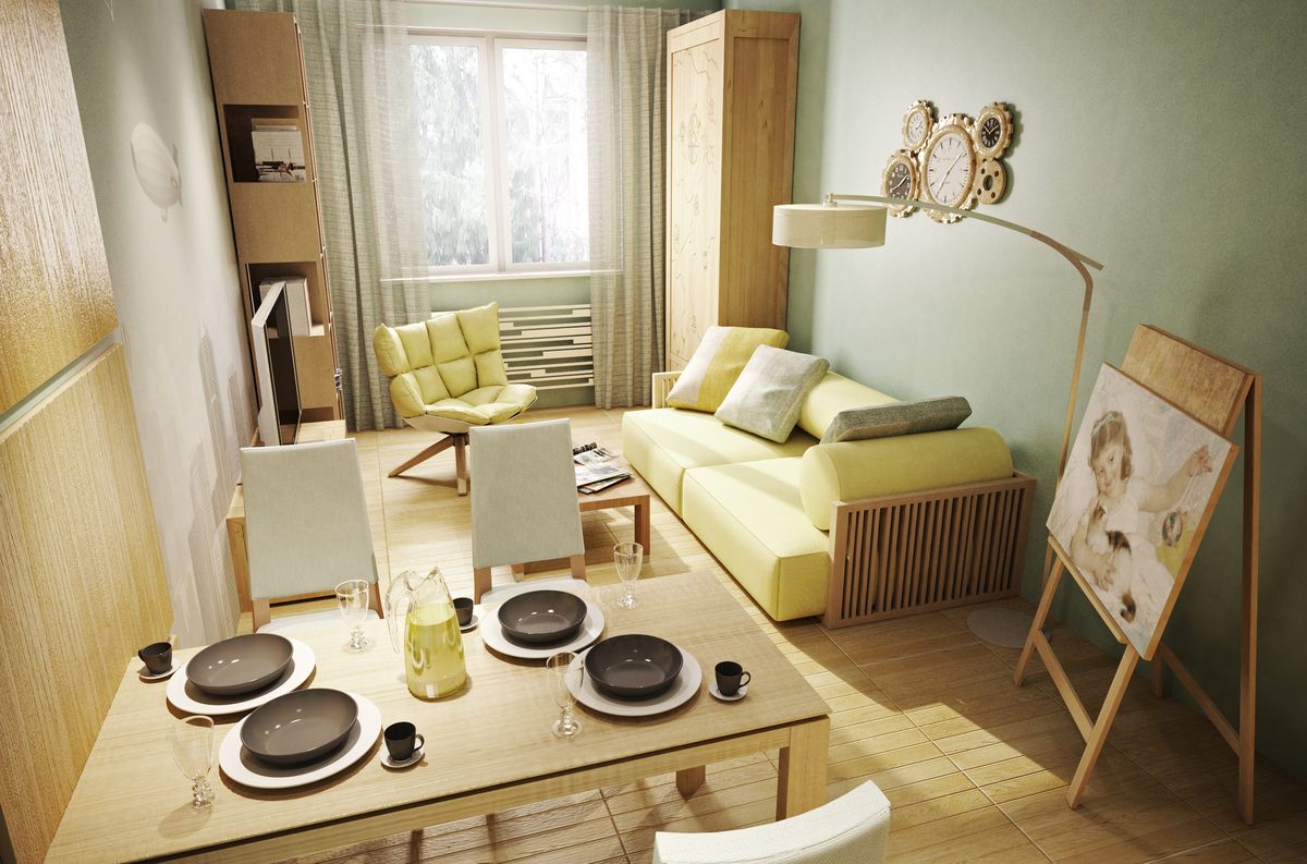
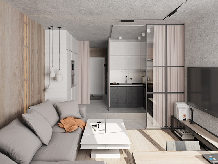
- Another warm, visually very pleasant apartment. You can see how the sofa becomes a bed just by throwing back the pillows. In the corners there are cabinets that are not striking, while they are certainly roomy.
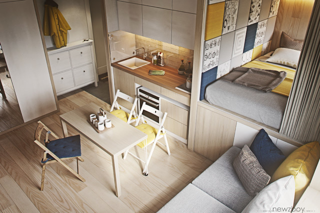
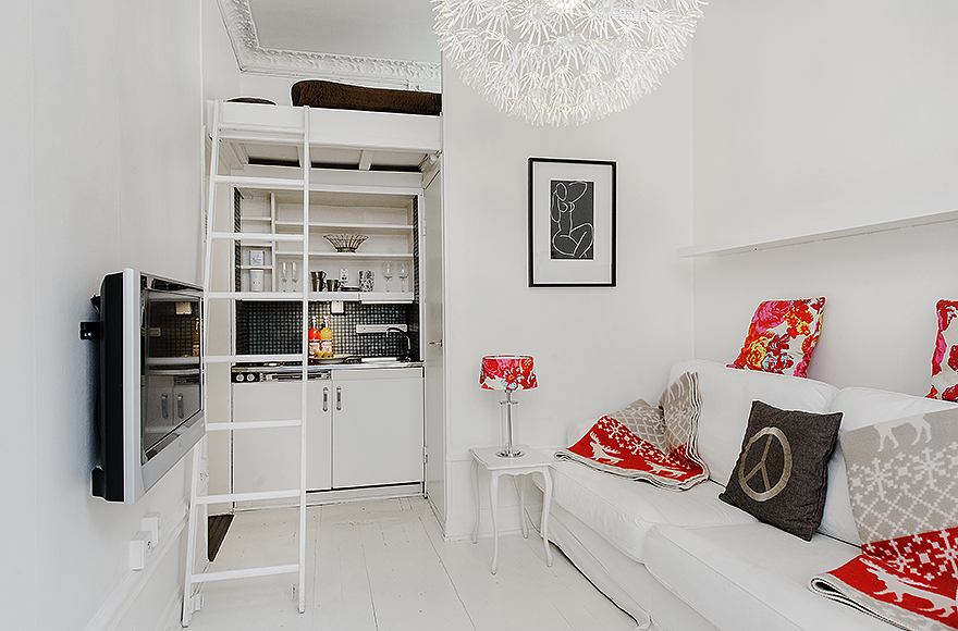
- A small studio often has high ceilings, which makes it possible to organize an almost complete second floor. And under it will be a nook kitchen. Obviously, a rather large library can be kept in such a dwelling.

- Panoramic windows for the studio - a preference that is difficult to overestimate. The lighting issue has been cleverly resolved, and a lot of things can fit in the cabinets lined up along the wall.

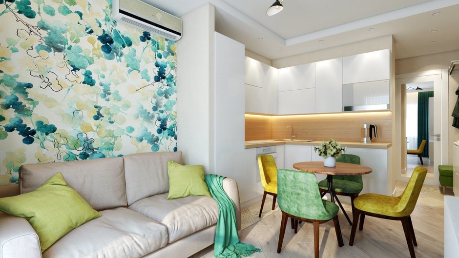
- This example is included here for a reason. There is no clearly expressed style, it seems, even somewhere too much with details. But the space looks cozy, habitable, and for a young couple it is not an option.
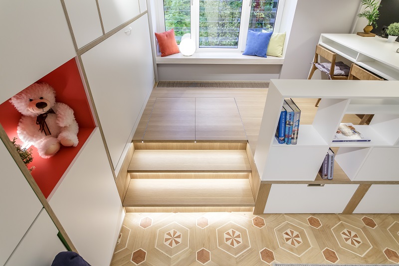
- Podium project shows how to divide the space clearly enough. It is clearly seen that two workplaces are located here at once.

- Raised bed, a small cozy kitchen and a transparent table in the center of the room - you want to warm yourself in such a house.

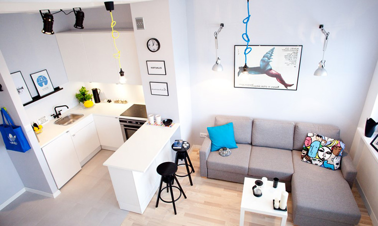
- White plus a little black, plus a little bright and colorful. Together we get a Scandinavian laconicism, which visually pushes the walls and inspires you to rest, cook, work, and just anything. You get a little tired in such a room.
- A very gentle example from which you can glean yourself aesthetics of performance. Again, it is noticeable how the podium is used and its capabilities.
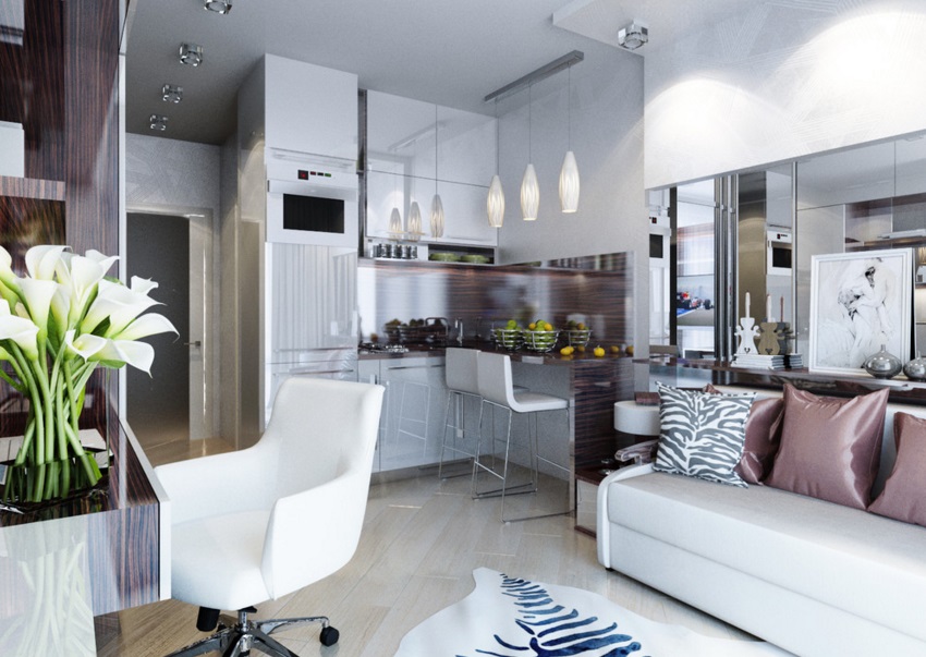
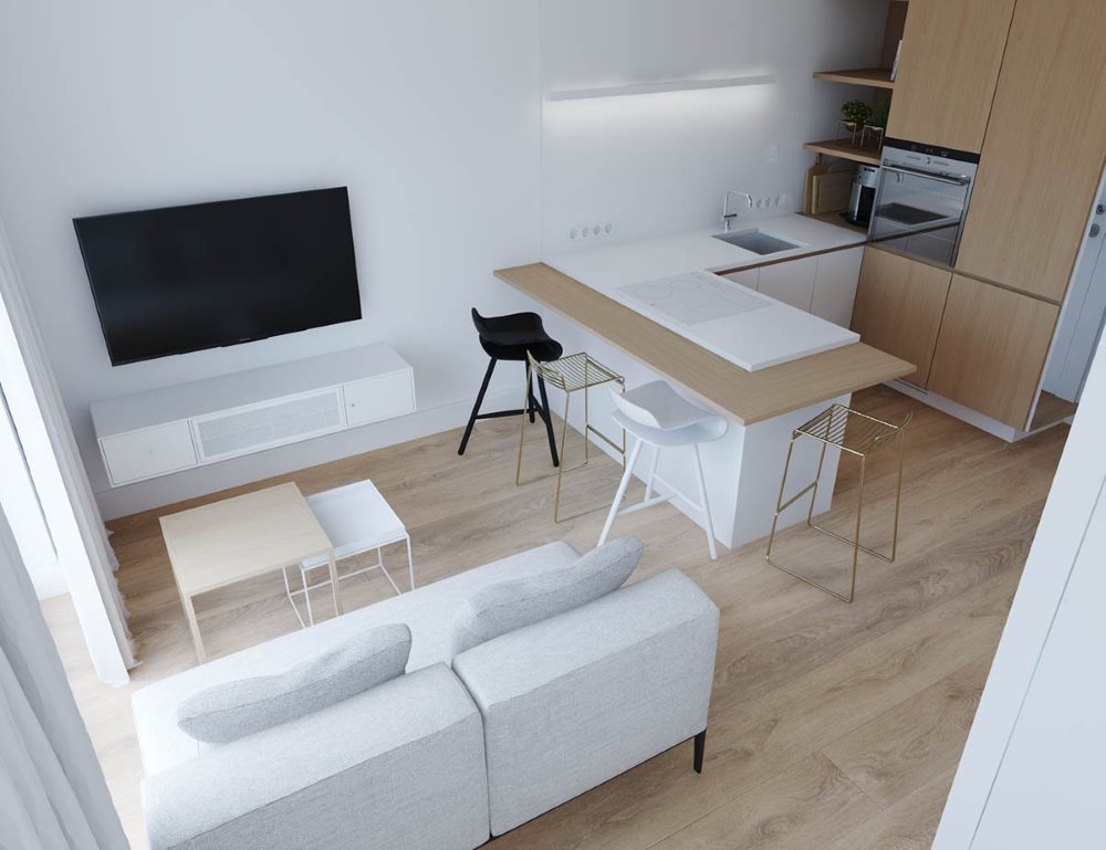
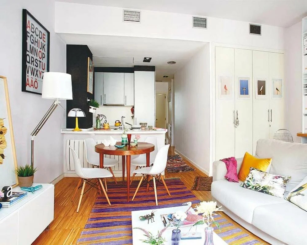
- In this studio, a full-fledged no dining tablebut there is a glass coffee table that will replace the dining table. The good thing about such studios is the abundance of light.
You always have to choose - what to give up, in favor of what to give up, which colors to give preference to, and which style will set the mood for the space. But there are still many solutions, and even for 20 meters they are enough to find the best, your own.