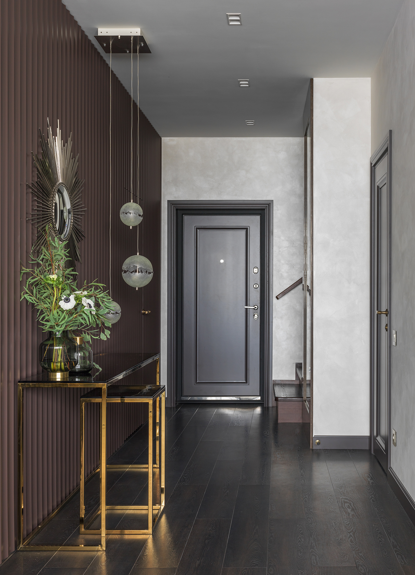
Hallway in gray tones

Gray is usually associated with something plain, simple and boring. Nevertheless, with an excellent balance of colors and shades, the gray hallway looks fresh, stylish and harmonious. An excellent solution for small corridors of small apartments.


Advantages and disadvantages
You can not be afraid that the hallway in gray tones will look boring and dull. All shades of gray combine well with the rest of the spectrum, so you can use various contrasting combinations to give a certain mood to the interior.
The following advantages of decorating the hallway in gray can be distinguished:
- a noble color, incredibly rich in shades from light dusty to rich charcoal, it is also silver, platinum and chrome;
- neutral gray serves as a kind of background for creating any, even the most daring stylistic solution;
- the entrance hall, designed in gray, perfectly connects rooms decorated in different stylistic directions, and it itself is excellent for eclecticism;
- light and contrasting shades of gray expand the space, making it ideal for narrow corridors and tiny hallways.

Regardless of the style in which the room is decorated, it is important to maintain color balance and carefully select shades. A skew can lend a dark and dull atmosphere to a hallway. Therefore, such an interior requires good lighting.
It is important that the walls and floor are leveled, regardless of the choice of finishing material: the gray color perfectly emphasizes all defects.
But the combination of contrasting transitions allows you to beat the unsuccessful layout.
What kind of textured materials to use?
A gray hallway can be decorated in any style, even mixing is allowed if the final image is harmonious. Mostly the walls act as the background, so the emphasis is more on furniture and decor. It is desirable that they be textured, contrasting in color, but kept in the same style.
If the walls are textured, have a bright pattern, perhaps photo wallpaper was used, then the furniture should be as simple as possible so as not to draw attention to itself. Otherwise, the interior may look clumsy. But it is best for the walls to be a more subdued shade than the furniture.
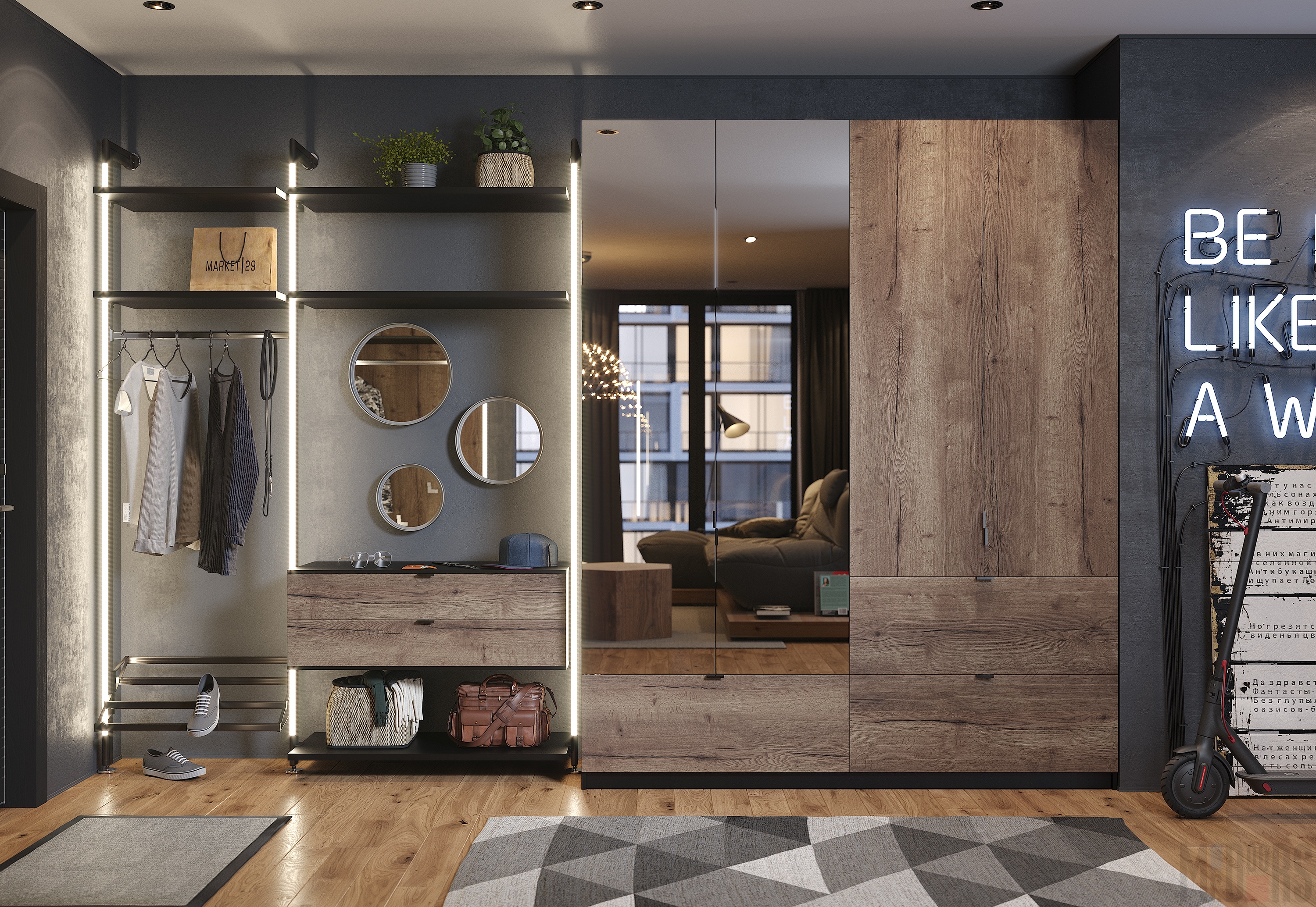
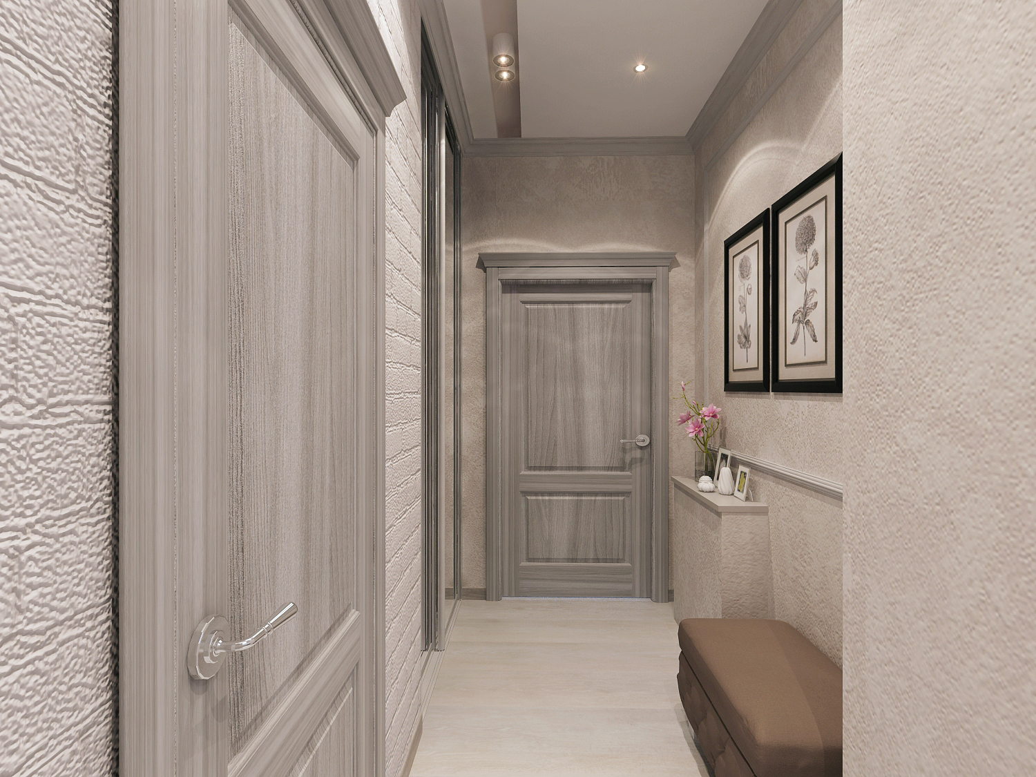
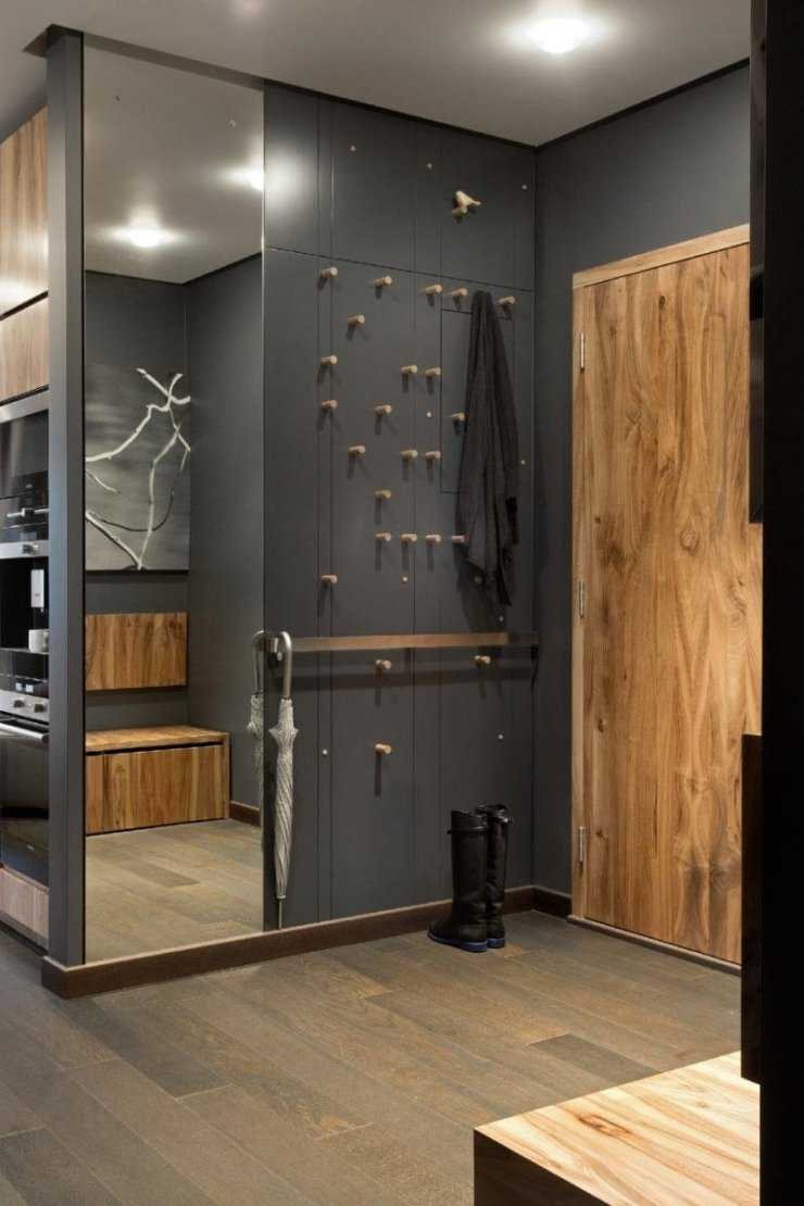
The gray color goes well with wood and its imitation. These can be furniture facades, floors, or individual decorative elements. The color of the tree is natural, or has a gray tint.

In such hallways, textured cladding looks great, for example, under a stone or brick. But to appreciate such a design, it still takes a place. If the space is small, then it is better to use something more monochromatic or in a small pattern, mostly in light shades.


You can play on the contrast of matte, rough walls and glossy surfaces, such as cabinet doors. The main thing is that they are consistent in color and style, otherwise you can go too far with eclecticism.

It is better to choose the most practical materials for decoration themselves. For example, vinyl wallpaper will stand up to water droplets from a jacket or umbrella. They are easier to clean than paper ones.
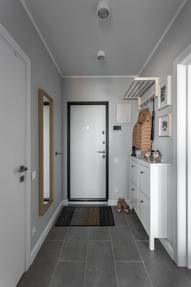
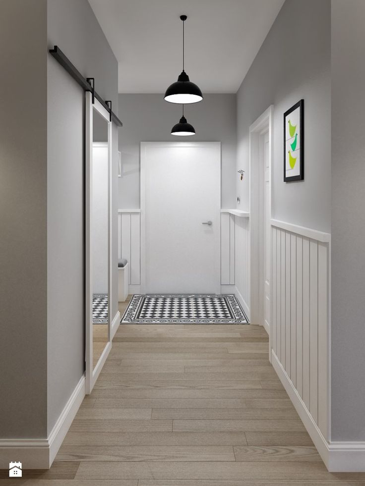
Particular attention to the floor and ceiling. If they are knocked out of the general style, then the violation of the composition immediately catches the eye. It is desirable that the floor be of a contrasting shade, perhaps even gray. It does not have to be darker, light is also allowed, but it definitely should not blend in with the walls.

Special attention is paid to lighting. If the hallway is made in dark shades of gray, then insufficient lighting will turn it into a "basement" room. It is recommended to use diffused light.
One light source should be replaced with several point ones so that there are no light spots and dark corners.

Selection of furniture
It is recommended to choose textured furniture to make the hallway look more interesting. Straight shapes without frills and bright elements can turn an interior into a mundane and boring one. The only exception is if the walls themselves are decoration and eye-catching.
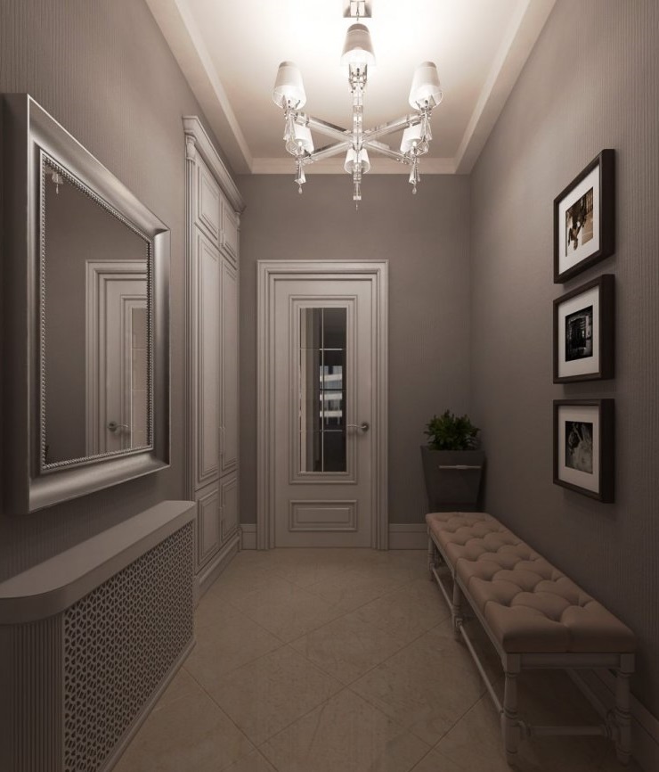
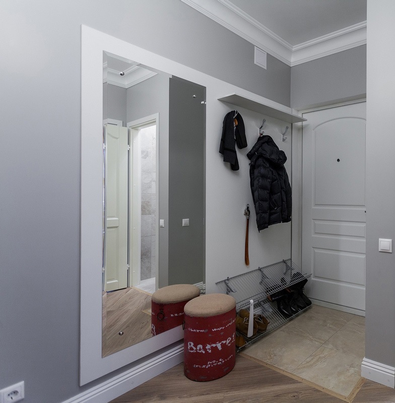
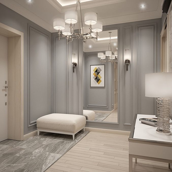
Furniture of a lighter shade or white looks great on a gray background. Especially important for small hallways with poor lighting. In this case, it is recommended to use glossy, chrome and mirror elements so that they not only expand the space visually, but also reflect poor light.
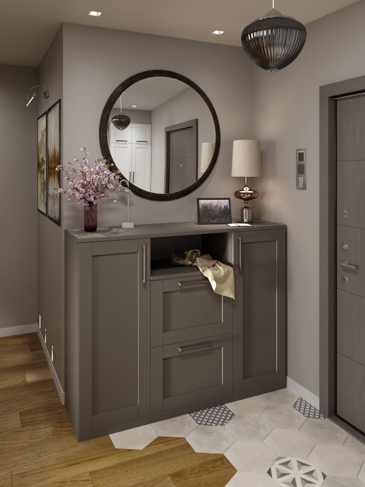
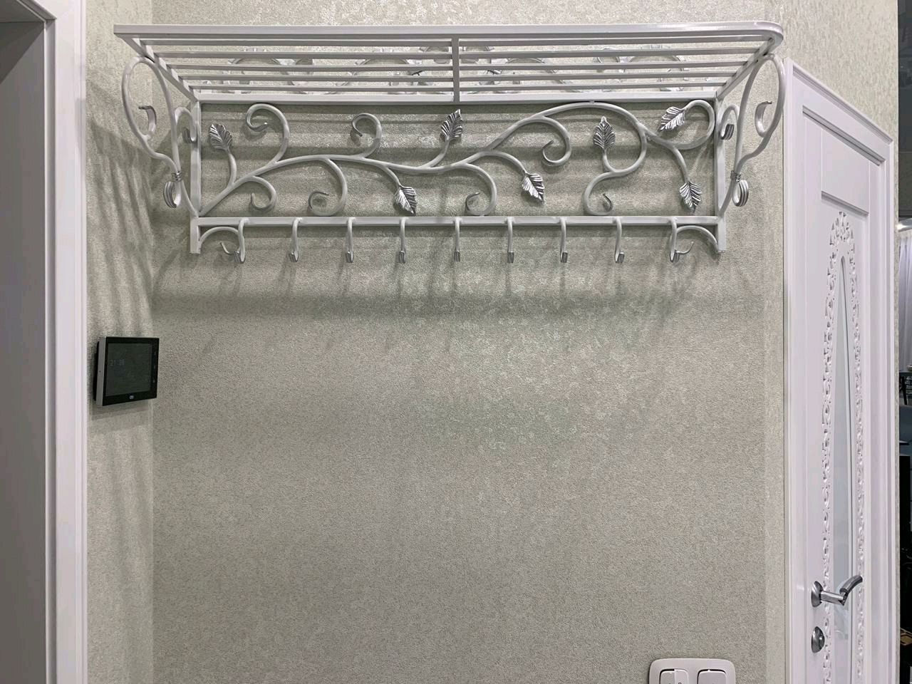
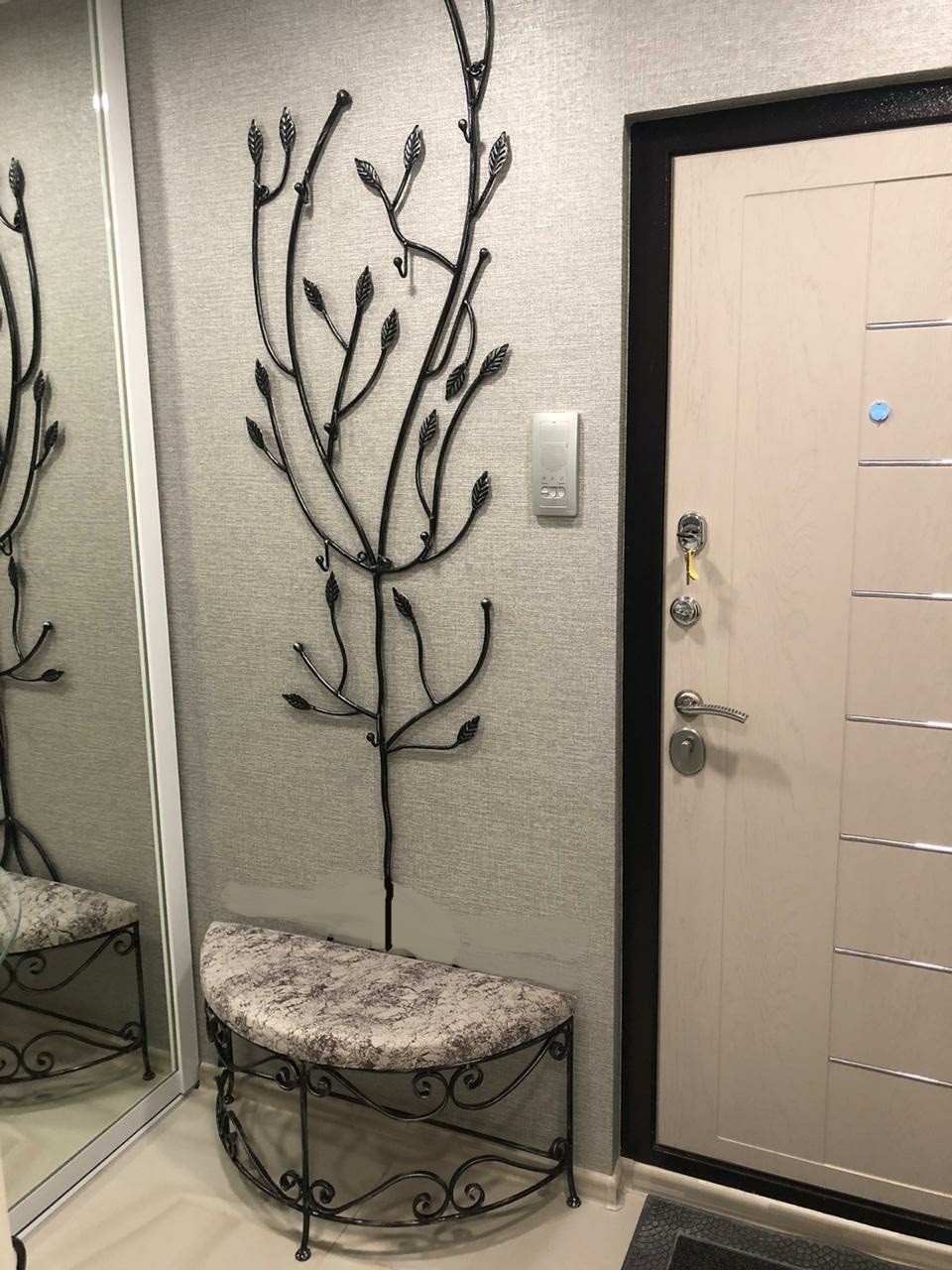
Dark forged furniture and the same design elements look great on a light background. This can be a hanger, table legs, benches, a chandelier or a sconce. Their use gives the interior airiness and grace.
If you choose dark-colored furniture, then it is better to purchase not black, but dark brown. It makes the interior softer and more harmonious.
Dark walls look good in contrast to light wood. Such furniture gives the hallway a degree of serenity and consistency.
Combination with other colors
Designers recommend diluting the gray color to make the interior look more interesting. You can use different shades of gray - both contrasting and smooth gradient transitions.
Combinations with other colors of the palette look interesting. This allows you to play with the zoning of the room. Using various techniques, you can visually expand a narrow corridor, beat up an inconvenient layout, protruding columns, a pantry, a mezzanine, or closely spaced doors to other rooms.
With light
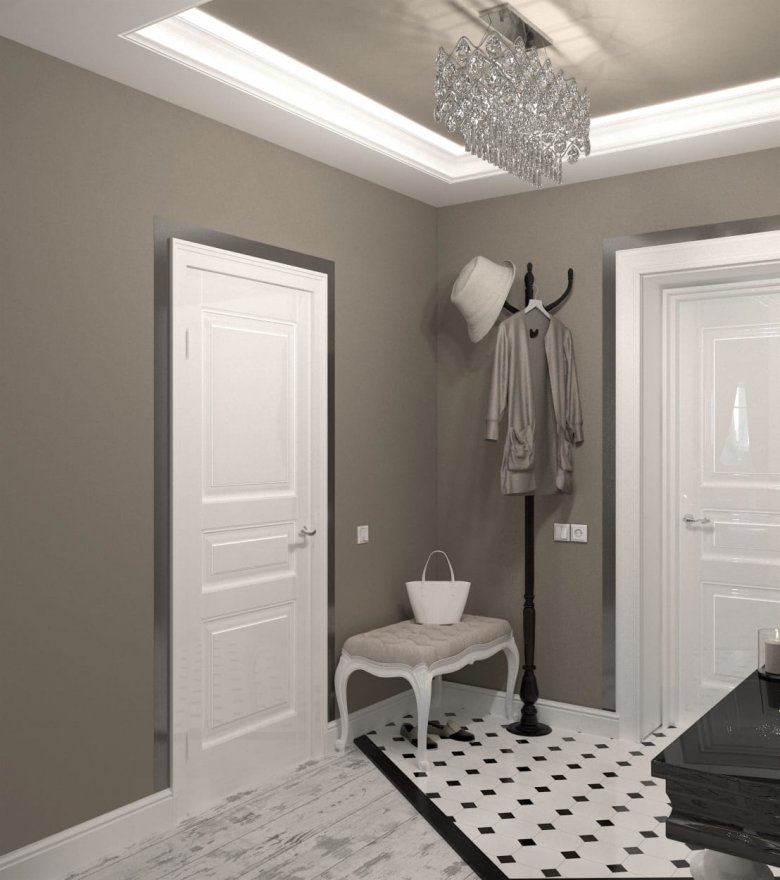
The combination of gray and white looks great. Moreover, white can even be the main color, be diluted with gray walls or floors, as well as various decorative elements of a darker shade. This is a versatile combination. After all, white can evoke associations with the hospital and its sterility, and shades of gray can dilute the interior, making it harmonious.
The combination with blue gives the hallway an atmosphere of calm and tranquility. It is pleasant to return to such a house, I want to leave all the negativity at the door, to tune in to rest. In this case, it is better to select a shade of blue according to the intensity of gray.
For example, if you use dusty shades, bright blue can look inappropriate and even foreign.

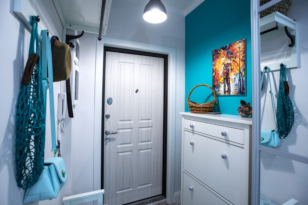
The turquoise hallway looks more optimistic and festive. At the same time, gray slightly mutes, making the design calmer. Perfectly done in a Mediterranean or nautical style.

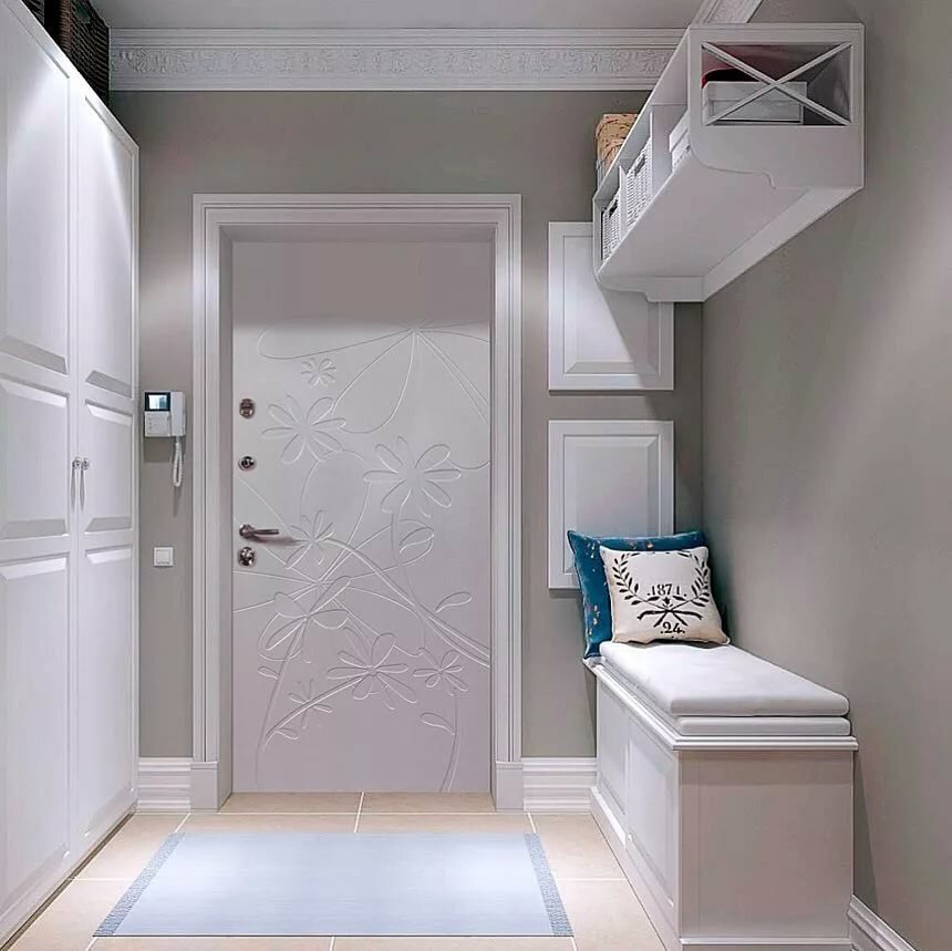
The combination of gray and beige looks very cozy. Not a bad option for a small hallway, as well as families with children, as such an interior will look warm and welcoming. Wood in warm shades can be used as beige elements.
With bright
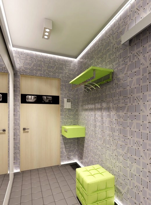
The combination with bright elements allows you to create an unusual design. The gray color not only harmonizes perfectly with the bright palette, but also perfectly compensates for them with its restraint. The interior is interesting, modern, but not flashy at all.

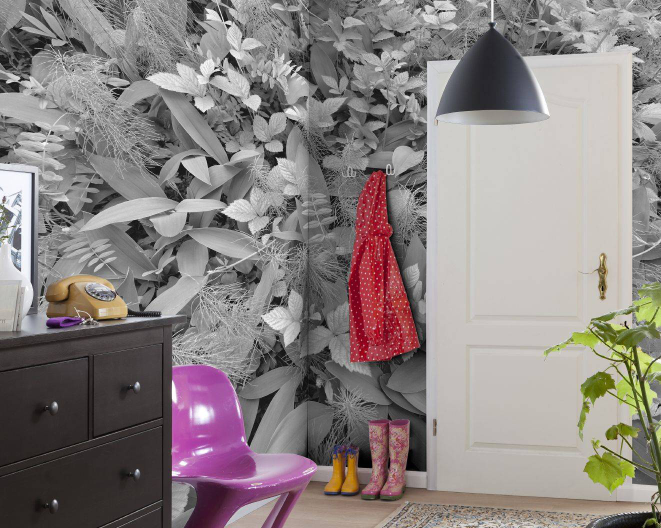
Moreover, bright colors allow you to perfectly adjust the layout of the room and recreate even the most daring design ideas. For example, if the far wall is painted red and the rest gray, then the narrow corridor will become visually wider. You can paint protruding columns or doors in a bright color, even hide them if you paint them in the same color as the wall. For example, this is how you can disguise the door to the dressing room or closet.


It is important to note that this is not just about lighter shades of gray. Darker, more saturated ones go well with yellow or blue. Not only walls, doors or floors can be painted in bright colors. Furniture, part of it, interior decorations can act as bright elements, and color can only be accents, and not fully woven into the interior.
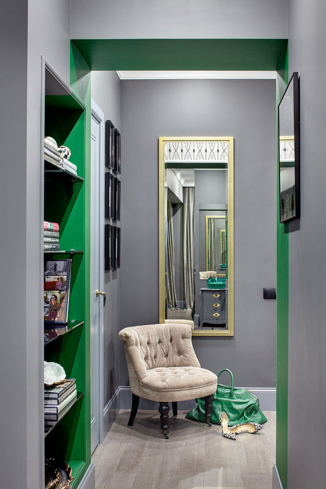
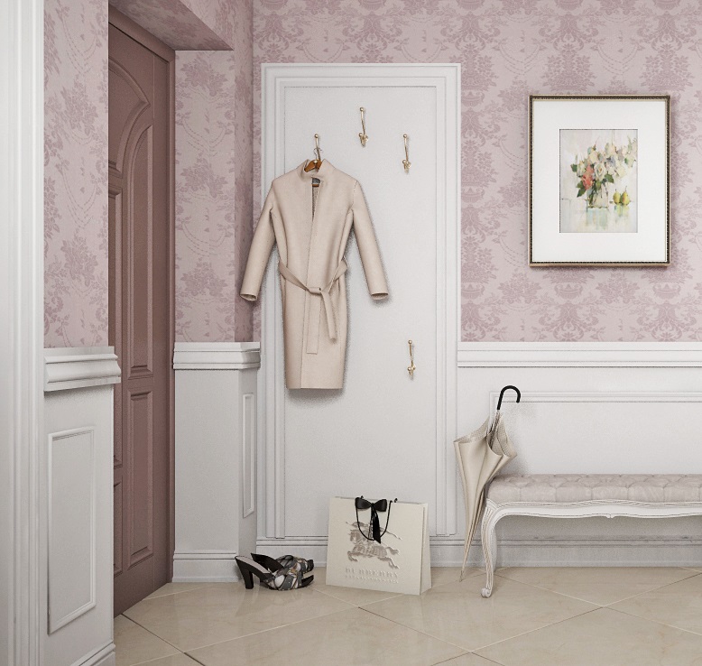
At the same time, gray can dilute. For example, if a green hallway has gray walls only as a background, the interior won't even be gray. Or a pink hallway has dusty gray-pink wallpaper and some dark gray décor elements.
With the dark
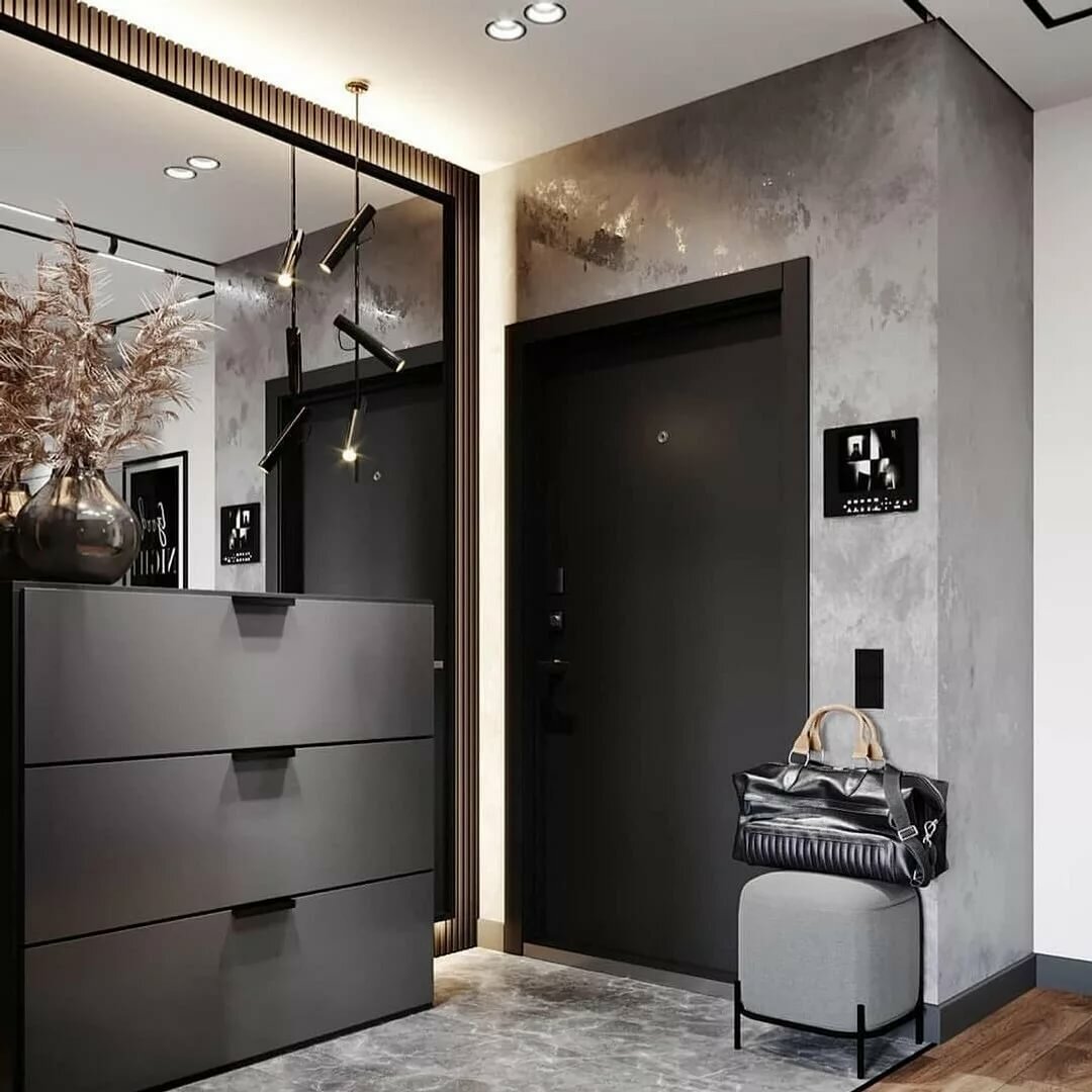
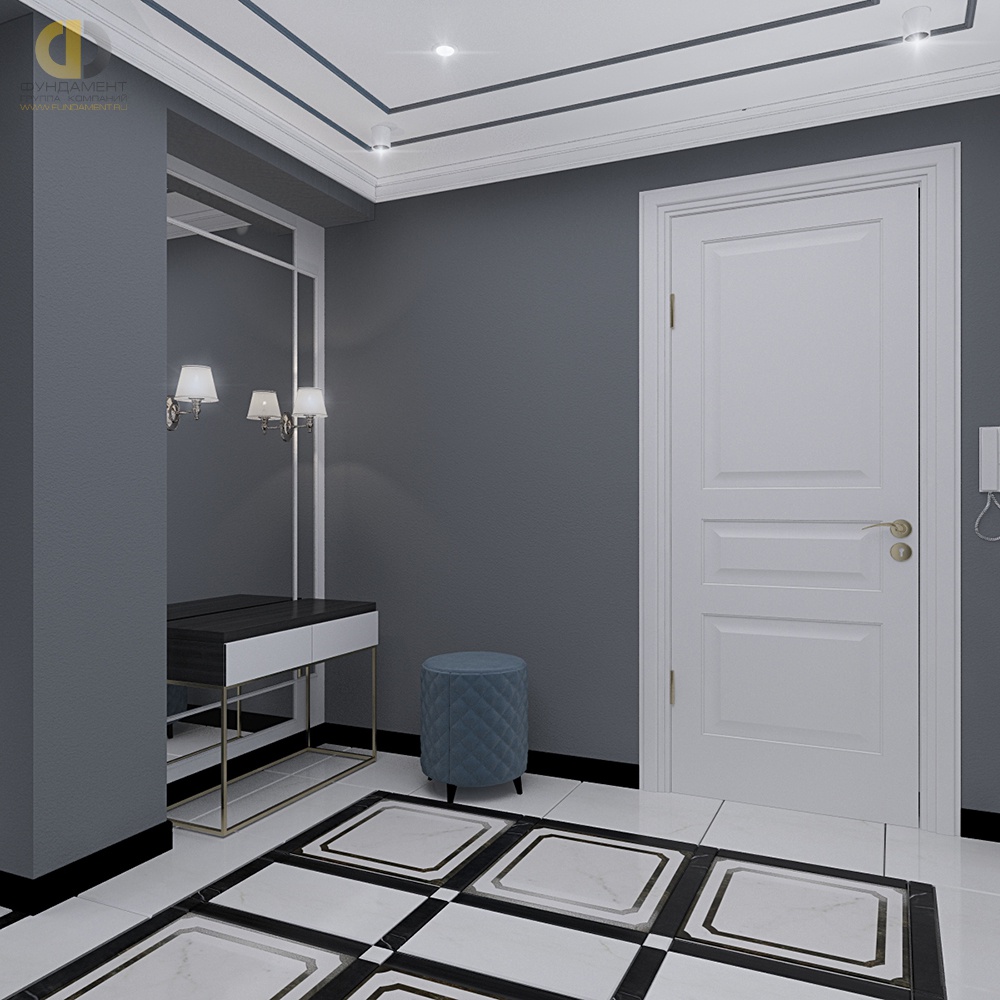
Dark furniture and an entrance door look great with gray walls. They add austerity to the interior. Wherein chocolate shades are an excellent substitute for the irreconcilable black color. They seem to add softness to the interior, while emphasizing the nobility of gray.
A hallway in gray tones goes well with brown. Interior doors and furniture fit especially well; you can also add wrought iron elements.
If the walls are dark gray, then it is important to attend to good lighting.
Beautiful examples
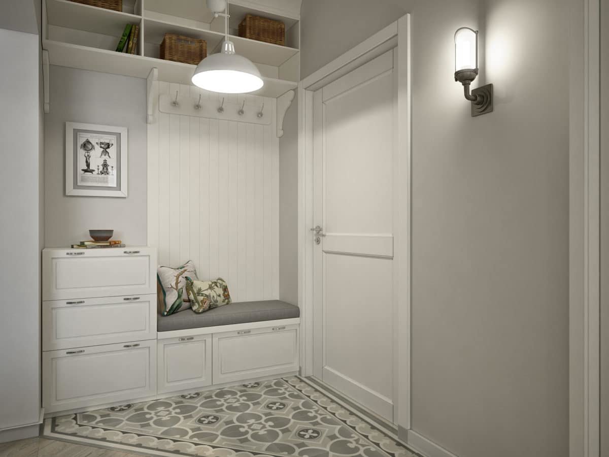
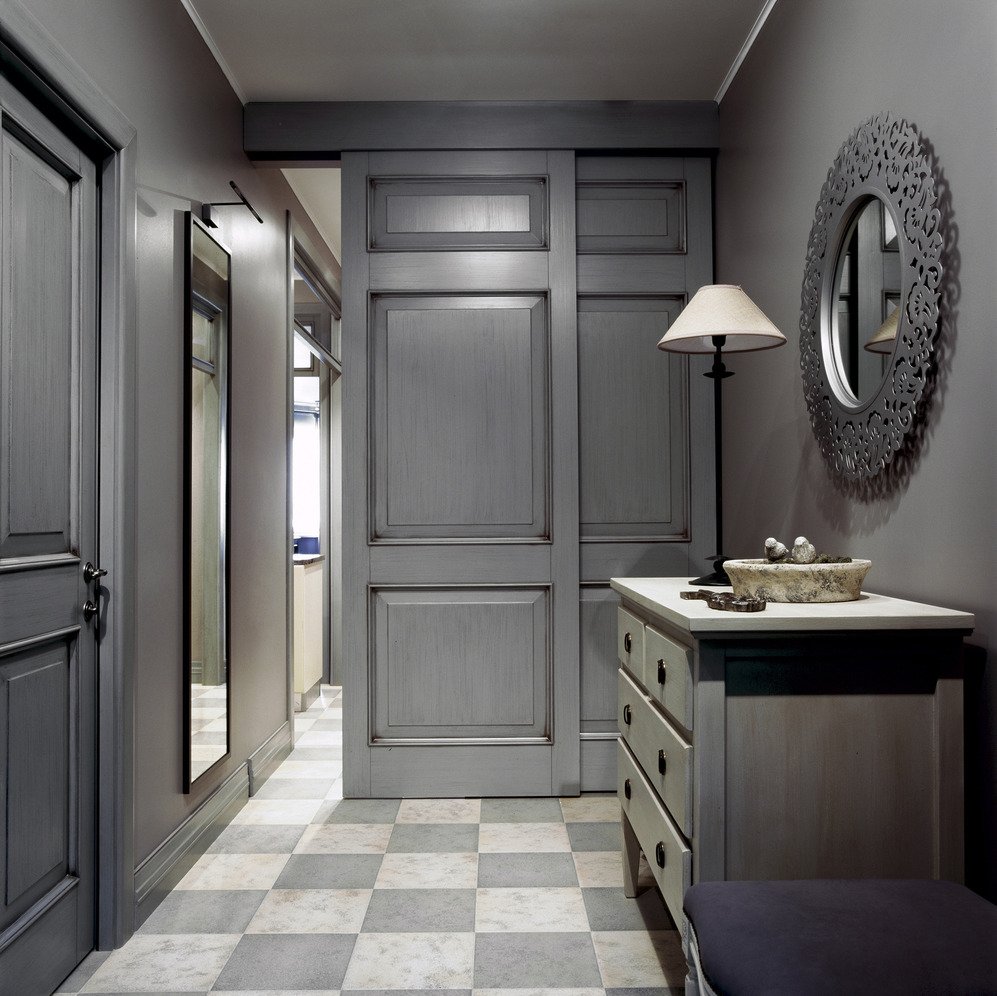
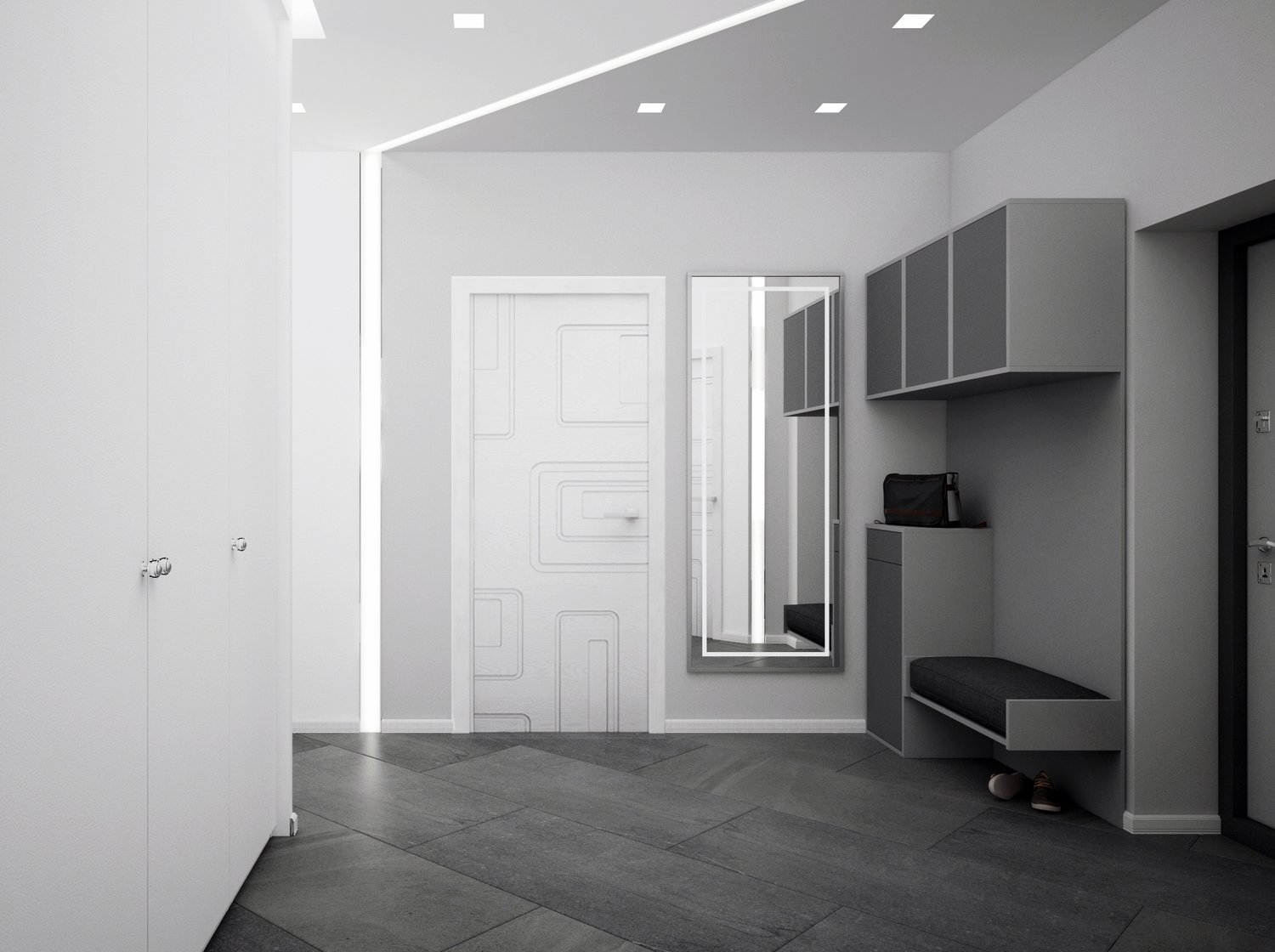
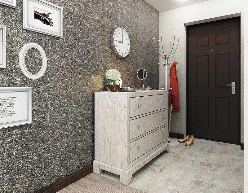
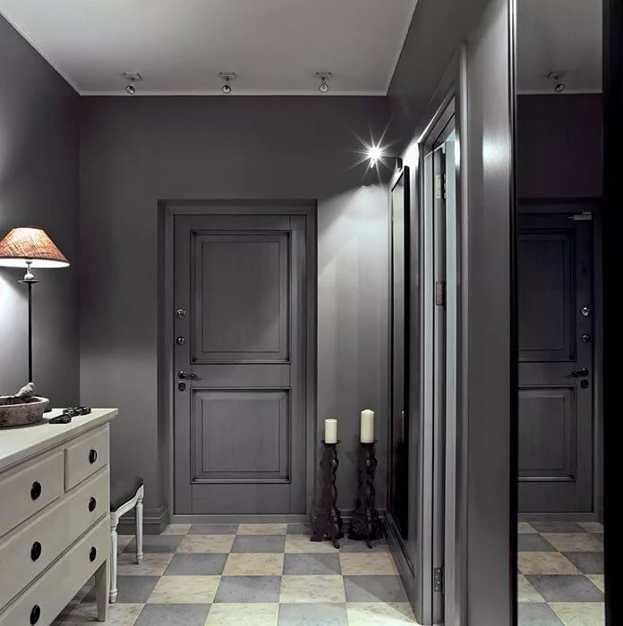
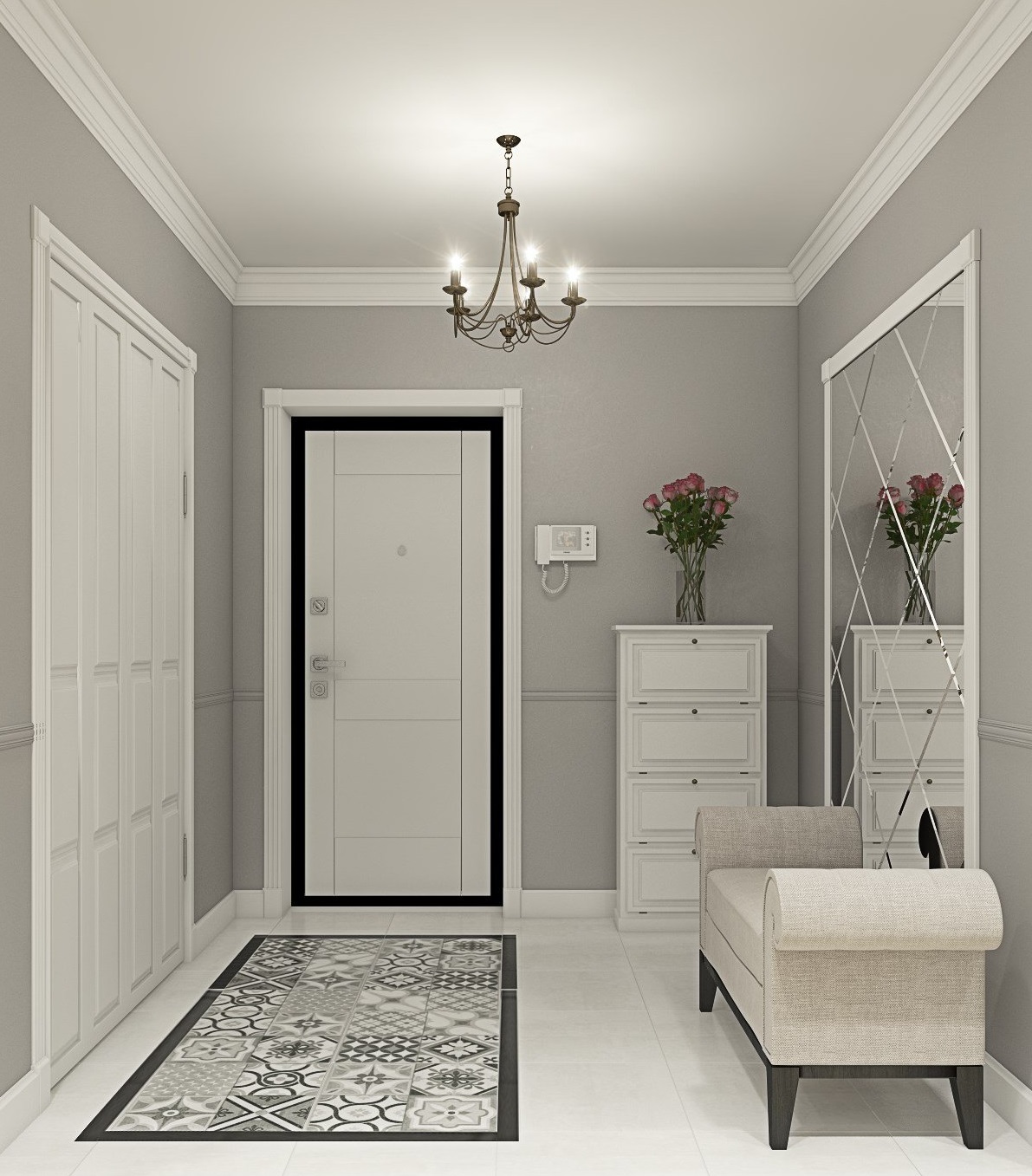
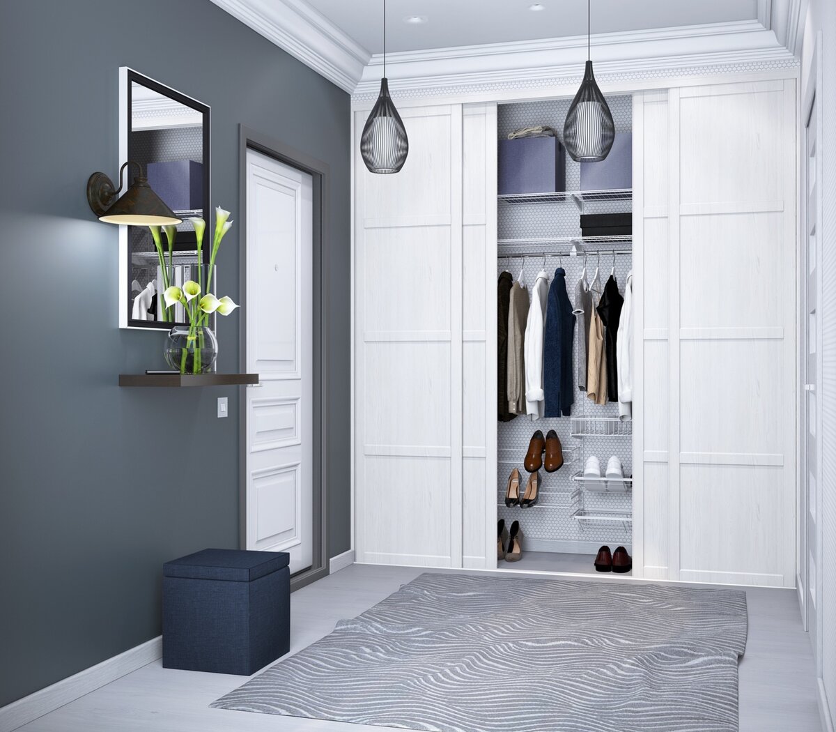
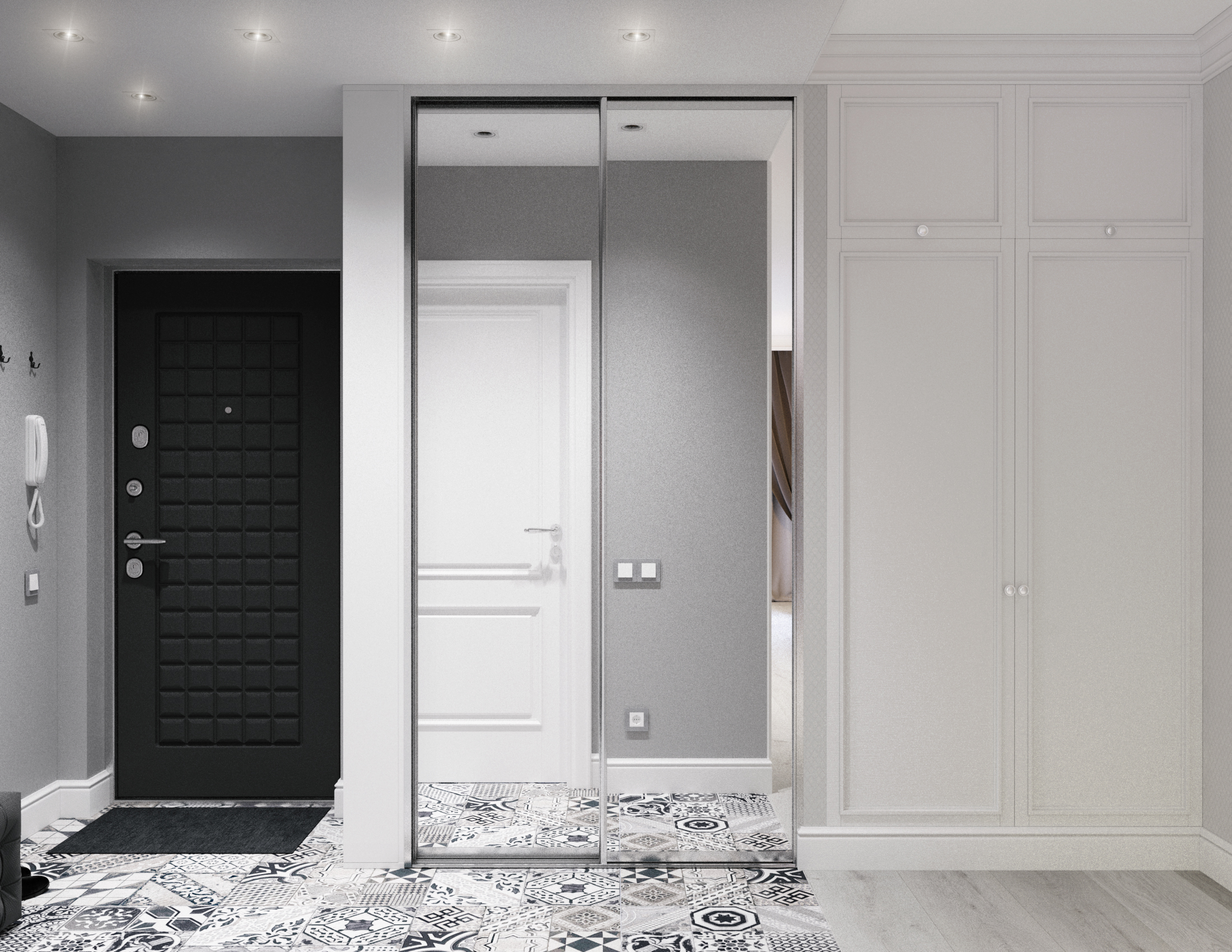
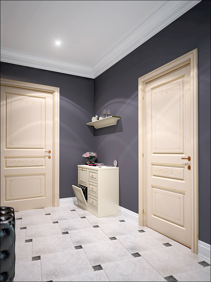
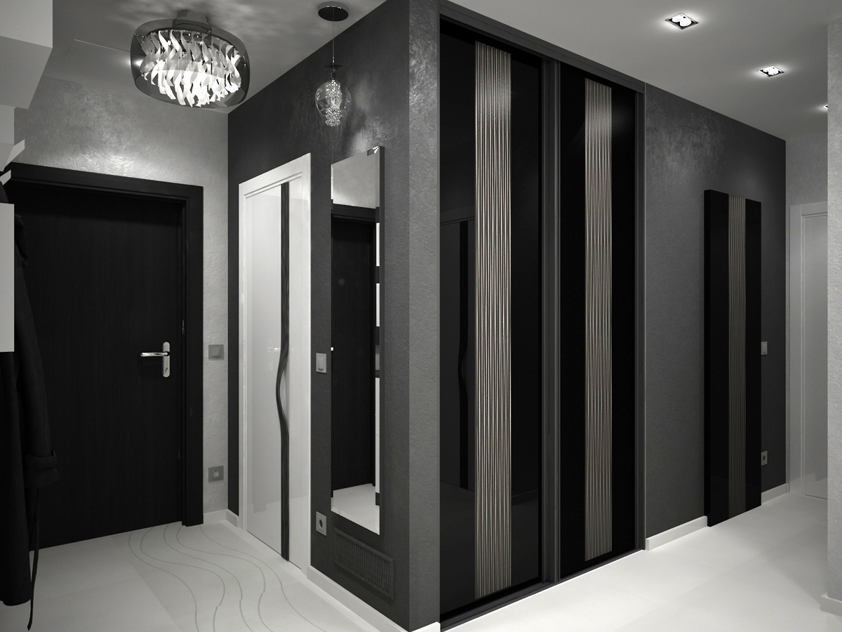
Due to the fact that the walls, floor, ceiling, front door and even the picture have different shades of gray, the interior looks simple, but harmonious and not boring at all. It is diluted with white spots in the form of a clock, a shoe rack and an interior door. The built-in wardrobe fits very harmoniously. He not only does not attract attention to himself, but also perfectly expands the space.

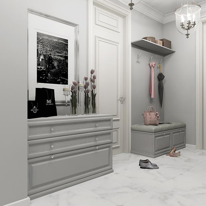
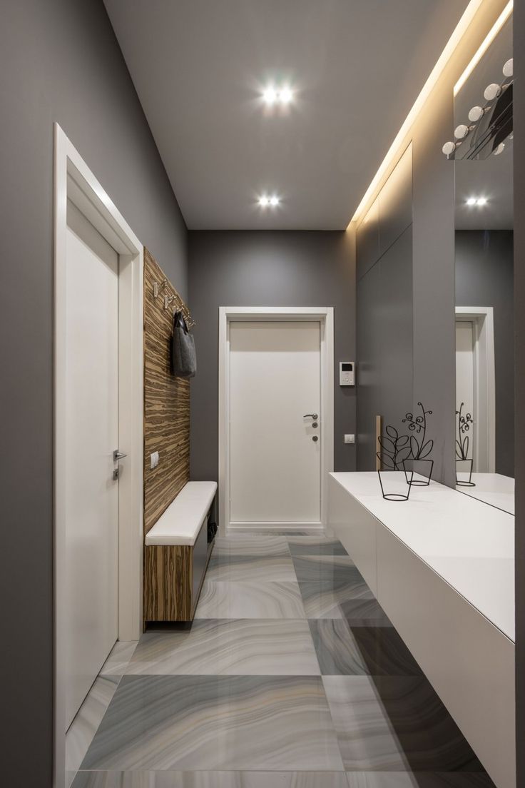
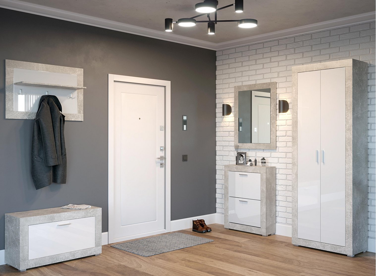
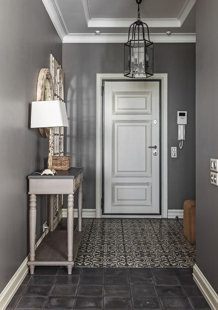
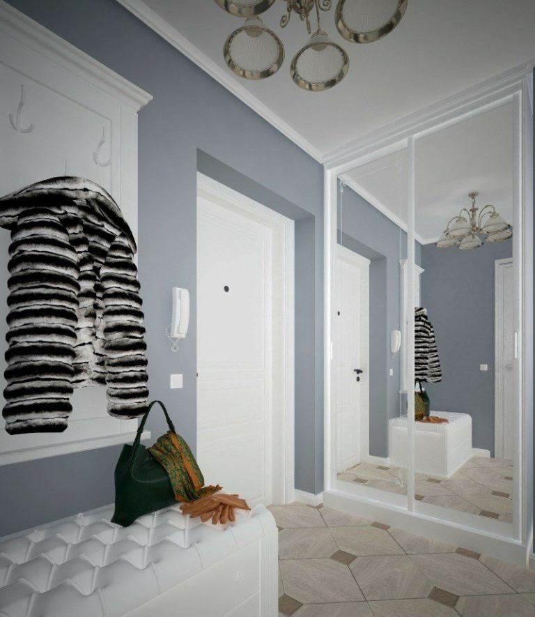
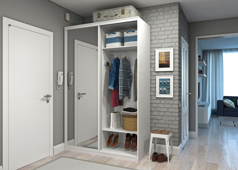
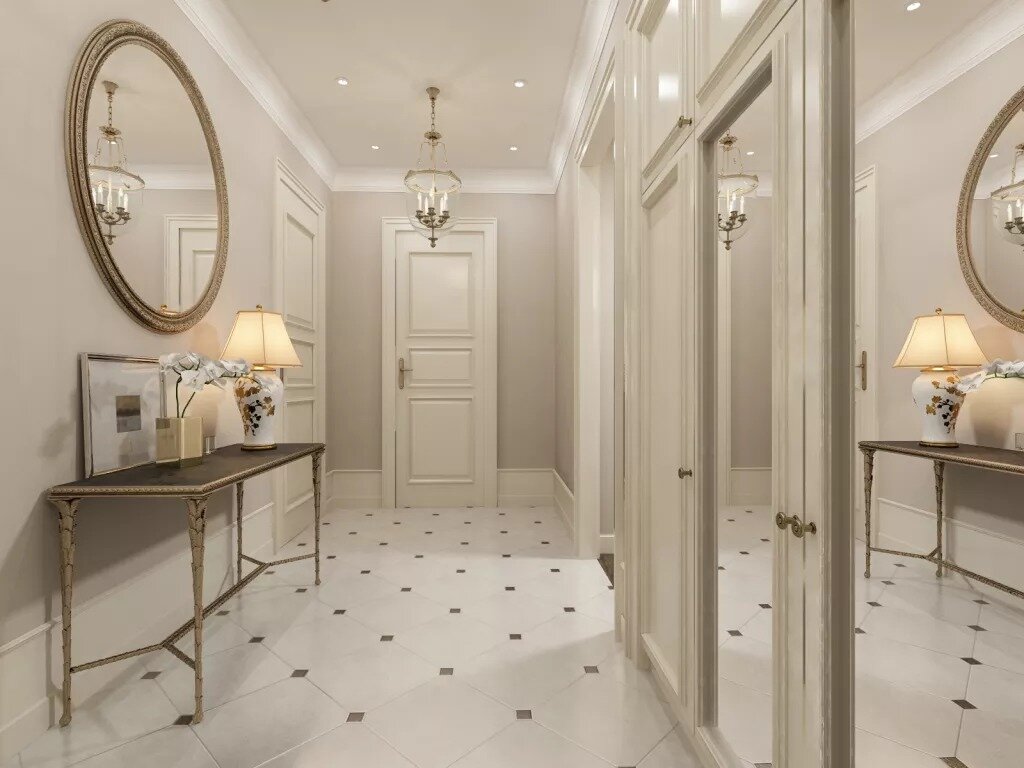
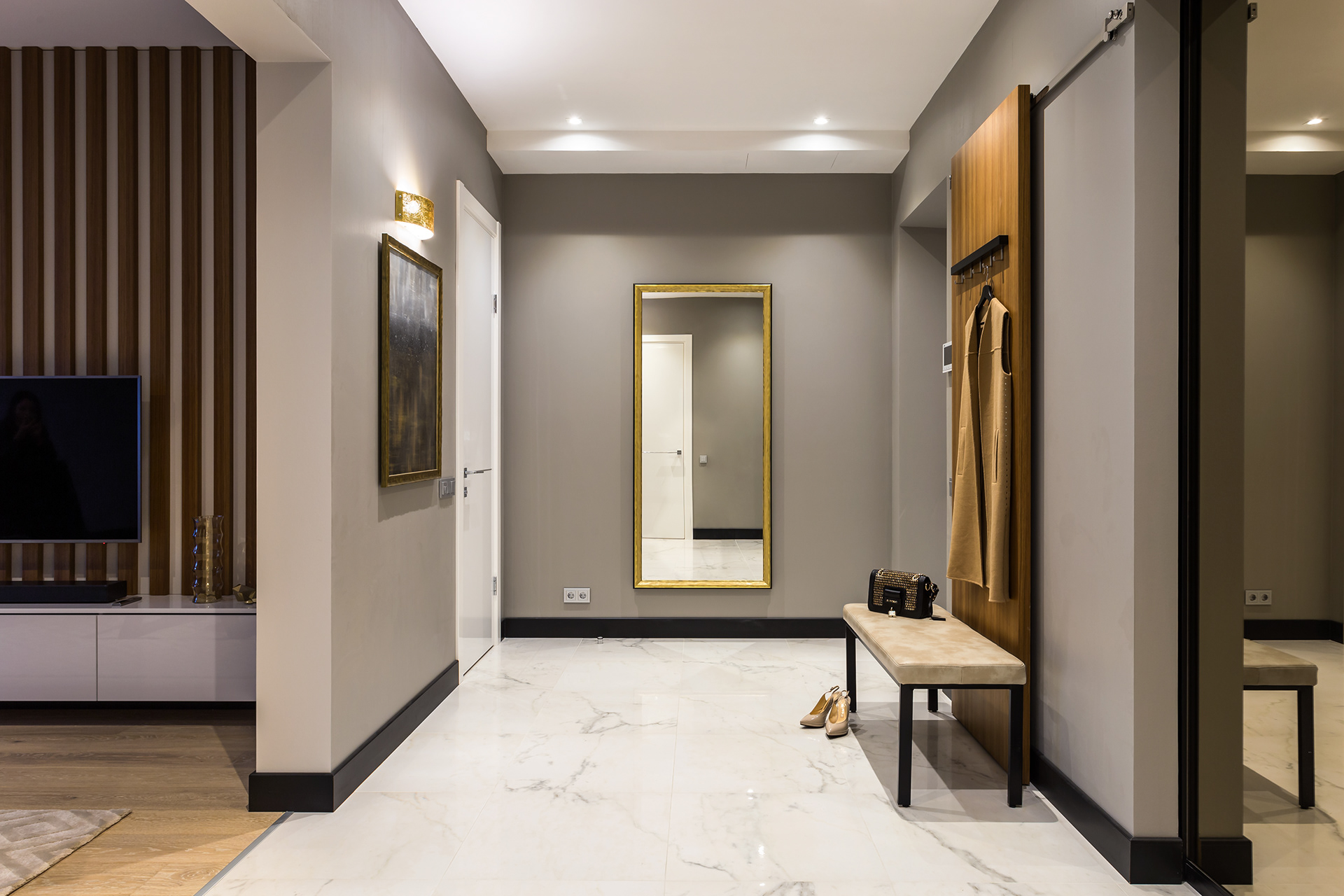
A great example of a combination of gray and beige colors. The entrance hall has a very warm, welcoming atmosphere. The gray floor perfectly sets off the embossed wall made of imitation brickwork. And the abundance of mirrored surfaces expands the space of the room, reflects soft, diffused light.

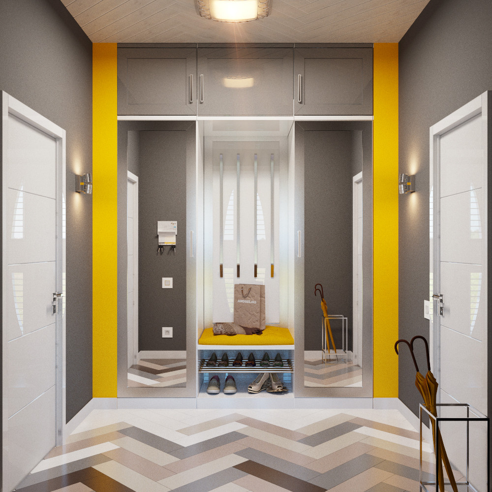
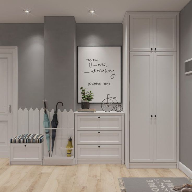
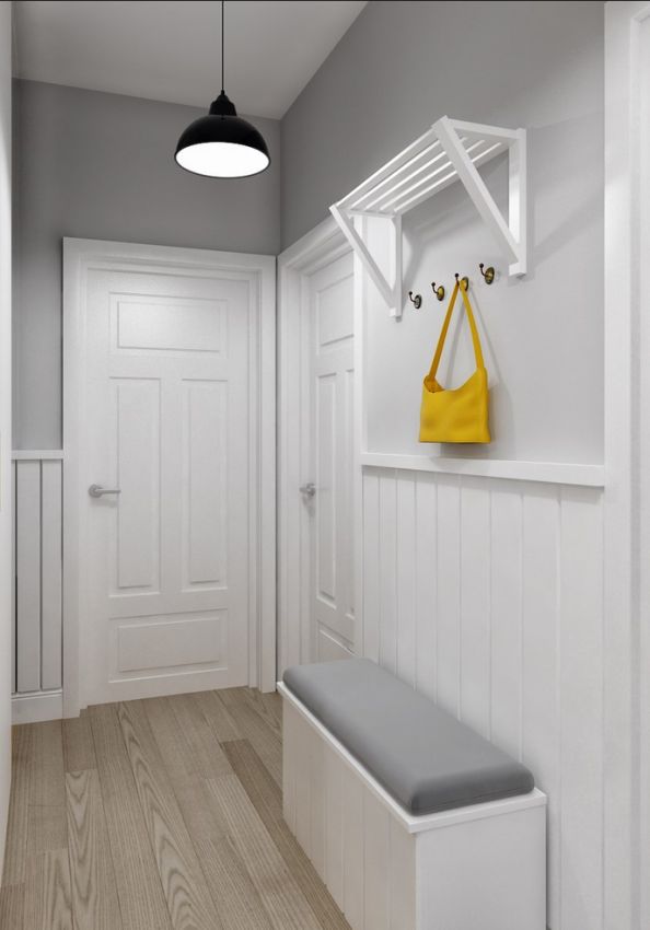
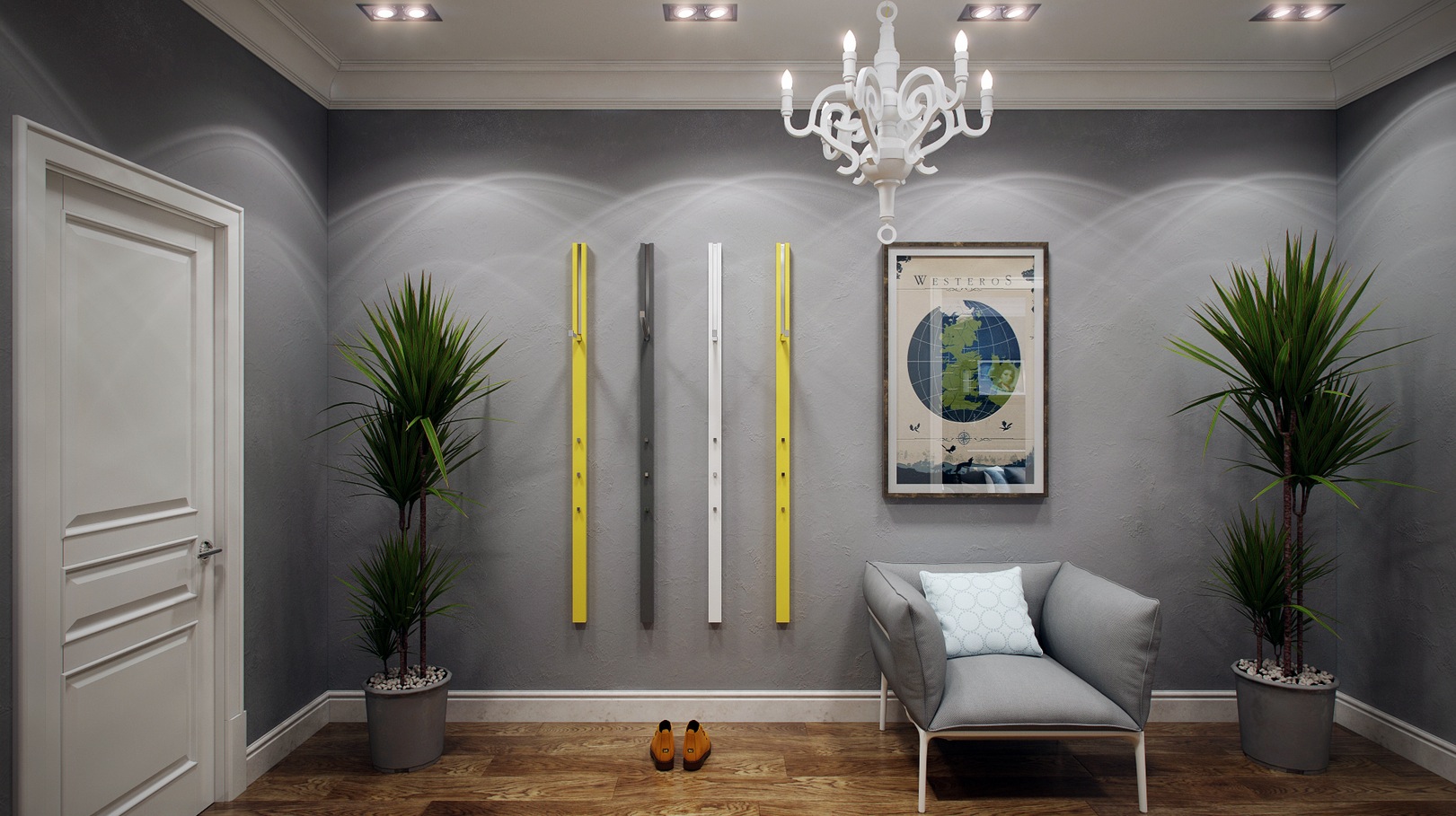
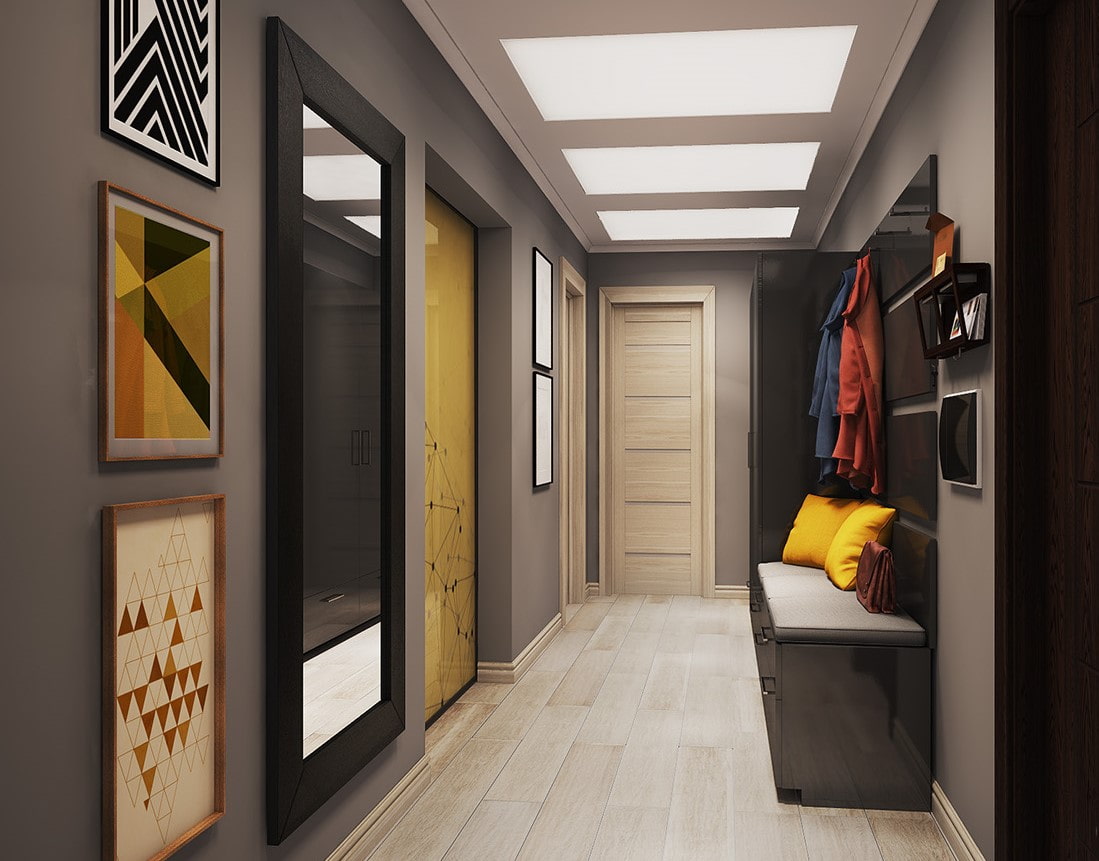
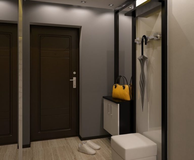
The interior of a gray, calm hallway is diluted with bright yellow doors of a built-in wardrobe. It feels like the sun has peeped into this corner of the apartment.


